Workday’s system of task management and workflow.
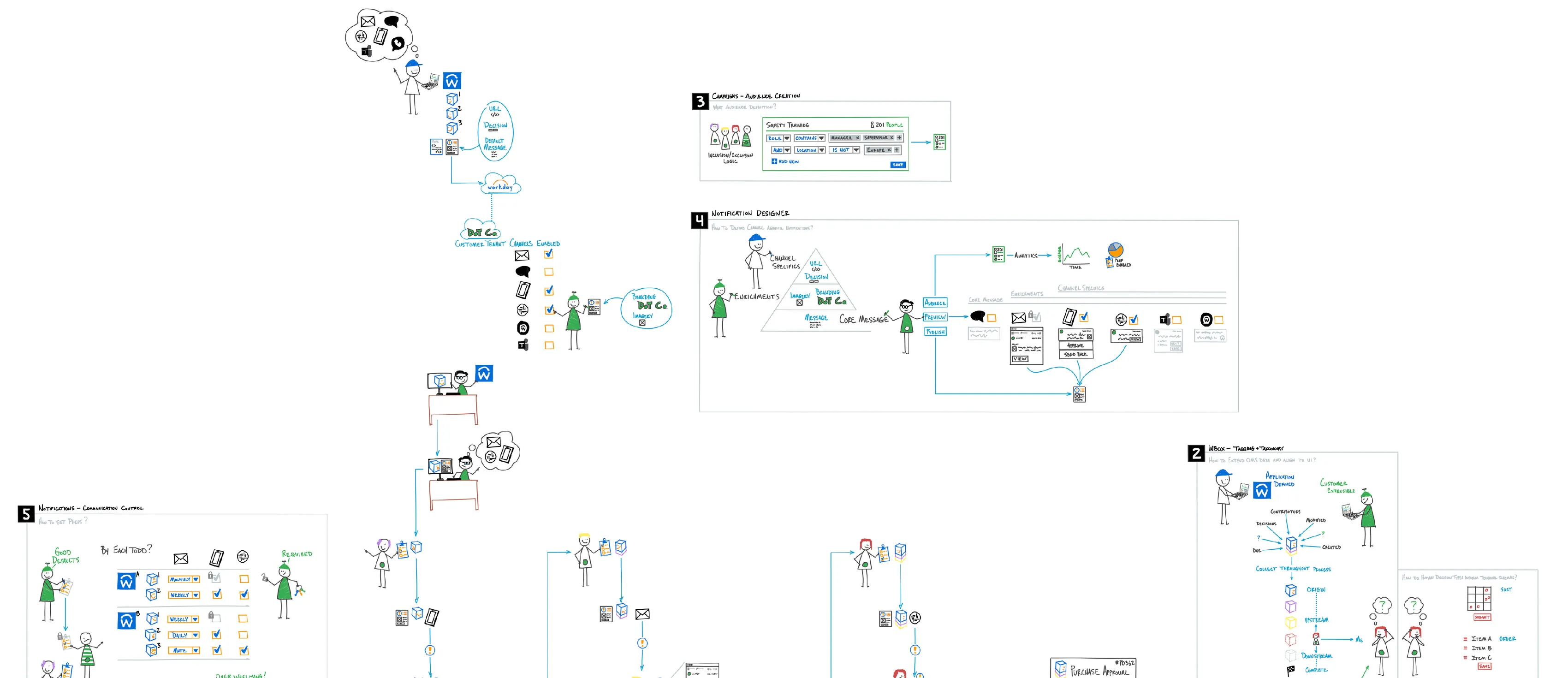
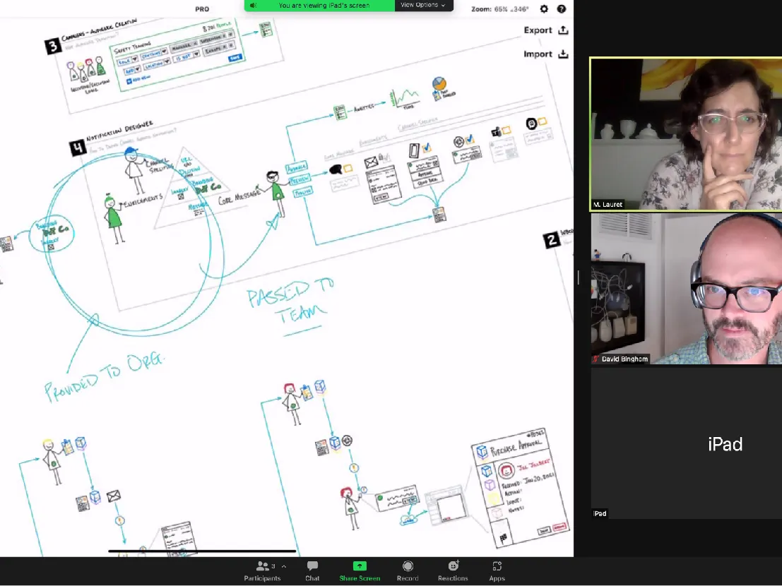
The title block: a wide band of the hand-drawn map of the Inbox and Notifications system, with its stick figures, numbered areas such as audience creation, notification design, tagging, and communication control, and the arrows that link channels, to-dos, and screens. The same map returns at the end of the project, numbered, to place the seven initiatives the work led to.
Inbox & Notifications
Problem space
The two systems the project covers, defined in a line each: the Inbox, Workday’s business task management tool, and Notifications, its multi-channel communication and awareness system. The rest of the project brings the two together.
Inbox: Workday’s business task management tool.
Notifications: Multi-channel communication & awareness.
The Workday Inbox as it was, in a browser window, an Actions list of tasks beside a business process audit, next to my account of the problem: two fundamental systems not redesigned in over five years, earlier efforts that only re-skinned the tools, little instrumentation, and quantitative and qualitative research that pointed to clear issues.
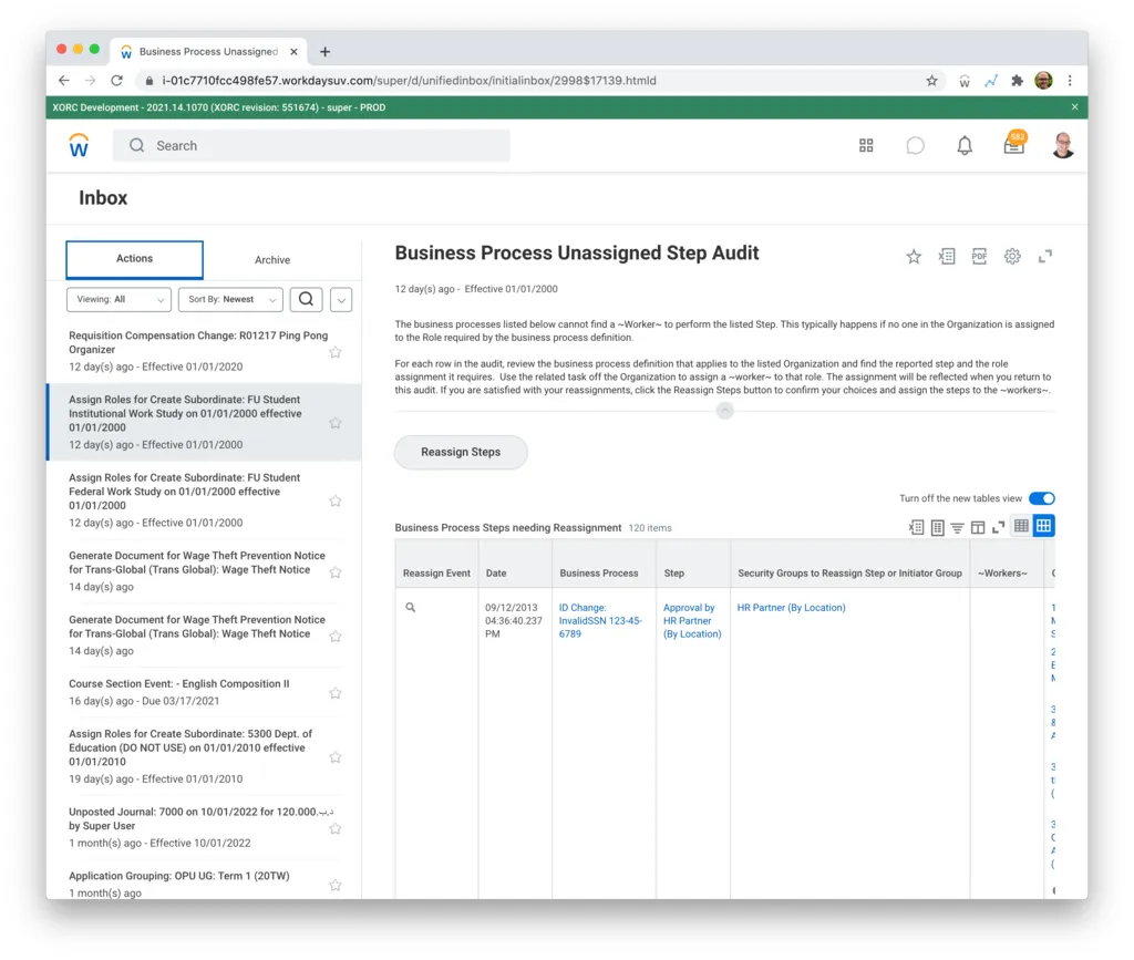
Workday’s Inbox and Notifications are fundamental systems, neither of which had been redesigned in over 5 years. Most historic efforts were simply re-skinning the existing tools and not addressing deeper workflow and user frustrations. While there was a lack of tool instrumentation, our quantitative and qualitative research pointed to clear issues needing to be addressed.
Research
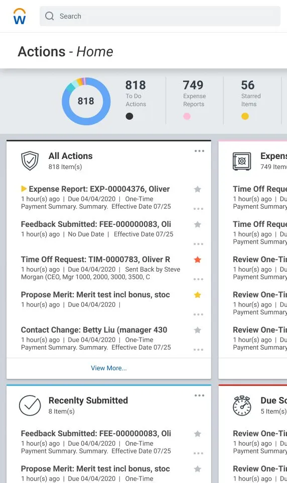
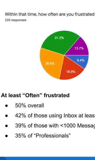
Four sources of evidence, each with its line from the slide: historic research and design, such as an earlier Actions Home screen on a phone; empty sand dunes standing for the usage analytics, of which there were none; a survey of 233 users charting how often they are frustrated; and the plan for the structured discovery I led with customers. With no analytics to draw on, the survey and the discovery built the current picture.

Problem definition
The three roles one person can hold in Workday, Employee, Manager, and Professional, joined by mode switching and set against item volume, frequency of use, and apps and channels, with Professional marked as the focus. Beside it, the four user problems the research defined: switching hats between roles, discovering items, noise and confusion between tasks and notifications, and inconsistent patterns across apps and channels.
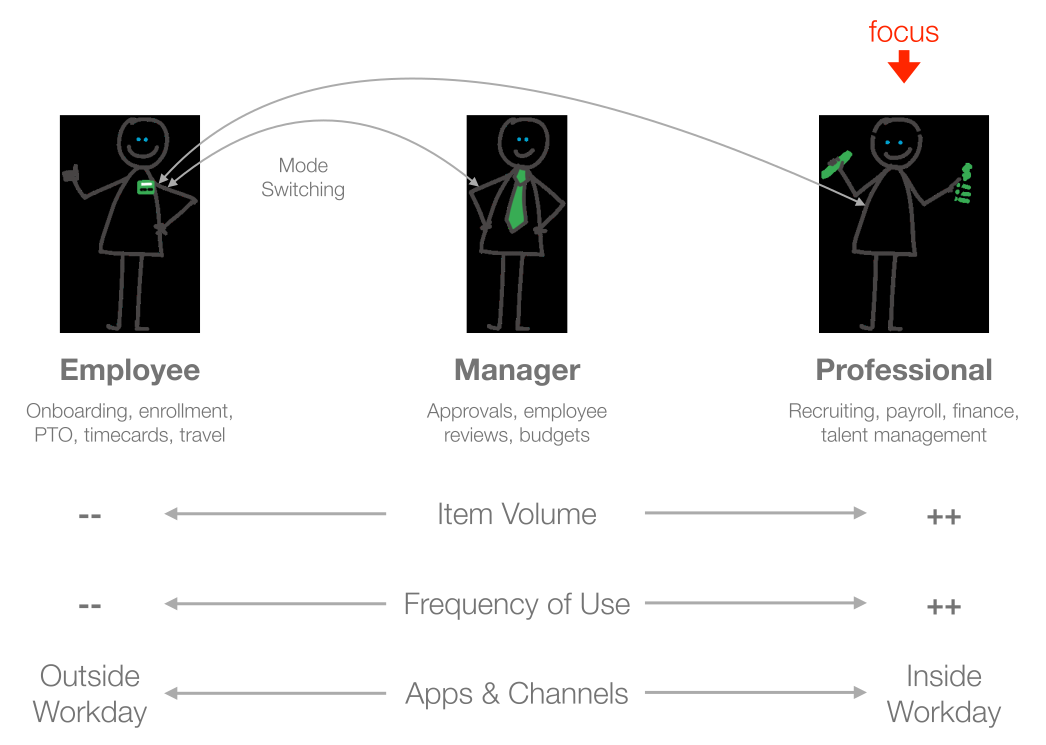
User Problems
- “Hat switching” between different user roles.
- Discoverability of items.
- Noise & confusion between tasks and notifications.
- Inconsistent patterns across apps and channels.
System mental model
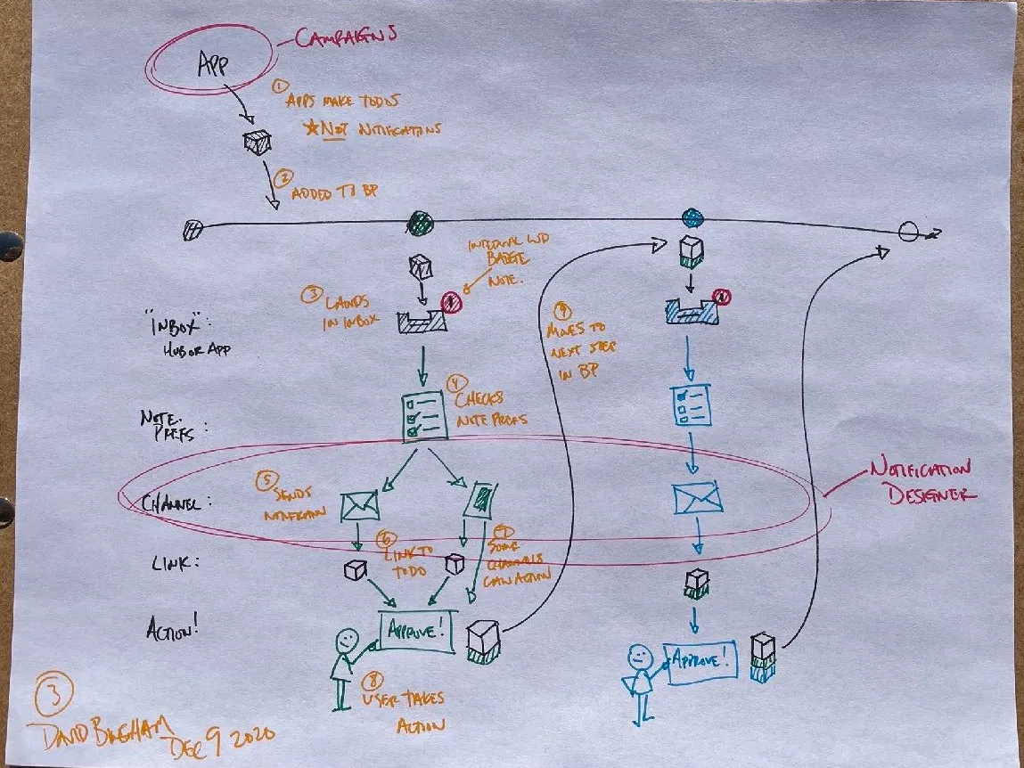
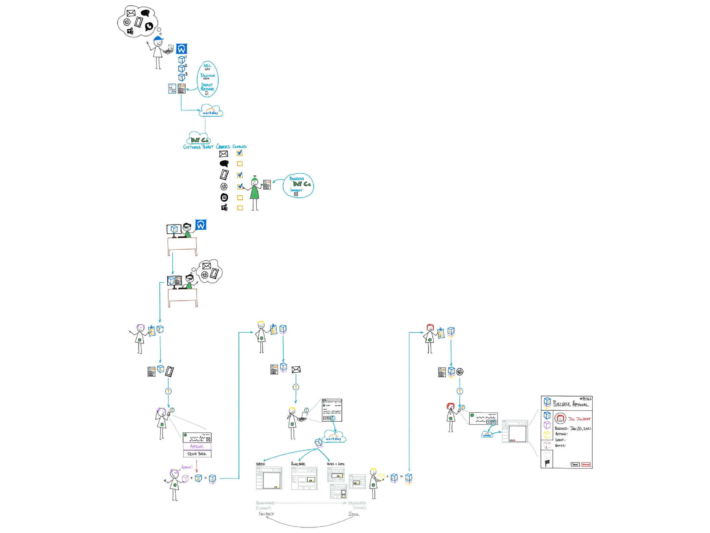
How the system’s mental model was built, in three steps: marker sketches on paper and whiteboard, a formal diagram drawn on iPad that situates the actors and objects, from the app developer and channel admin to the assignees who receive notifications, and Zoom sessions where I refined it with technical architects, designers, product managers, and researchers. The diagram follows a to-do from the app that defines it to the people who act on it.
Concept communication
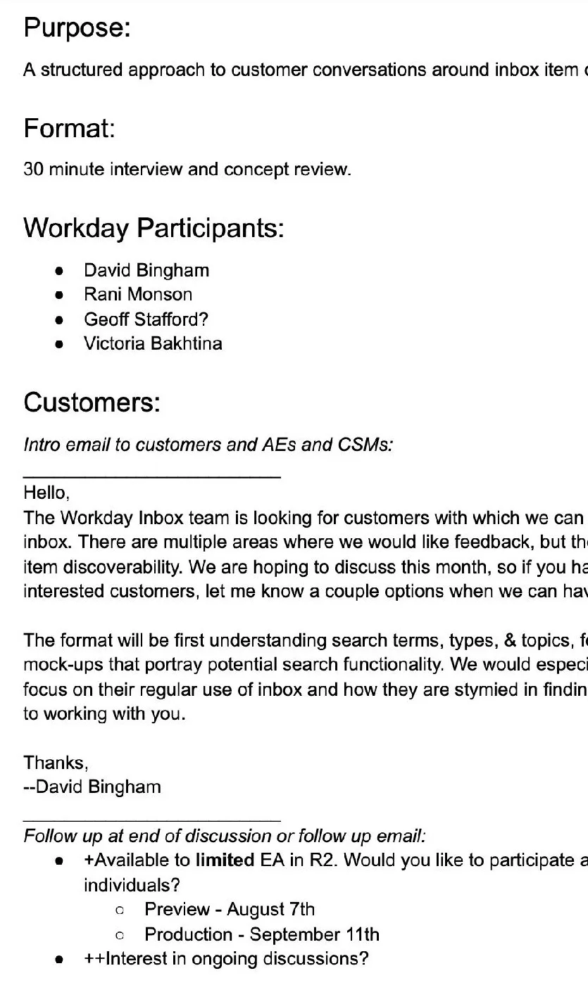
The Inbox Ecosystem Video, 12:56 with my voice-over, whose title card reads Problems, a path, and supporting projects. It was made by turning the system diagram into a presentation, recording a voice-over, and exporting the result as video, so the system model could travel as one narrated piece.
 Video, 12:56
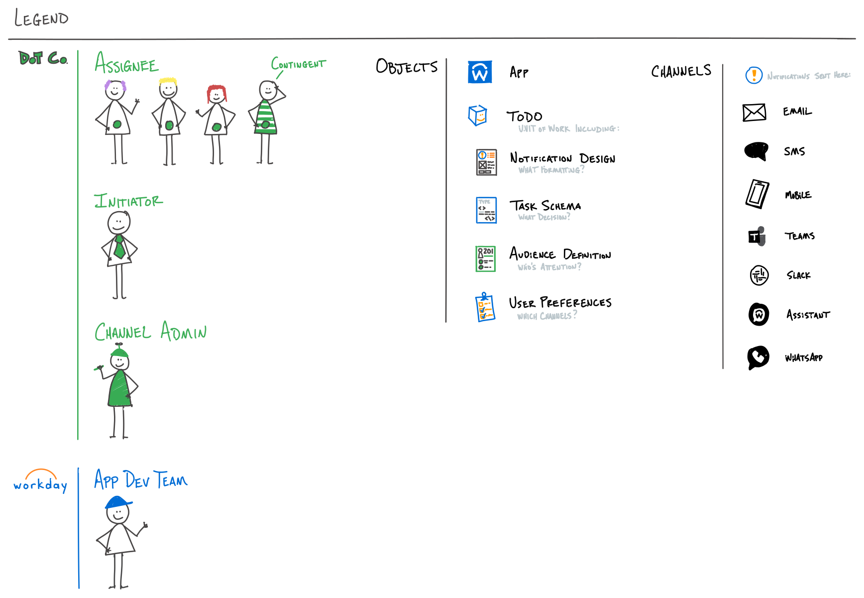
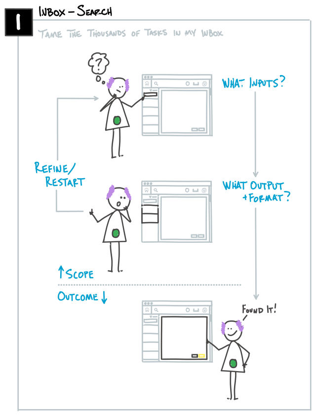
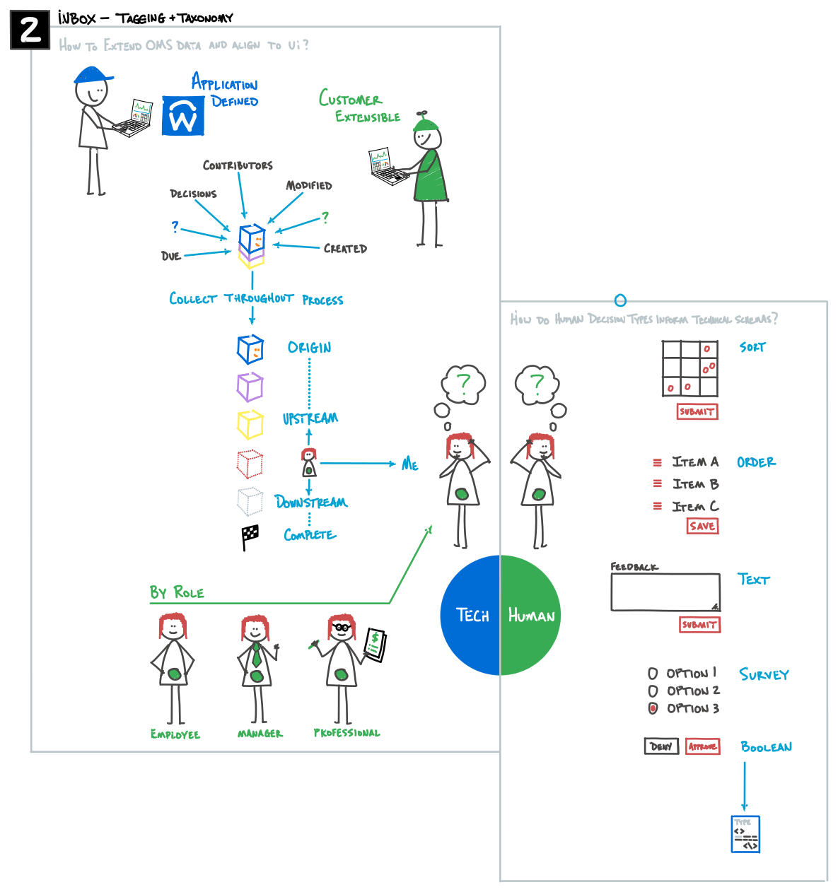
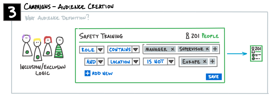
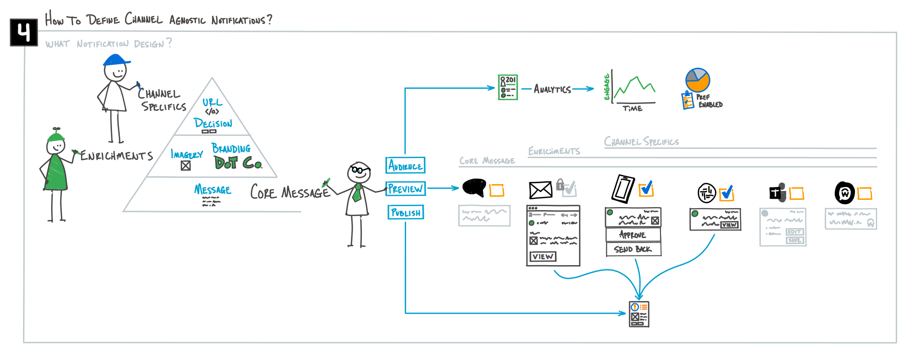
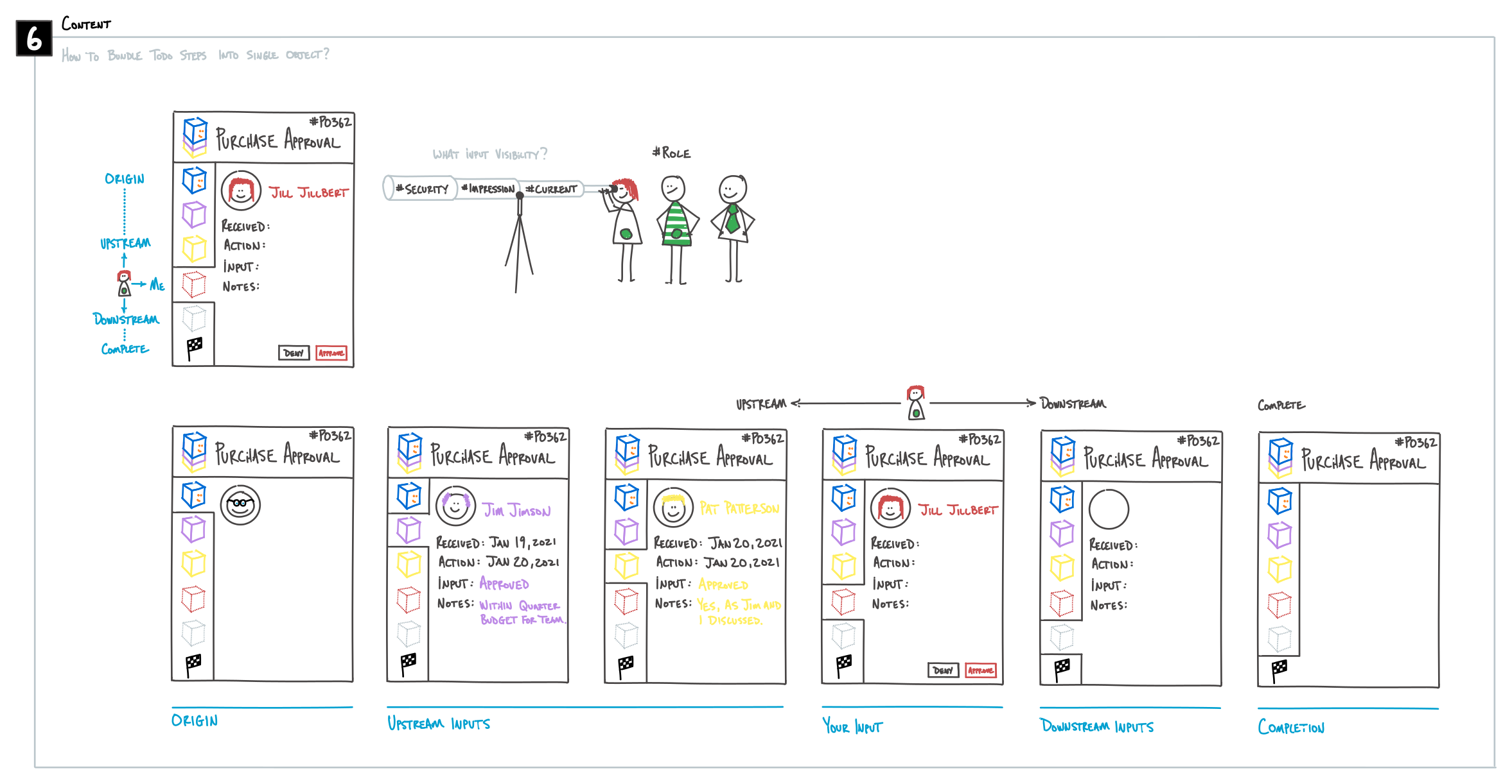
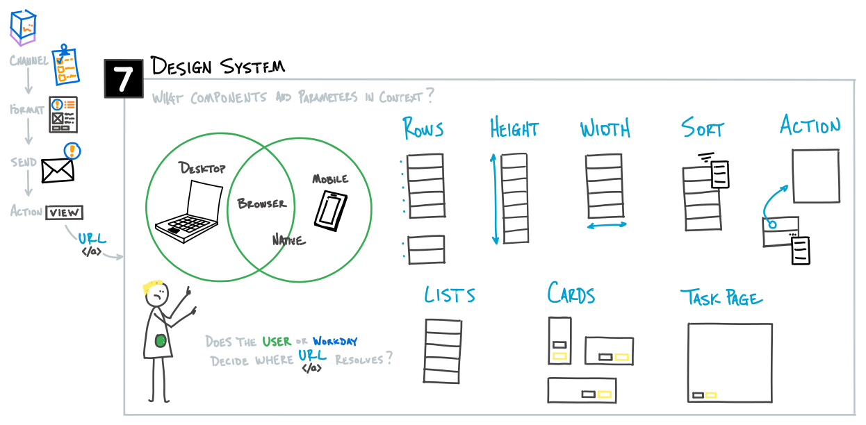
Text equivalent: Hi, I'm David Bingham. I'm a designer here at Workday. I'm going to walk you through a presentation that I put together around the inbox and notifications concept. This talk will be just a little over 10 minutes. There are going to be a lot more words on screen than I'm going to read, so feel free to pause and read some of the details. This presentation outlines experiential problems with Workday's inbox and notification system. It depicts a future system that addresses these problems, as told by a to-do traveling through a workflow. The story ends by outlining project areas that contribute to the realization of this experience. In the past year, we've had a number of customer conversations that have contributed to and inspired this outline in some way, shape, or form. The first big problem that we're addressing here is around inbox and notifications being confusingly similar, without a very clear and consistent relationship. The second big problem is that Workday's notifications follow a different model than contemporary notification systems; it's also not very tied out with a lot of external notification systems. Third, customers want to address inbox content with better information in the context of their role, be it an employee, or a manager, or some profession. Fourth, management of notifications and channel preferences is neither intuitive nor scalable. To guide some of the design direction, we've put together a few design principles. The first one is around being action-oriented, where the inbox becomes the user's queue of to-dos. The second is around workflow representation, where individual inbox items represent the entirety of a single workflow. In user awareness, notifications are the messaging extension of an inbox item. And lastly, respecting context: inbox items surfaced in Workday products and through notification channels respect the context and capabilities of that particular medium. So all of this was put together into a diagram that will tell a story addressing these problems and leveraging our various design principles. We'll follow the path of our to-do friend through definition by a Workday app team, creation by an initiator, and inputs from assignees. To understand what those roles mean, I built a legend that defines the key people and components used to describe the concept. There are green people, who are part of my fictional Dot Co company. The primary groups here are assignees, which is any individual assigned to a to-do; an initiator, that is any person that generates a to-do; and a channel admin, who provisions channels available to assignees, and may also inject company-wide branding and imagery for use in those channels. Blue people are Workday employees. There's only really one here, and that's the application development team. It builds applications used by initiators to generate to-dos. There are some objects and abstractions of key software components and parameter definitions within the Workday to-do workflow. There are applications. There are to-dos, which I am defining as an actual assignment, created by an initiator for an assignee. And as a point of clarification, there are tasks, there's a formal notion of to-dos, there are items coming off of business processes, there are surveys that go through notifications. I'm including all of those together as the total list of things and generically calling them just a to-do: any unit of work for an assignee. We'll also touch on notification designs, task schemas, audience definition, and user preferences. A notification is a to-do related message delivered via a channel to an assignee. And we have a number of channels here that we'll touch on. Some of them exist now. Some of them might be included in the future. So let's start. The Workday app dev team defines to-dos and the default notification design. They build their application and associate the type of decision that needs to be made with that to-do, the default message that might get sent out with a notification, and the way that message links back into the Workday system, to the right place to execute whatever the to-do is requesting. They publish their application to the Workday cloud. The channel admin provisions tenant channels and inputs company-wide communication assets. So they decide what channels will be used. They might add some additional company-wide branding, some other imagery that's licensed for use, for sending out more detailed and nicer notifications. An initiator creates a to-do from the application. They preview the notification design and edit it to suit before launching the to-do. The to-do goes out and checks the first assignee's preferences, and a notification is sent to the preferred channel using the associated notification design. The assignee receives a notification, in this case on their mobile device, as their preference, and they provide the requested input. In this case, the approval is now appended to the to-do, and the to-do moves on to the next assignee. It checks their notification preferences, and a notification is sent to that assignee's preferred channel, again using the associated notification design. The assignee gets a cursory understanding of the need and clicks the included link. So from their email, when they view that link, they're routed to the best available location to complete that to-do. Within the Workday cloud, as they're moving into the Workday environment, they traditionally come to the inbox or view that task page, and that's the generalized, current fallback for all things. In the future, as we move towards specialized or more ideal hubs and application spaces, this routing may be able to evolve to point people to those better tools that Workday has provided for them. Ultimately, the assignee provides the requested input, and it moves on to the next assignee. And I think you get the picture. In this last one, though, as the assignee views the notification, they are taken to the place where they're requested to provide their input, and they can view all the relevant information for the to-do type, formatted to whatever device they have. So as they view this in detail, they can see the steps taken prior to their receiving this to-do, and what comes after they complete it, on its way to completion. This continues until the to-do completes, collecting information and inputs from the assignees. But now let's review what is needed to make this journey possible. I've put together seven identified areas contributing to the realization of this experience, and I'll walk through each of these. Inbox Search is a funded program that is helping to improve discoverability of items within the inbox. It's focused primarily on the current inbox itself, but as we figure out ways to surface these items, that may trickle out from the inbox into other areas that I'll discuss. Second is around inbox tagging and taxonomy. This is: as a to-do flows through Workday, how might we tag it for users to group, type, and discover? The left half of this is a technical endeavor, to make sure that we've got the right metadata and information associated to those to-dos, and then additional data collected as it moves through the process. The right half of this is much more around human decision-making types, and understanding what information is needed in order for people to make the most informed decision. The third item here is around audience creation. This is really to ensure that the right inclusion and exclusion logic is defined in order for to-dos in any sense, could be learning, could be recruiting, could be finance, to be sent to the right people. Fourth is around notification designer. The problem here is expanding from the v1 focus on email: how might we allow initiators to create channel-agnostic notifications? This is really spreading out from email into the variety of channels that need some sort of design and formatting as appropriate to those channels. As we get closer to the core message, I believe the initiator needs to focus on that message, and then borrow some of the enrichments and channel specifics that were defined earlier on, and then assign those and preview those in the various channels that are available on their tenant. The fifth one is around notification communication control, or user preferences. The problem here is keeping users engaged but not overwhelmed: how might we structure a scalable notification control module? If we try to do this by each to-do, by each channel, within each application, it's going to become very, very overwhelming, but we do need a way to allow channel admins to require certain channels and set good defaults. As more sources and more to-dos come online and more channels become available, it's going to become very overwhelming, and we need a model that allows people to stay in control, learns from their interaction patterns, and aligns notifications to their schedule. Some sample models might be how we think of this in terms of point in workflow, or how we associate critical to-dos to the immediacy of some channels, where push notifications tend to come quite immediately, while email tends to be a little bit more passive. We might think of this around due dates for to-dos. But in either case, we need to find a balance in order to get attention where it is both most critical and most urgent. The sixth is around content, where we need to make sure that the right information is there for each of these types of task schemas to support good decision-making. And lastly is the design system question: as the inbox moves into more spaces across Workday, how might we keep engagement with to-dos scalable and consistent? Now, these seven areas are very interrelated to the success of each other. Audience definition is used in notification design. The schemas can action from the notification in some cases. The schemas will inform content and layout. That content and layout will be broken up into various components in our design system. And preferences relate to the various schemas and channels. So, some next steps to consider. We'd like to go and validate the inbox and notifications model with key stakeholders. We want to find top task workflows and pressure-test this model, to see where it falls apart, where it succeeds, or things we just haven't thought about. We need to refine these supporting project areas and detail design briefs for them. And then lastly, as this becomes a priority or formal initiative, define resourcing needs, assignments, and metrics for success. That's all. Thank you. Please reach out if you have any questions.
Interface experience
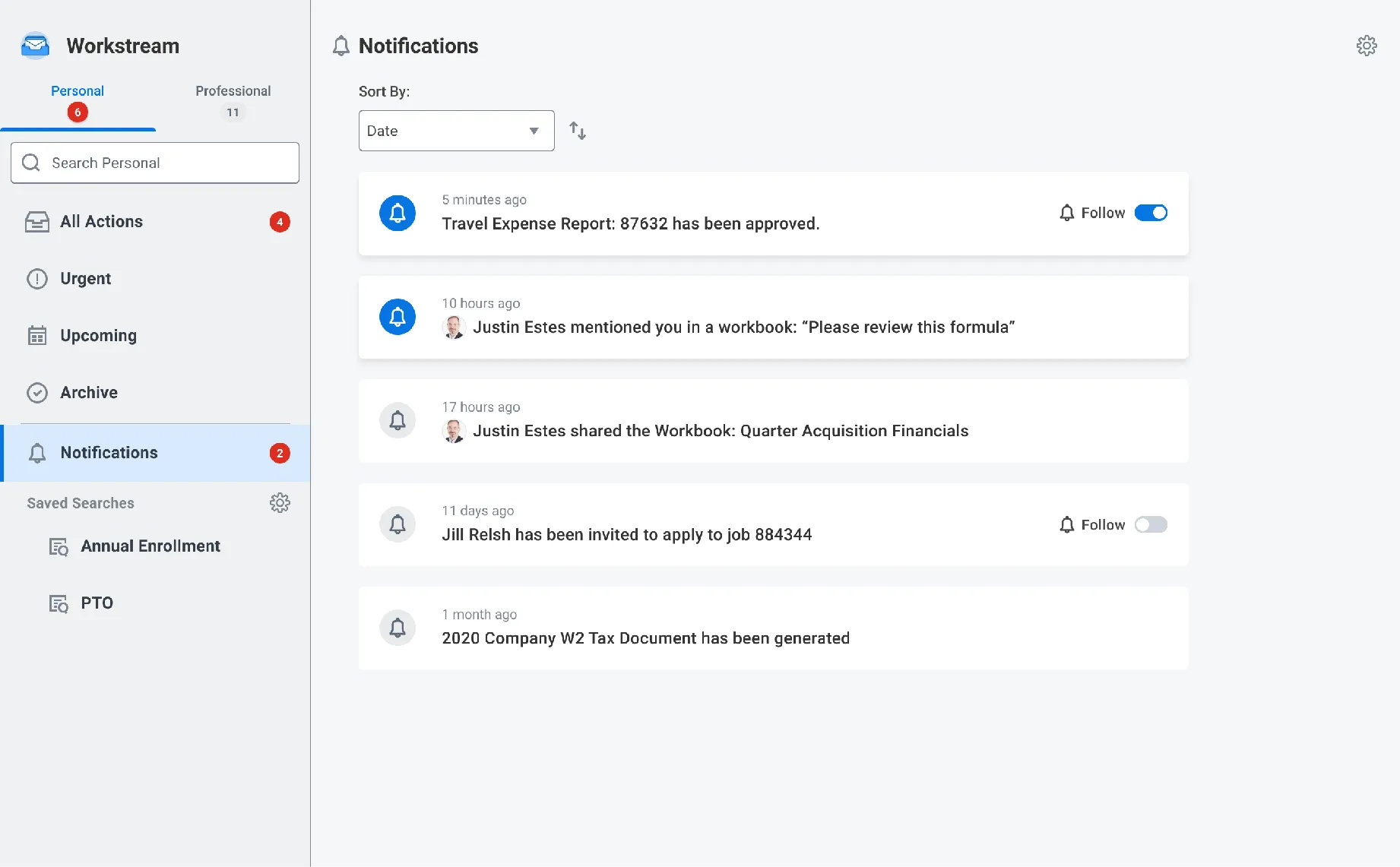
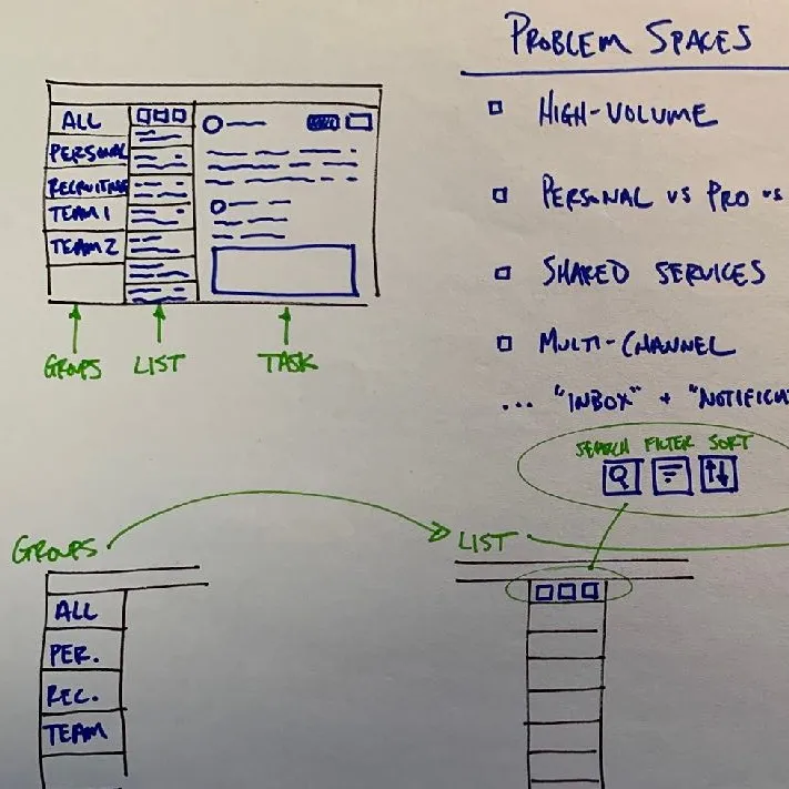
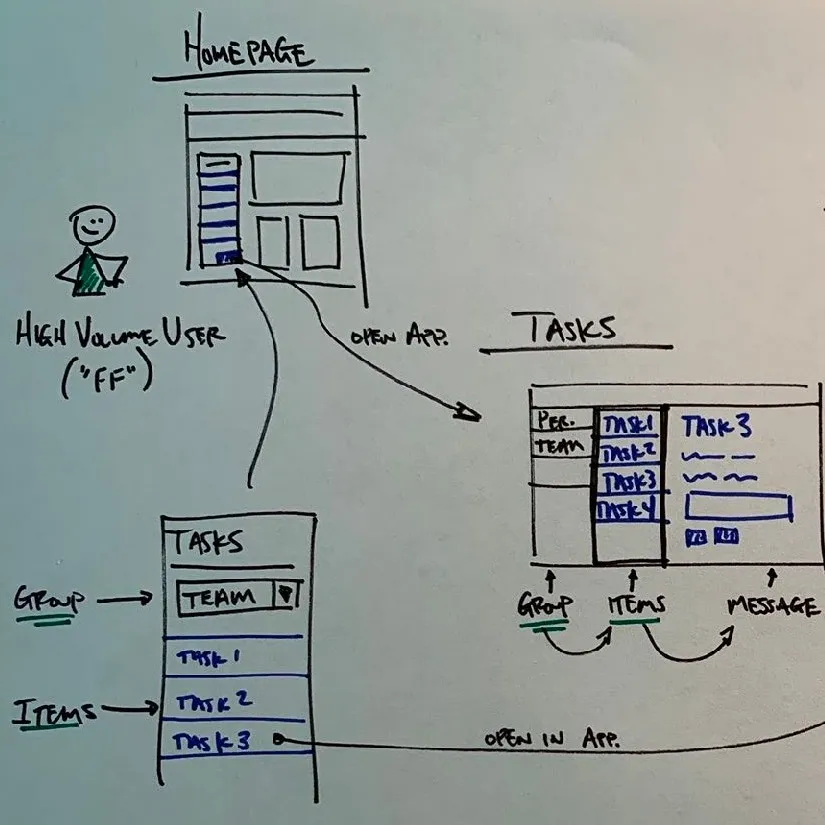
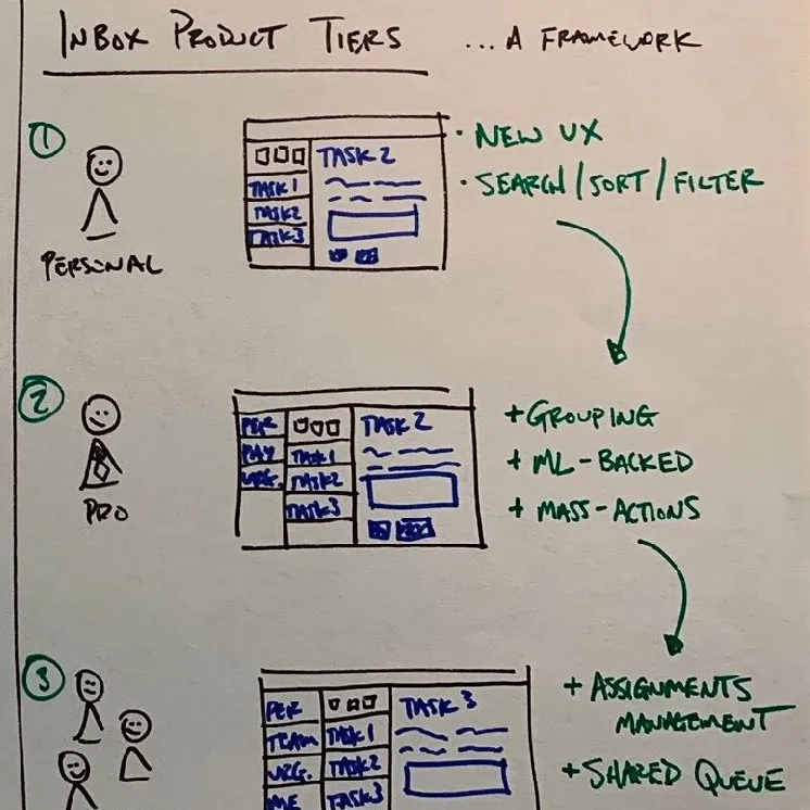
The interface direction, from paper to screen: three pen sketches of the problem spaces, a high-volume user’s path from the homepage to a full tasks app, and product tiers for personal, pro, and shared users, beside two Workstream screens, a manager’s All Actions and a personal Updates list. Three lines set the direction: a layout familiar to existing users, tasks and notifications aligned in a single UI, and customization for discovery and focus.
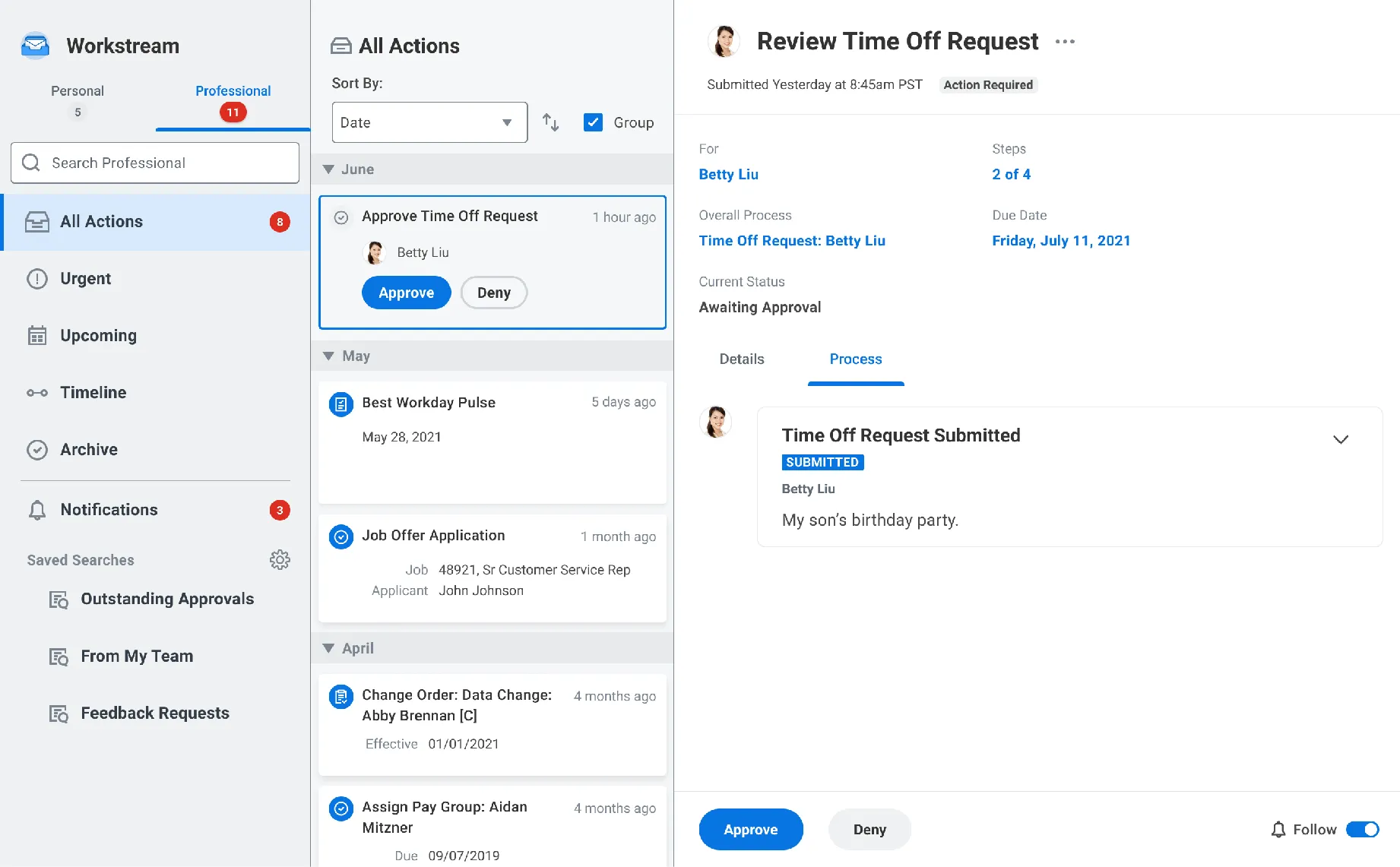
- Layout familiar to existing users
- Tasks & Notifications aligned in single UI
- Customizable for discovery and focus
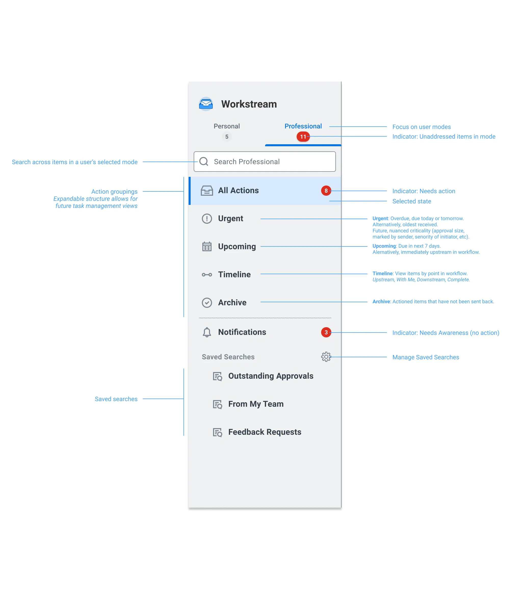
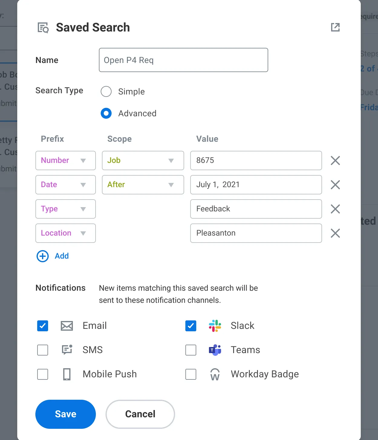
The Workstream sidebar with its parts called out (user mode tabs, search, action groupings, indicator badges, notifications, and saved searches), beside the Saved Search dialog, where a search can be tied to notification channels such as email and Slack. Task management for high-volume users pointed to saved searches, sorting, and grouping, and saved searches also became user-defined notification categories.
Customer validation
The scale of the customer validation: research with 11 customers, about 20 users.
Researched with 11 customers (~20 users)
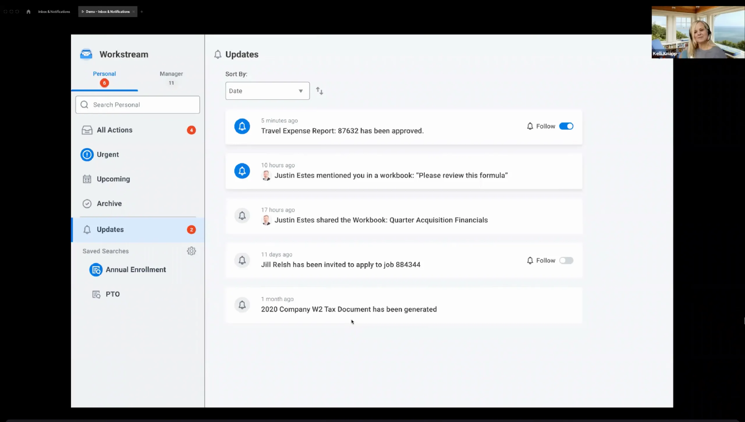
A video call of 19 August 2021 sharing the Workstream prototype with a participant, beside what users found most compelling (search and saved searches, mode switching, and following tasks) and the opportunities for further refinement: stay familiar and evolve, keep groups simple, and allow configuration by admins and end users.
What users found most compelling:
- Search & Saving Searches
- Mode Switching
- Following Tasks
Opportunities for further refinement:
- Need to be familiar & evolve
- Keep groups simple
- Allow configurability by admins and end-users
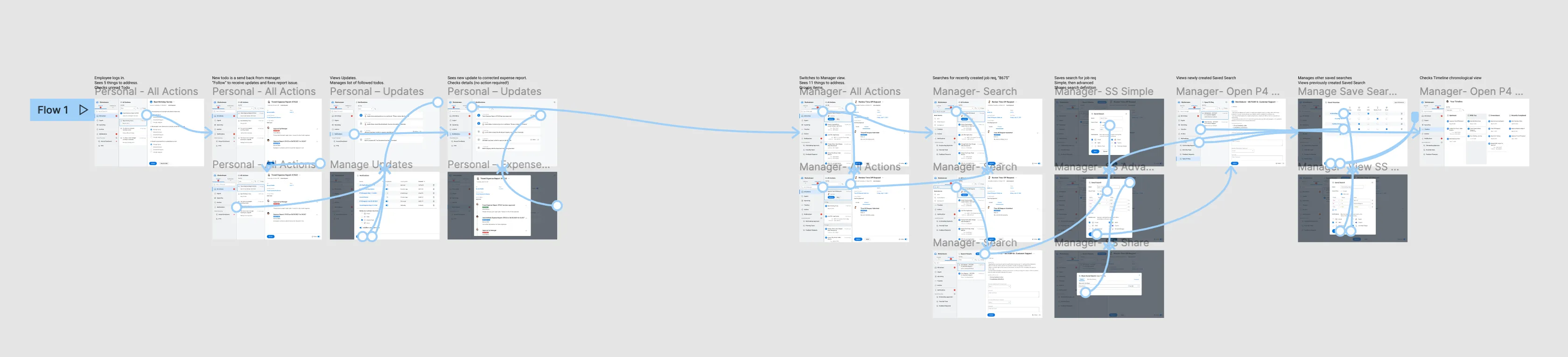
The validation prototype laid out in Figma as one flow: small screens linked by arrows, from an employee’s personal All Actions and Updates to a manager’s search, saved searches, and sharing. Its screens cover the features users responded to: following updates, switching to the manager’s mode, and saving searches.
Product roadmap
How the vision became a roadmap: design, product management, and development broke it into component parts, built along a path from the original Workday Inbox to the final Workstream Inbox.
Design, product management, and development deconstructed the design vision into component parts built along a path from the original Workday Inbox to the Final “Workstream” Inbox.
That path as six screens: the original Workday Inbox, a hybrid transition design, saved search, an open layout with sections, unified notifications control, and the final Workstream Inbox. Each step adds to the one before, ending in Workstream’s personal and professional modes and its urgent and upcoming groupings.
01 · Original Workday Inbox
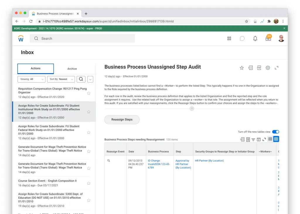
The starting point: an Actions list beside the selected task, with an Archive tab. 02 · Hybrid transition design
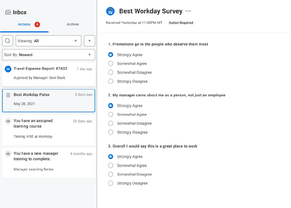
The same Actions and Archive structure in a new visual style, with each item as a card. 03 · Saved search functionality
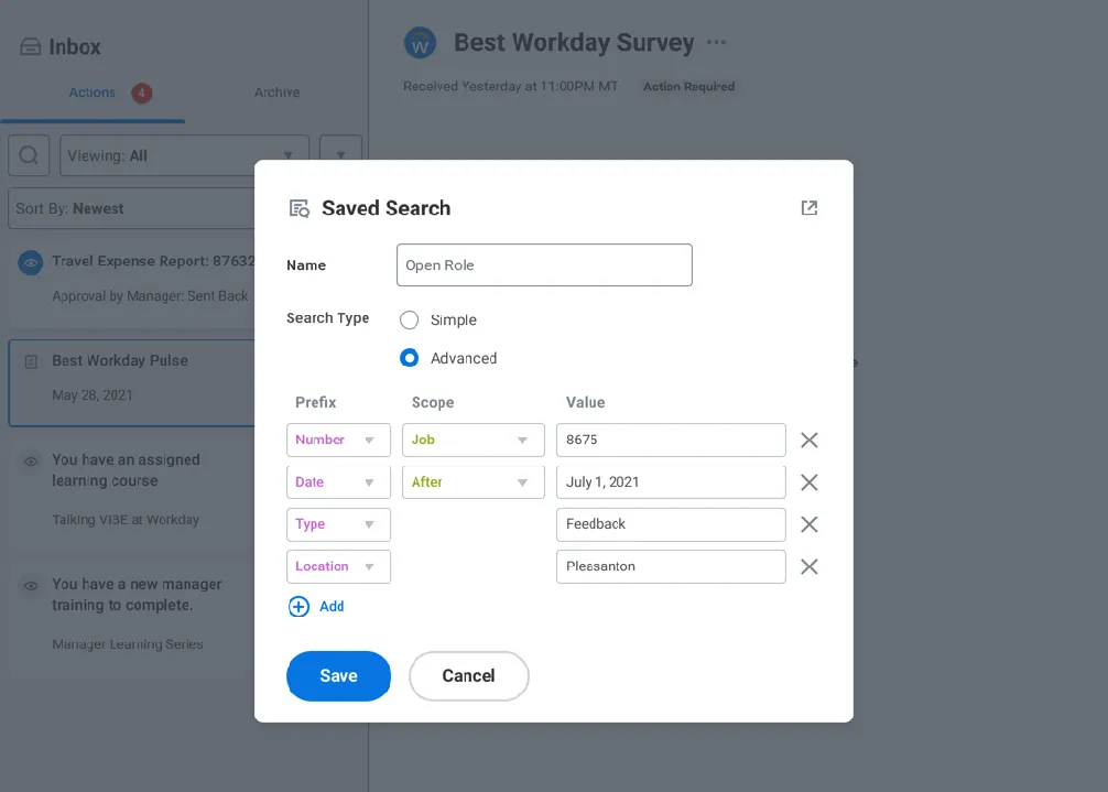
Searches built from rows of number, date, type and location, named and saved. 04 · Open layout with sections
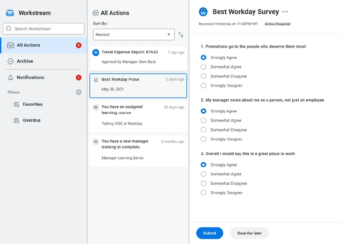
The tabs become a sidebar: All Actions, Archive and Notifications, with filters such as Favorites and Overdue. 05 · Unified Notifications control
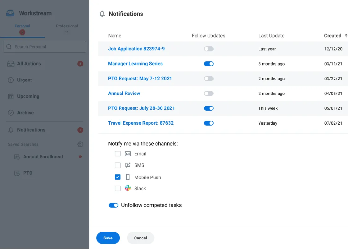
One panel to follow or unfollow each item, choose channels from email, SMS, mobile push and Slack, and unfollow completed tasks. 06 · Final “Workstream” Inbox
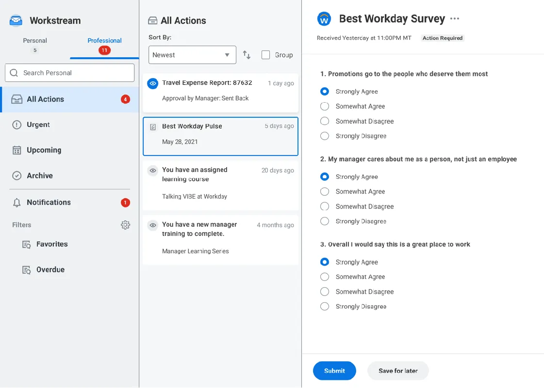
Personal and Professional modes, Urgent and Upcoming groupings, and a Group option on the list.
Results
The seven initiatives the work led to, numbered on the system map where each sits: Inbox search, item metadata and tagging, audience creation, notification design, notification preferences, content strategy, and design system integration. The key marks the first two as having secured funding and the next two as having reached strategy alignment.
- Inbox Search $$
- Item Metadata & Tagging $$
- Audience Creation ✔
- Notification Design ✔
- Notification Preferences
- Content Strategy
- Design System Integration
$$ Funding Secured
✔ Strategy Alignment
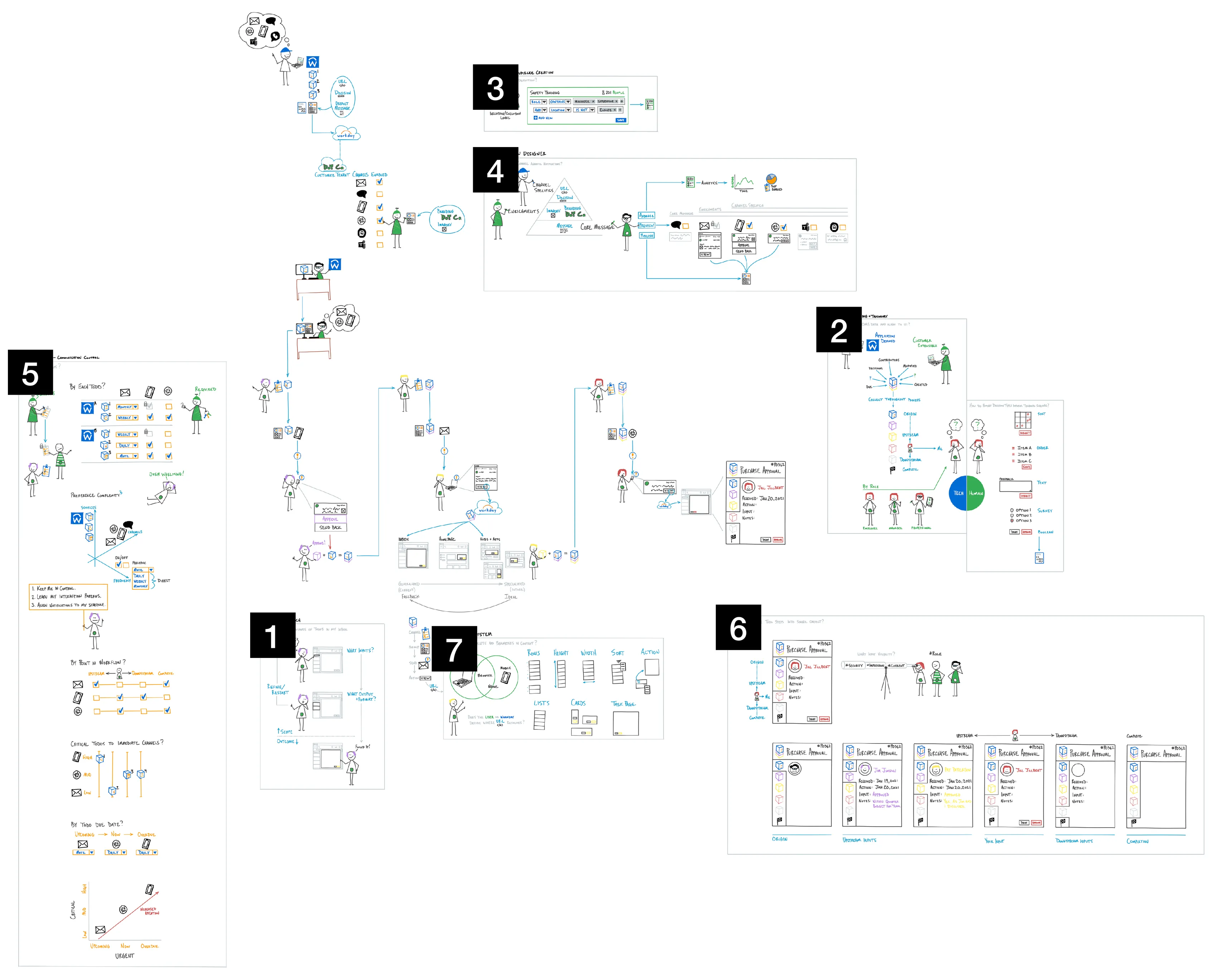
The eight Workday Inbox boards, drawn in the Doodle People notation: the overall flow and its legend, then one board for each numbered initiative, from search, tagging, and audience creation to notifications, communication control, content, and the design system. Each works through one area of the system with the same figures and objects.
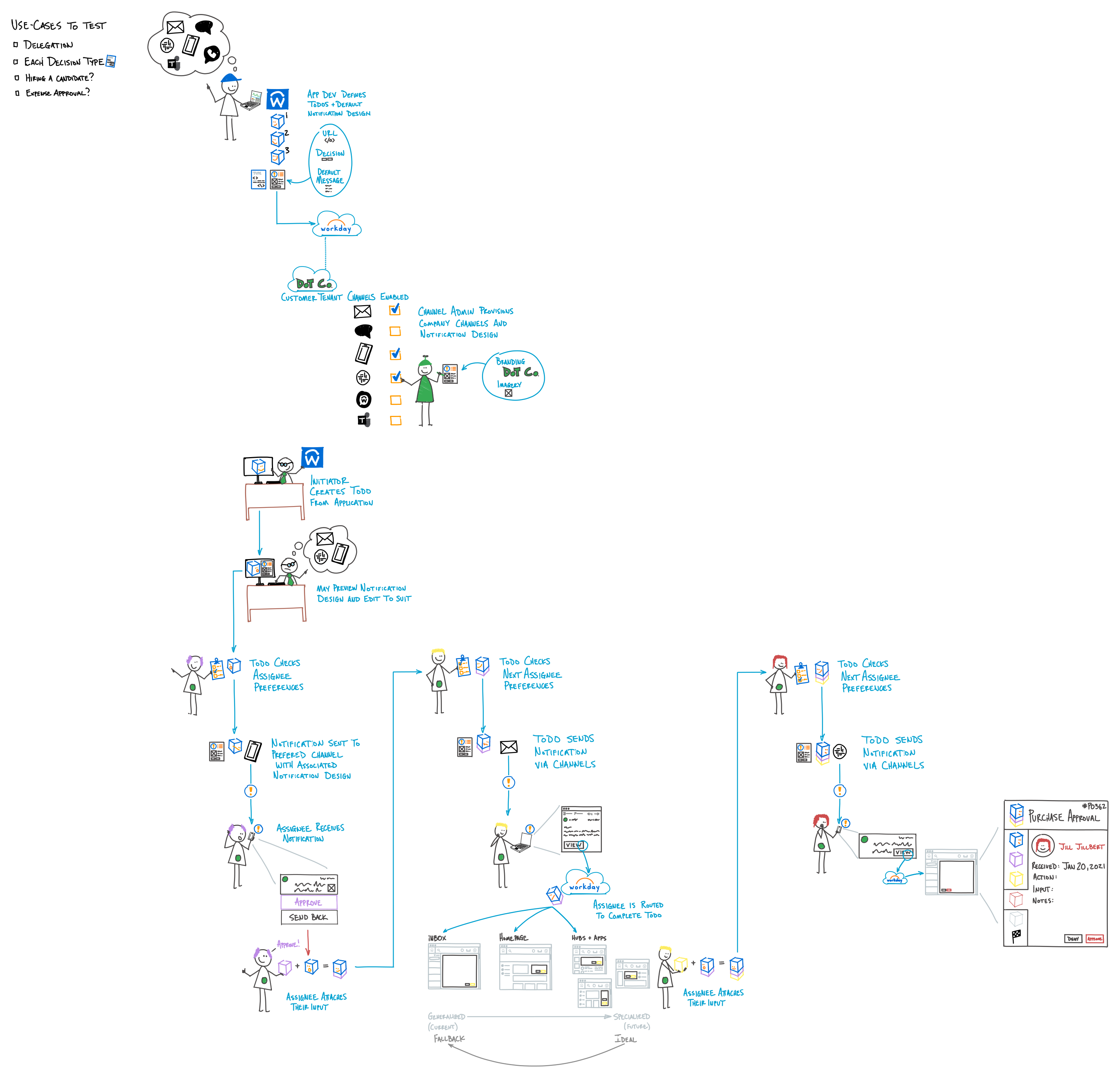
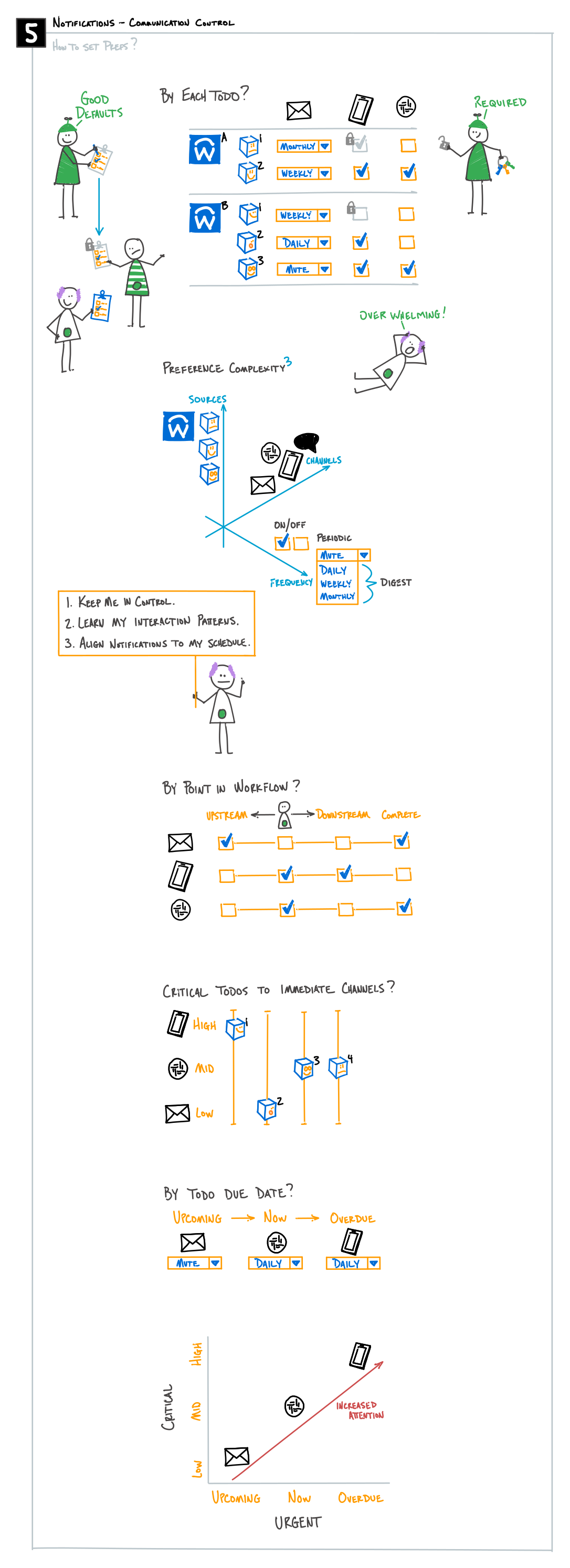
A link to Doodle People, the notation of figures and objects in which the Workday Inbox boards are drawn; the boards appear there too, among its other uses.

AI usage
2, Ideas. AI helped with research, sources, brainstorming or structure. I wrote every word.The tiers