A beautiful extension to the reimagined design museum.
The Pen was a handheld device given to every visitor of the reimagined Cooper Hewitt, used to collect objects from exhibit labels and to draw at the museum's touch tables. I led the interaction design at GE, defining how it answered each touch with light and a buzz, from the first sketches to a signed timing specification.
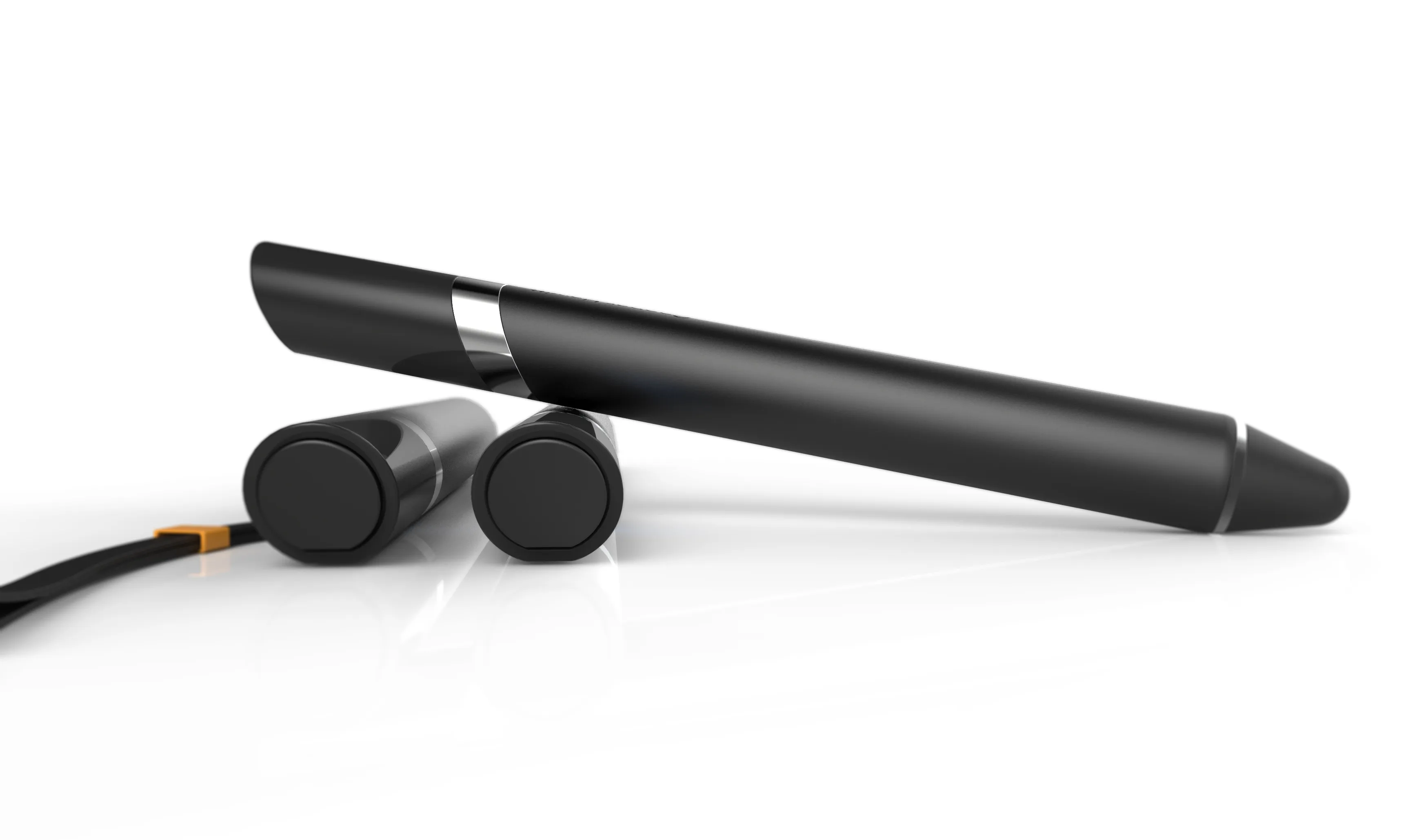
Cooper Hewitt Pen
Intro
This is the user journey I wrote at the start of the project, from receiving a Pen with a ticket to staff clearing it for the next visitor, beside the Cooper Hewitt mansion where it all takes place. Writing the whole loop down first, including the staff's part, is how I found which moments needed feedback from the device.
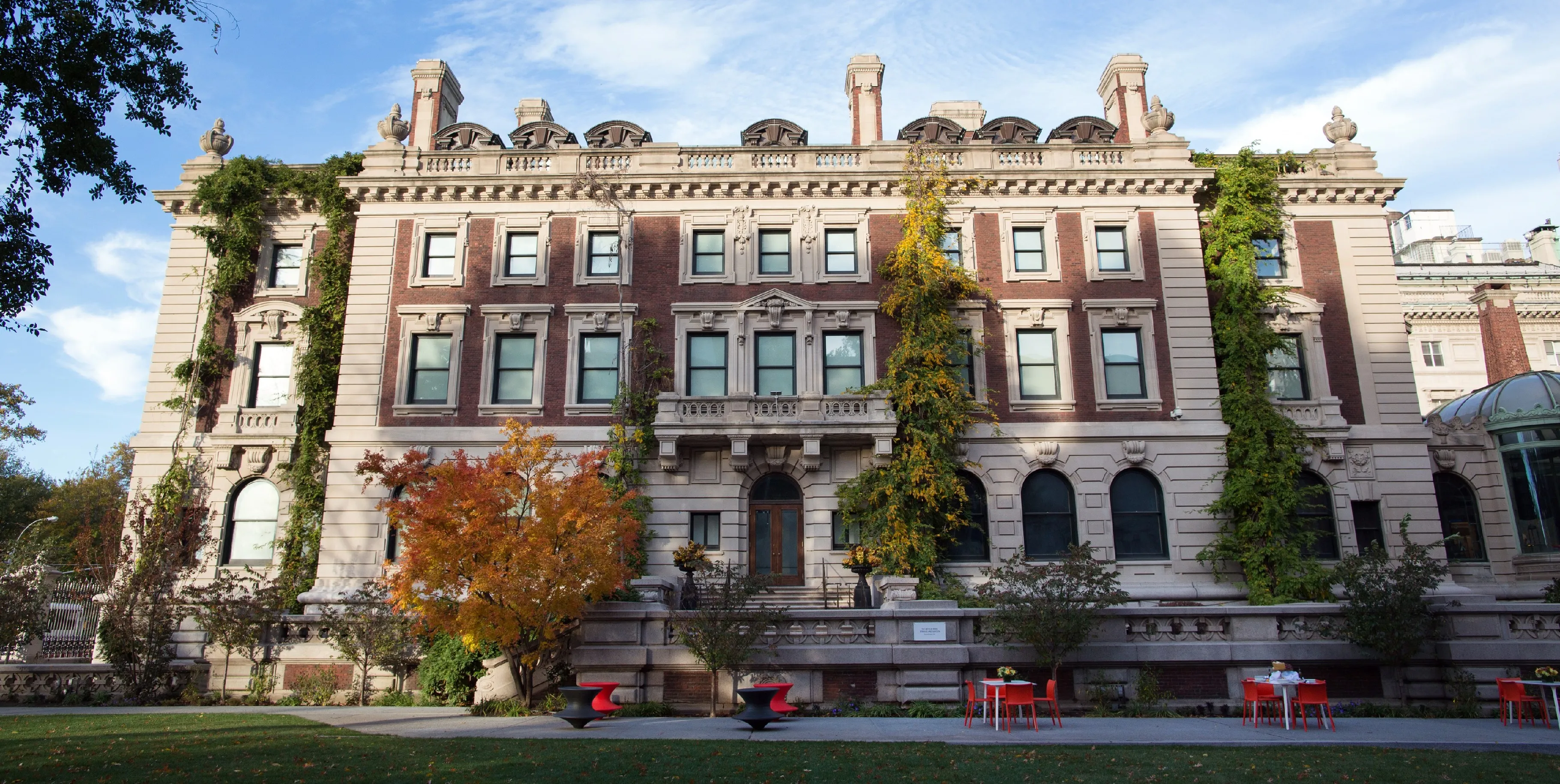
Upon admission to the museum, a patron receives a Pen linked to their ticket. They then curate a personalized museum collection by touching the Pen to exhibit placards. That collection can be downloaded onto the large touchscreen tables to learn more and doodle annotations. When a patron leaves the museum and returns the pen, their collection remains accessible online via the code on their ticket. The staff then clears the Pen’s contents, checks the batteries, and cycles it back for the next Patron.
Kickoff
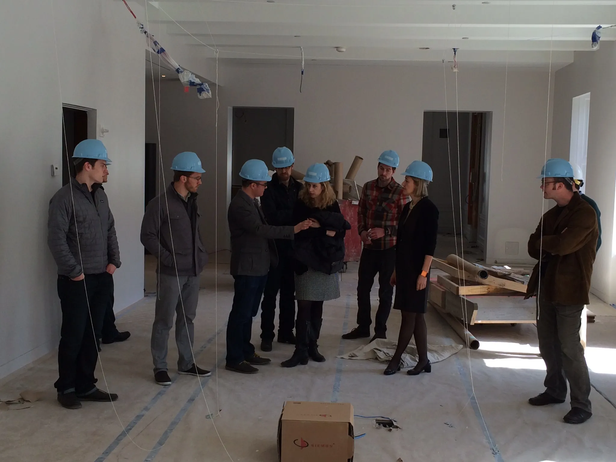
The collaborative work session that opened the project: a table of sticky-note clusters, the room where we worked through them, and a site walk through the museum mid-renovation. We started wide, with visitor types from families to curators, before cutting the personas down to patron and staff.
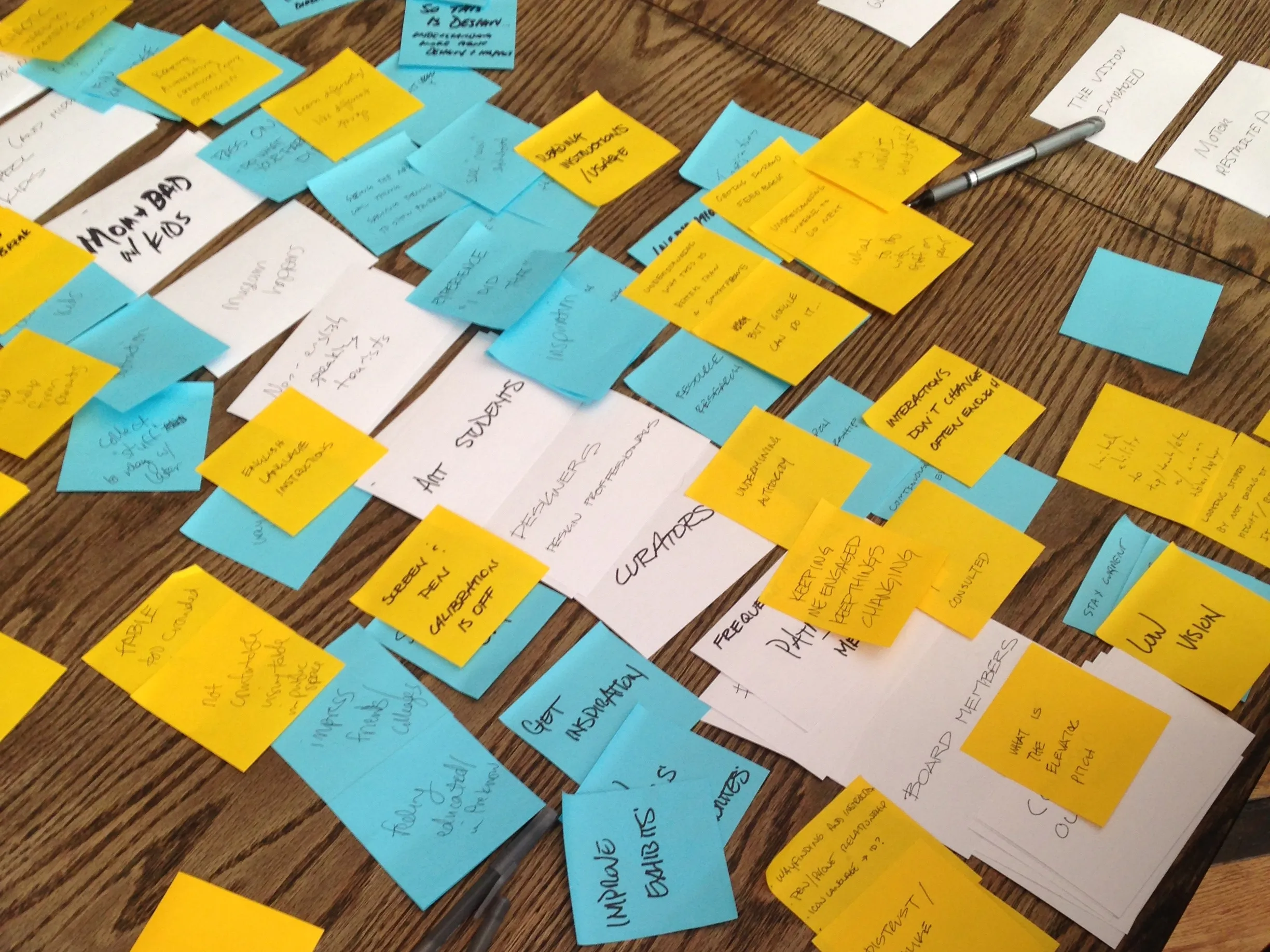
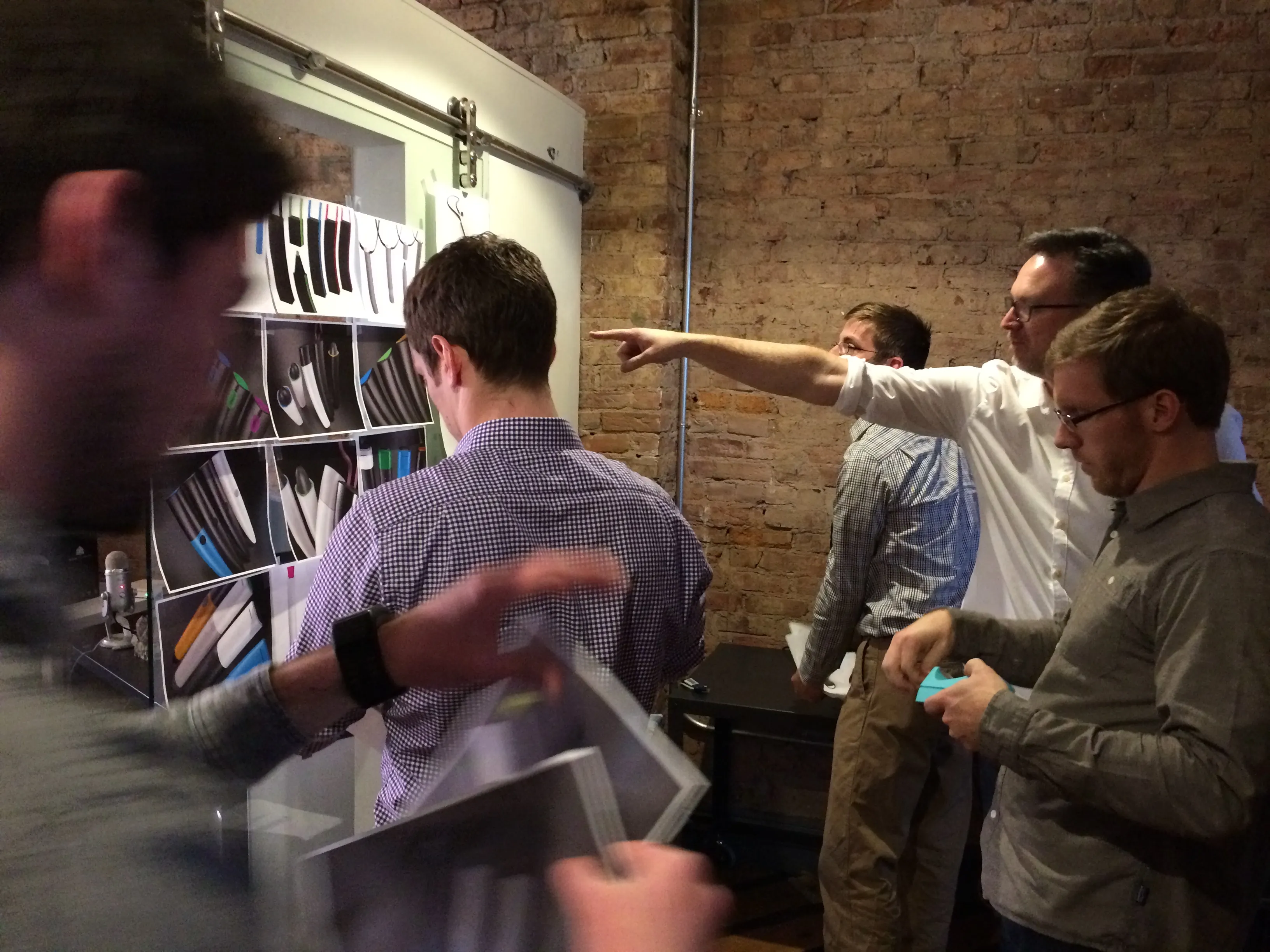
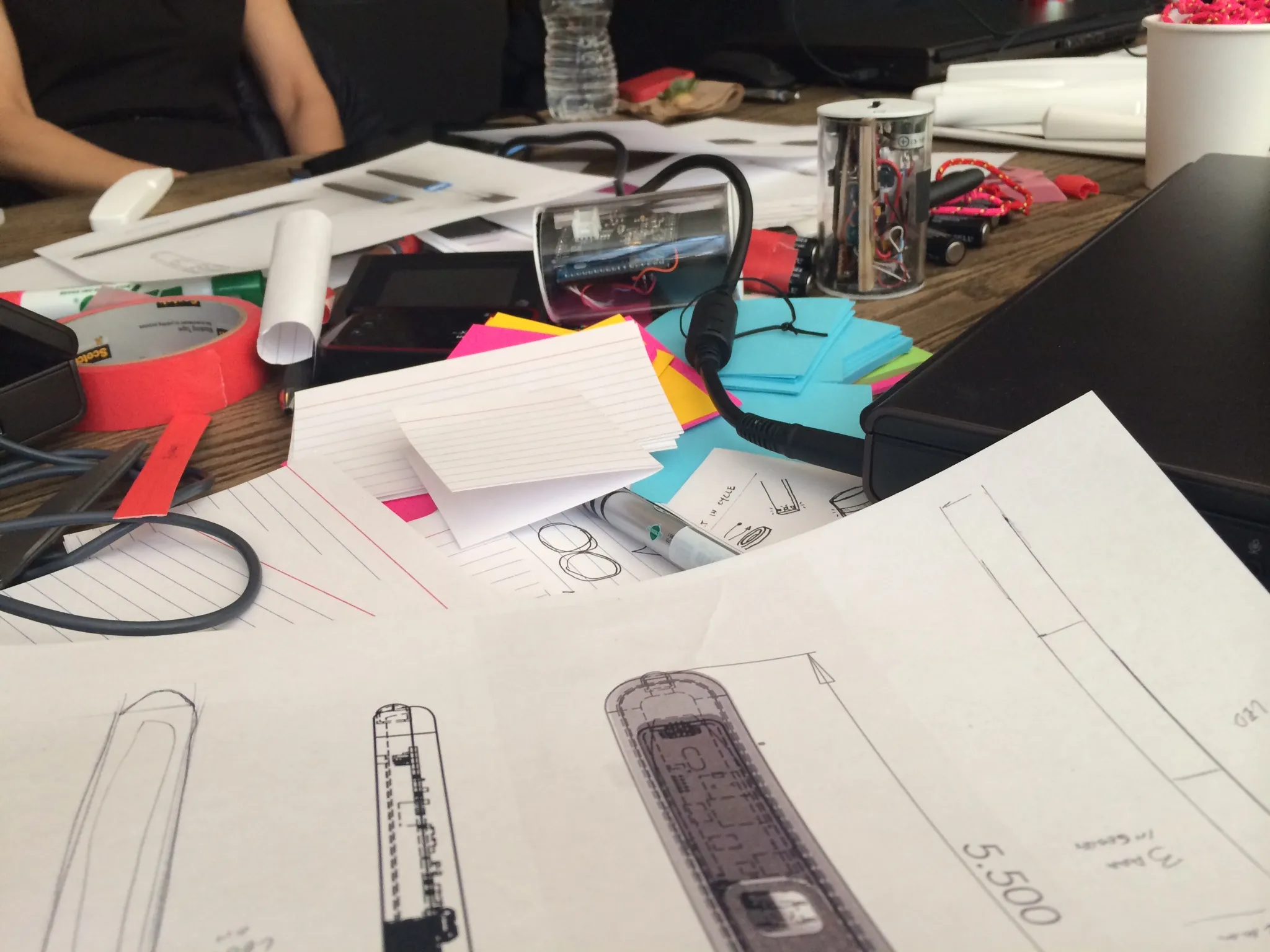
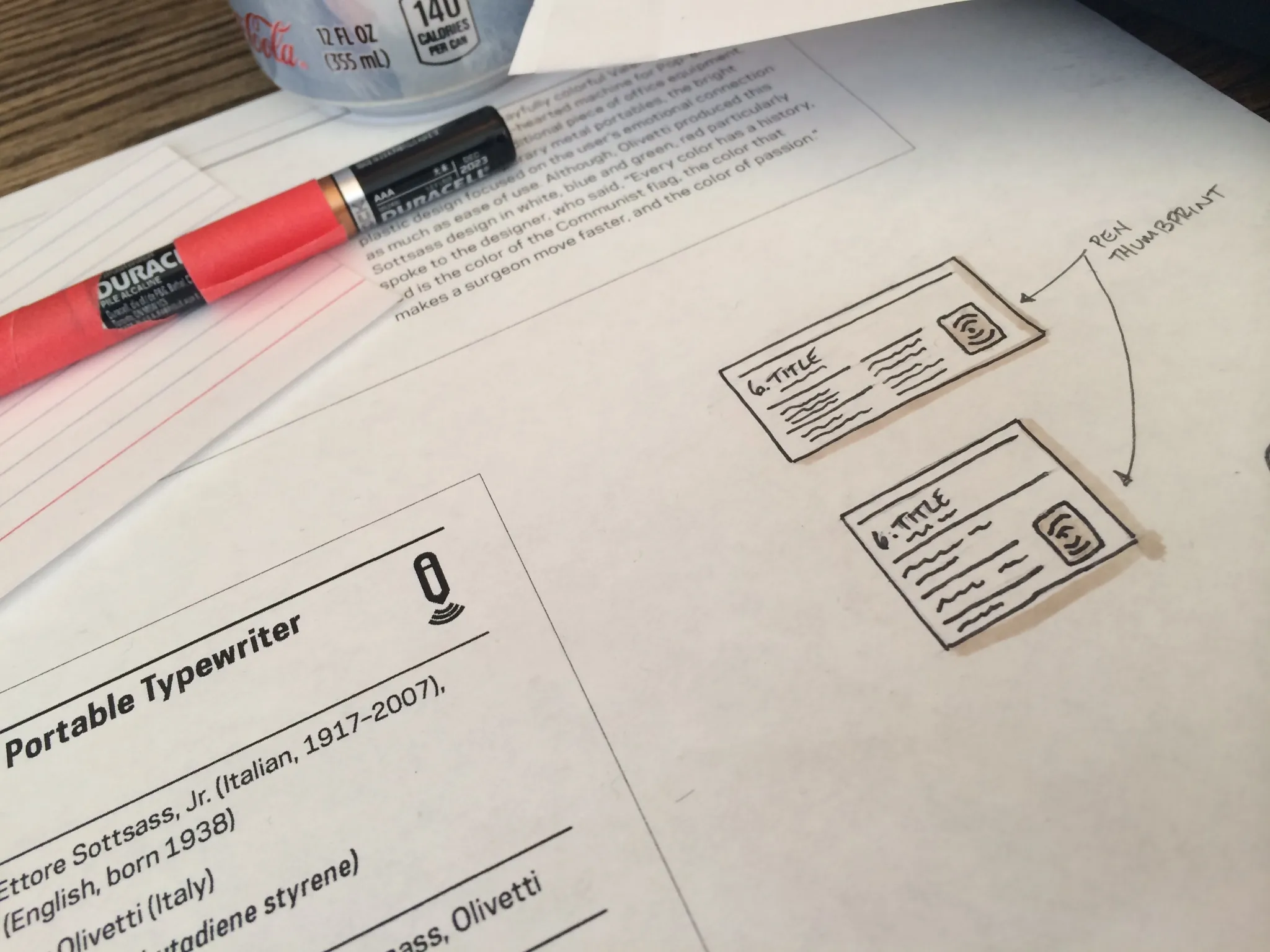
Sketches from the work session table: pen bodies drawn around their batteries and board, and an exhibit label with a target where the Pen would touch it. The label and the device were drawn side by side from the first day.
Principles
The seven design principles we set at the kickoff and held the design to. The first two, that the Pen should not be a barrier and that the exhibits are the focus, are why the finished device is one button and a few lights.
- Not a barrier to entry
- It just works for the visitor
- Extension of the content
- The exhibits are the focus, not the Pen
- Belongs in the museum
- Well designed, useful, and beautiful
- Encourages discovery
- Unlocks more content about the exhibit
- Part of an ecosystem
- The Pen interaction is part of the larger museum experience
- Context of use
- Different interactions and uses depending on location
- Direct manipulation
- Enables new interaction with content
Group concepts
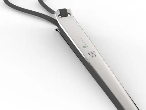
The first row of the initial concept board, March 2014: lanyard-hung pens in grey, black and colour, and a fan of rounded bodies with buttons and rows of lights. The board ran to twenty-two renderings in ten days, and I show them in quantity because the range considered is part of the record.
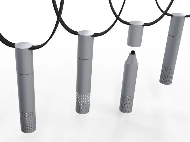
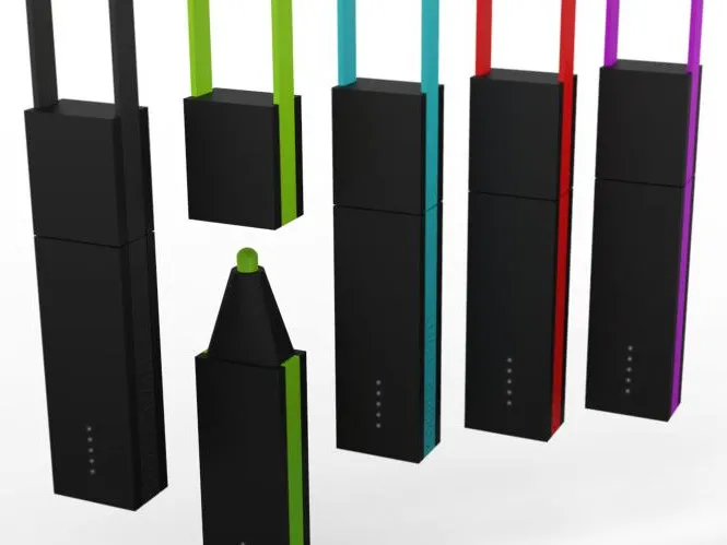
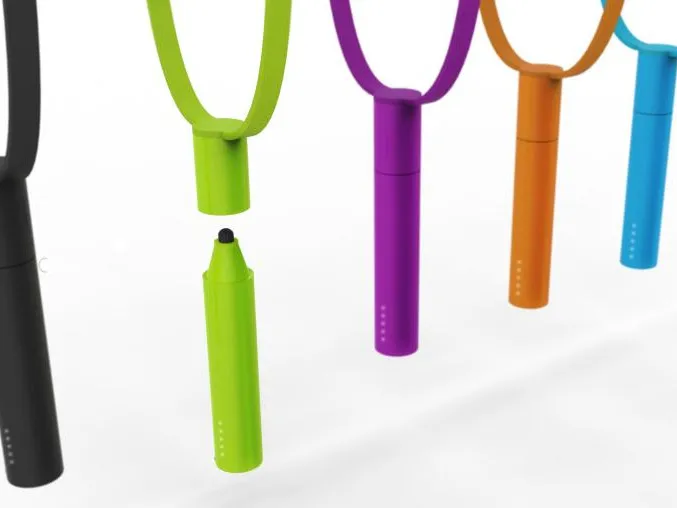
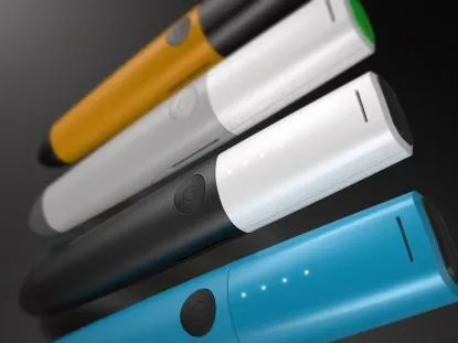
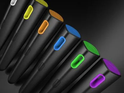
The second row of the concept board: coloured caps over rows of LEDs, angled tips in six colours, rounded nibs, and a clear bar beside a body with light strips and a power button. Colour, where the light sits and how the cap comes off were all still open.
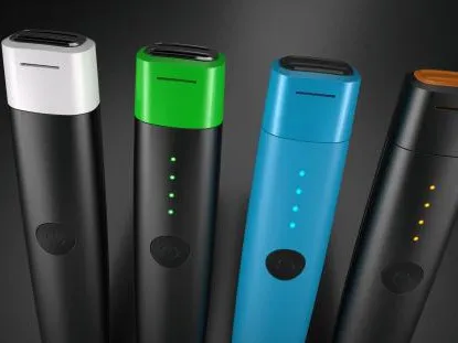
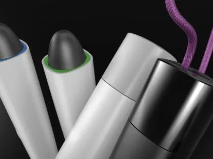
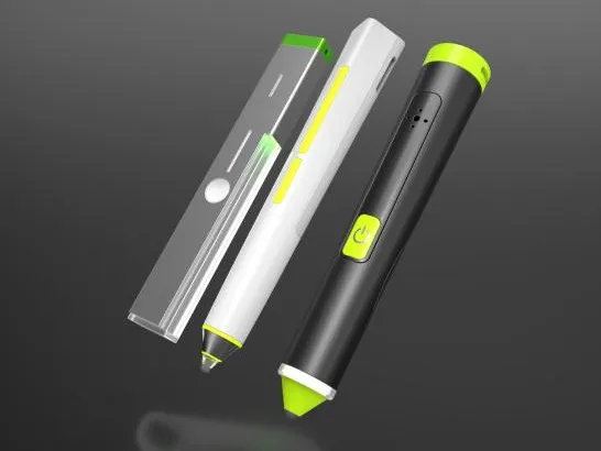
The third row of the concept board: bodies with light slots along the barrel and a marked power button, and the first flat oval forms held in looped straps. These put the feedback where the hand holds the device, or made the whole device a pebble.
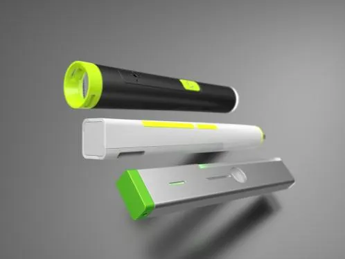
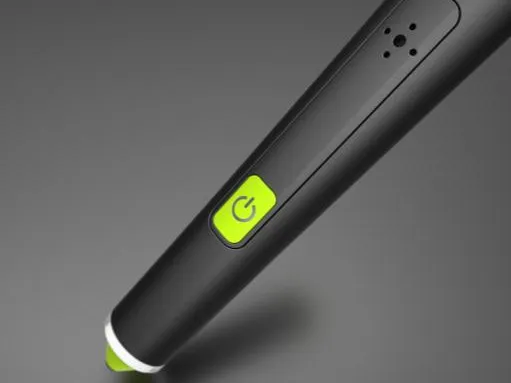
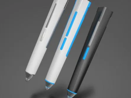
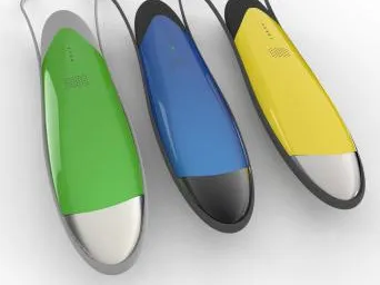
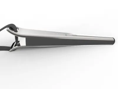
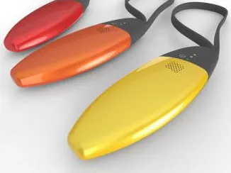
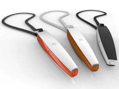
The last row of the concept board: silver bars and tapered wands on lanyards, oval pebbles in red, orange and yellow, and slim wands with coloured backs. None of these shipped, and seeing them beside the finished Pen shows how much was set aside.
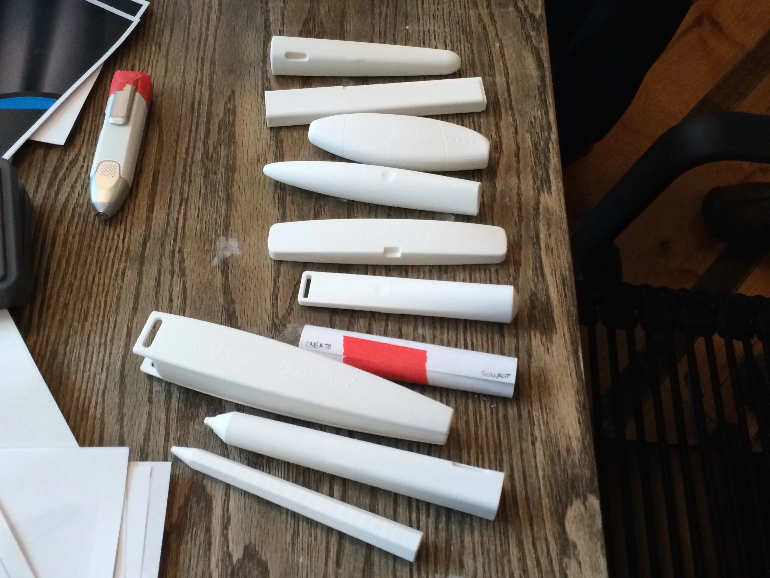
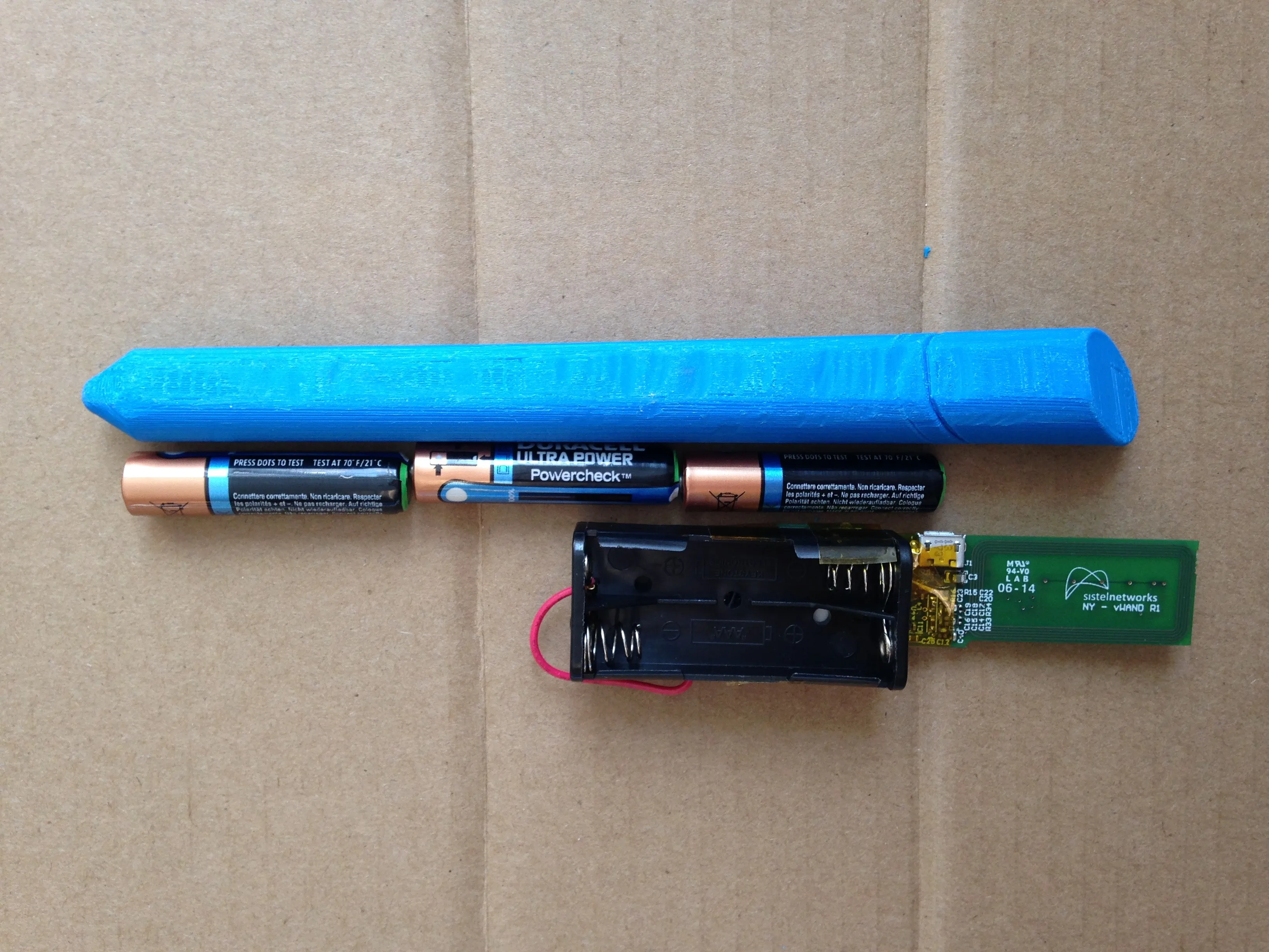
From the concept board to one form: white printed models on the worksession table, a rendering from the first round of refinement, and a bench mock-up of the AAA cells and board the body had to hold. Elliott led the industrial design and I led the interaction, and we worked side by side so the form and the feedback were designed together.
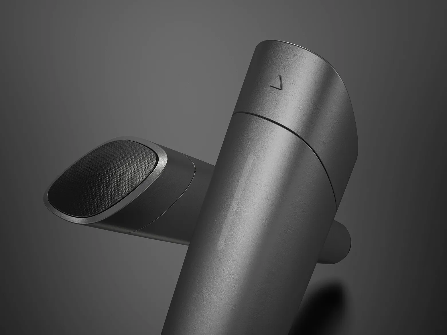
CreditGroup concepts with Jennifer Bove, Andrew Crow, Ryan Diener, Paul Haney, Billy Herweh, Jordan Hunsey, and Elliott Koehler.
Interaction
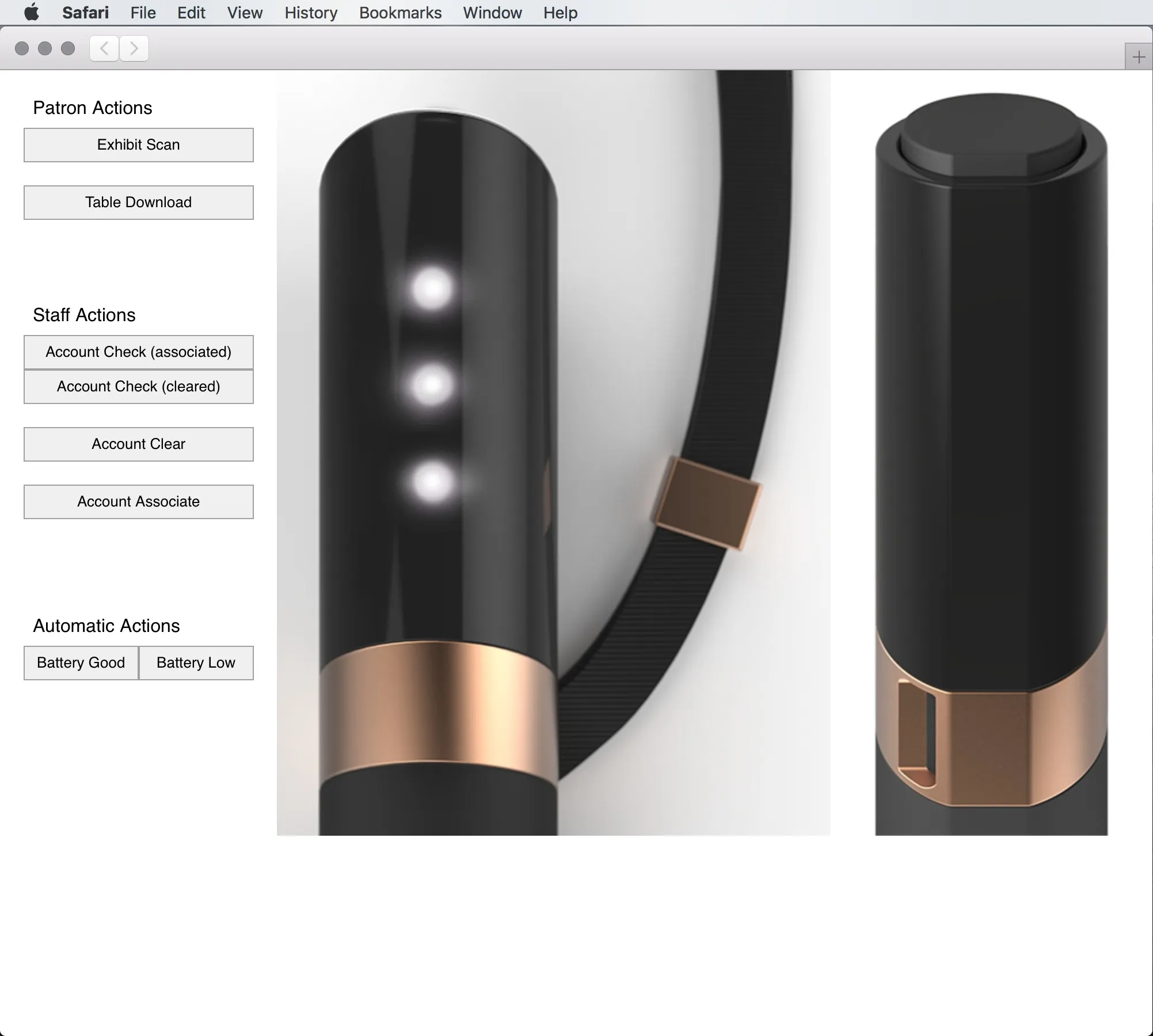
The eight steps of my interaction process, from personas and journey maps through sketched feedback concepts, software prototypes and a timing specification, to feedback through delivery. The image is my v3 browser prototype, which played each pattern on a rendering of the Pen.
- Defined “Patron” and “Staff” personas
- Created simple journey maps
- Identified actions, inputs, & outputs
- Aligned the communication mediums to hardware cost, battery life, & physical design
- Sketched feedback concepts
- Created software-based prototypes
- Built timing engineering specification
- Provided ongoing feedback through delivery
Development
A test from Sistelnetworks on 24 June 2014: a prototype pen tapped on hand-written NFC tags, with the exhibit scan lighting and haptic pattern playing. This is the specification running on real hardware.
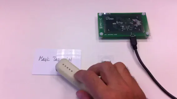 Video, 0:23
Text equivalent: On a desk: a green NFC gateway board, a small NFC sticker, and a white card hand-written Magic Tag CH. A hand touches the prototype Pen to the sticker, and its front LEDs flick on and off in a short run. Touched to the Magic Tag card, the LEDs light one at a time along the row, then three together, and go dark. Each is tried a second time, the second Magic Tag scan with the Pen laid on the card.
Four buzz lengths cut on 25 March 2014, short, mid, double and long, from half a second to just under two. They are not signals a visitor learns: they were development tests, made to try different lengths of buzz against each other while the patterns were being worked out.
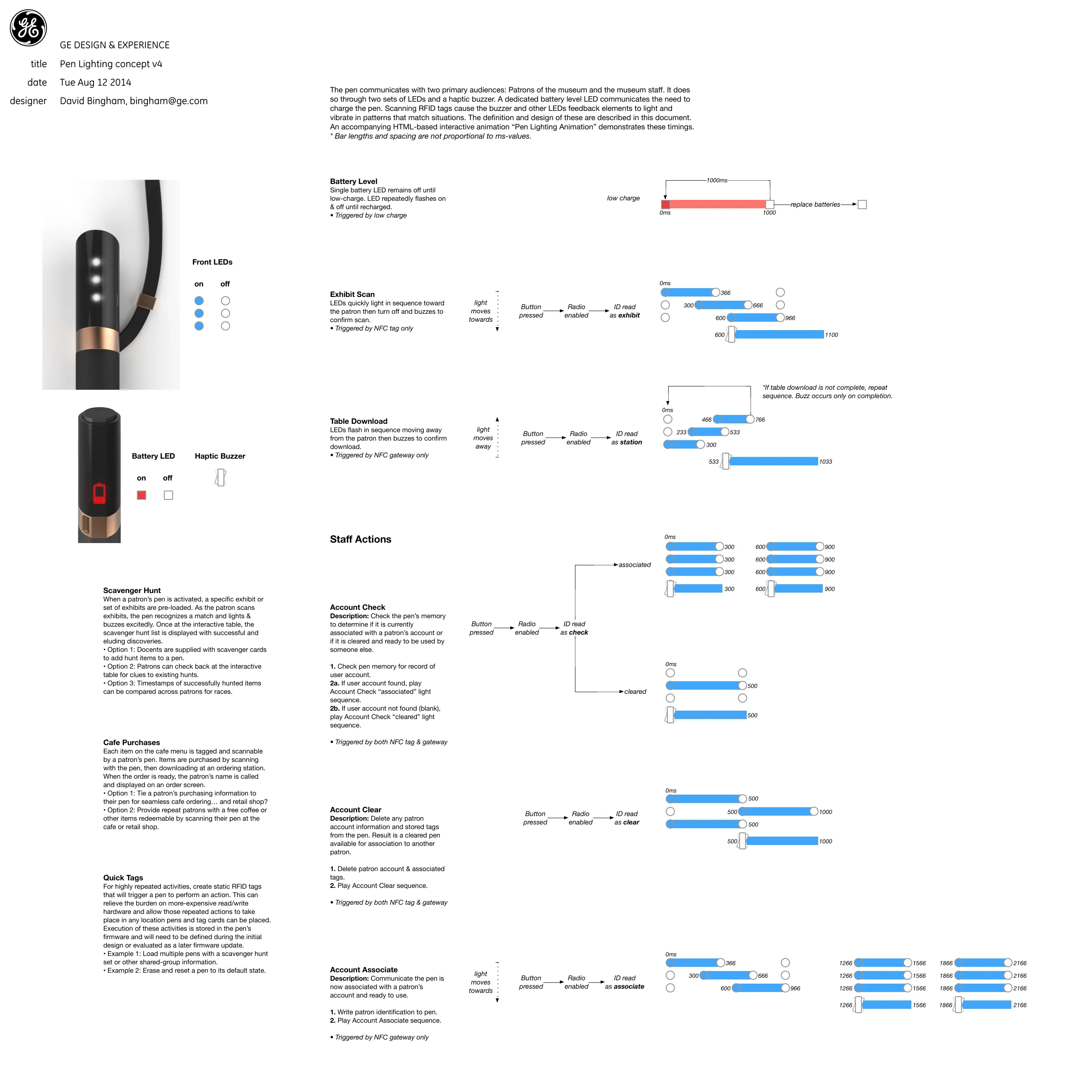
The specification at its four surviving dates, March to August 2014. v3 redrew the timings as bars, v4 made the table download repeat until the transfer finished and buzz only on completion, and v5 cut every timing by a quarter and dropped the three concepts that were not going to be built. The speed-up came from testing: the first version was too slow for an action repeated all day.
Reading order · left to right, earliest first4 states · five months
v1 · 22 Mar 2014
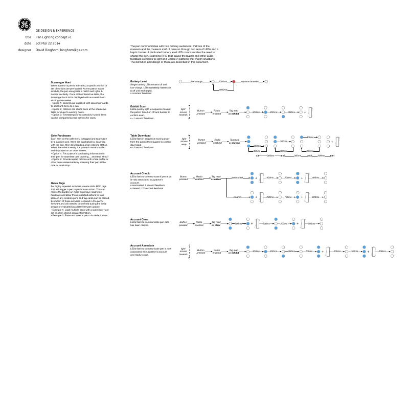
Six patterns drawn as rows of LEDs with millisecond gaps, each with a time budget: under a second for a scan, under three for a table download. v3 · 11 Jun 2014
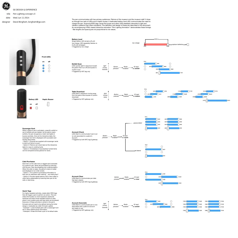
Every pattern redrawn as timing bars, each budget replaced by its trigger (NFC tag, NFC gateway, or both), and renderings of the LEDs added. v4 · 12 Aug 2014
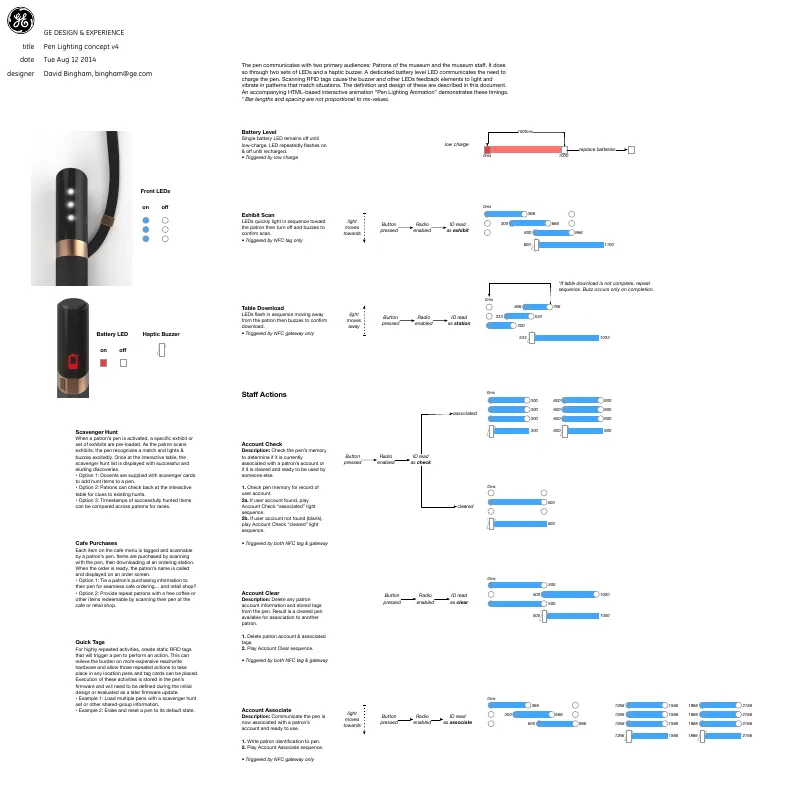
(full spec below) v5 · 25 Aug 2014
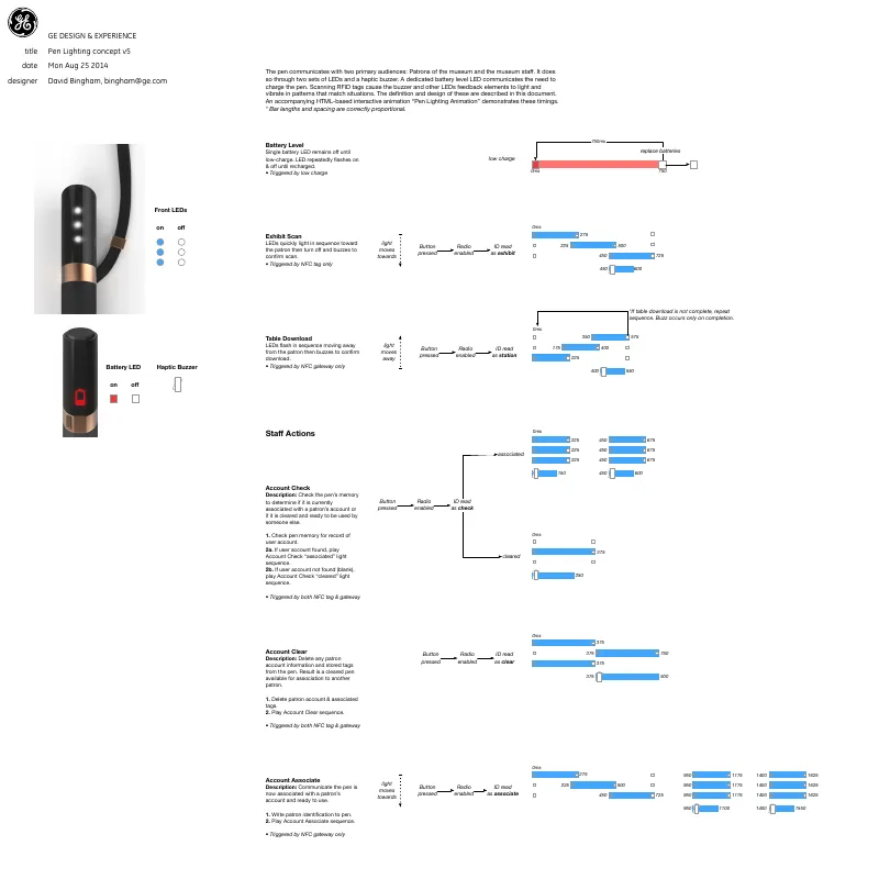
Every timing cut to three quarters of v4's, the bars drawn to proportion, and the three untimed concepts removed: Scavenger Hunt, Cafe Purchases and Quick Tags.
The specification as it stood on 12 August 2014, shown whole and large enough to read: the front and battery LEDs, the haptic buzzer, and every patron and staff action drawn as timed bars. This is the revision that added numbered procedures for the staff actions and made the table download repeat until the transfer finished.
Result
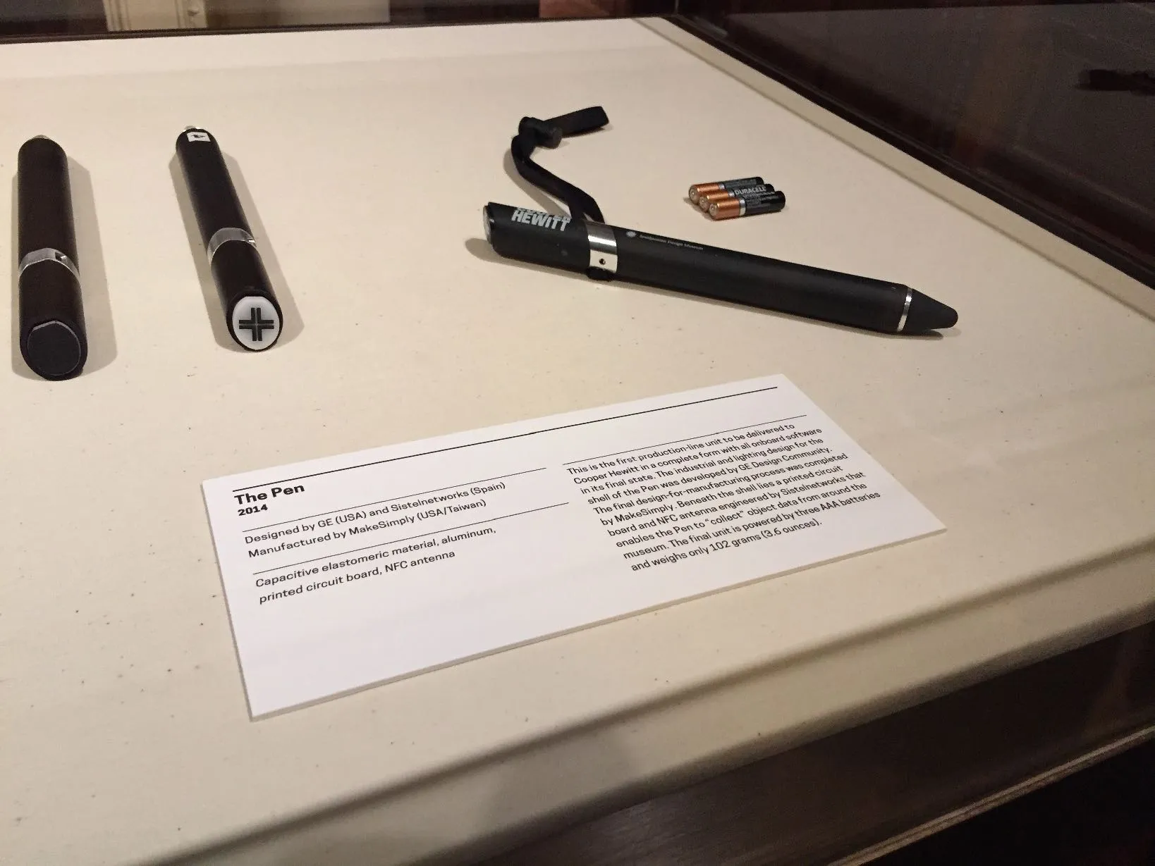
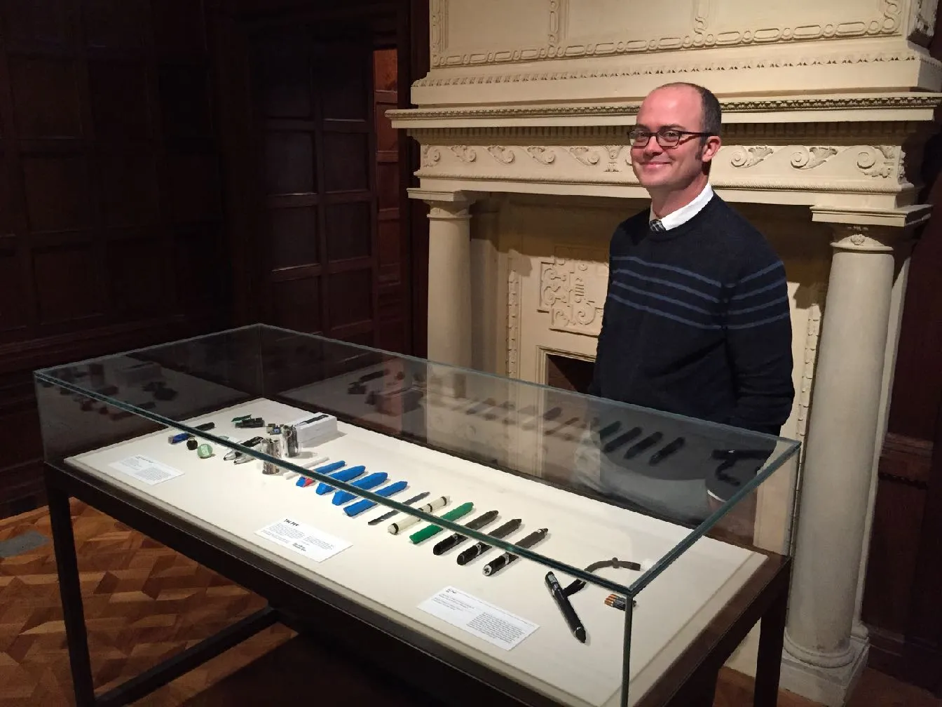
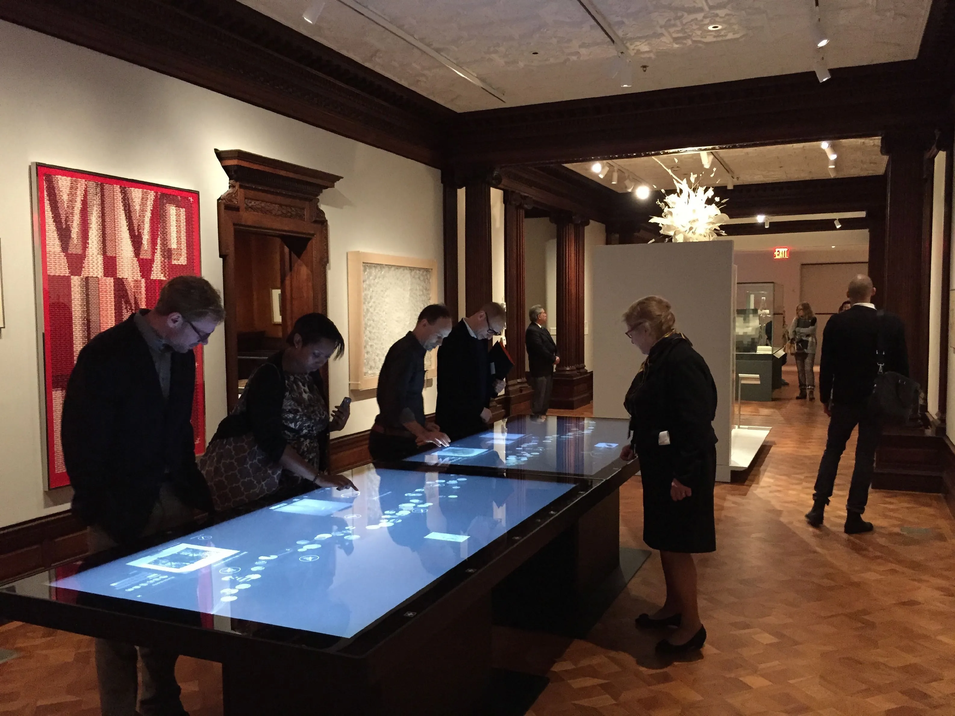
The Pen on show at the museum's grand reopening in December 2014: the first production unit in a case with its earlier prototypes, the vitrine of concept models, and visitors at the touchscreen tables in the reopened galleries. Seeing the discarded forms exhibited beside the finished one is the design process made public.
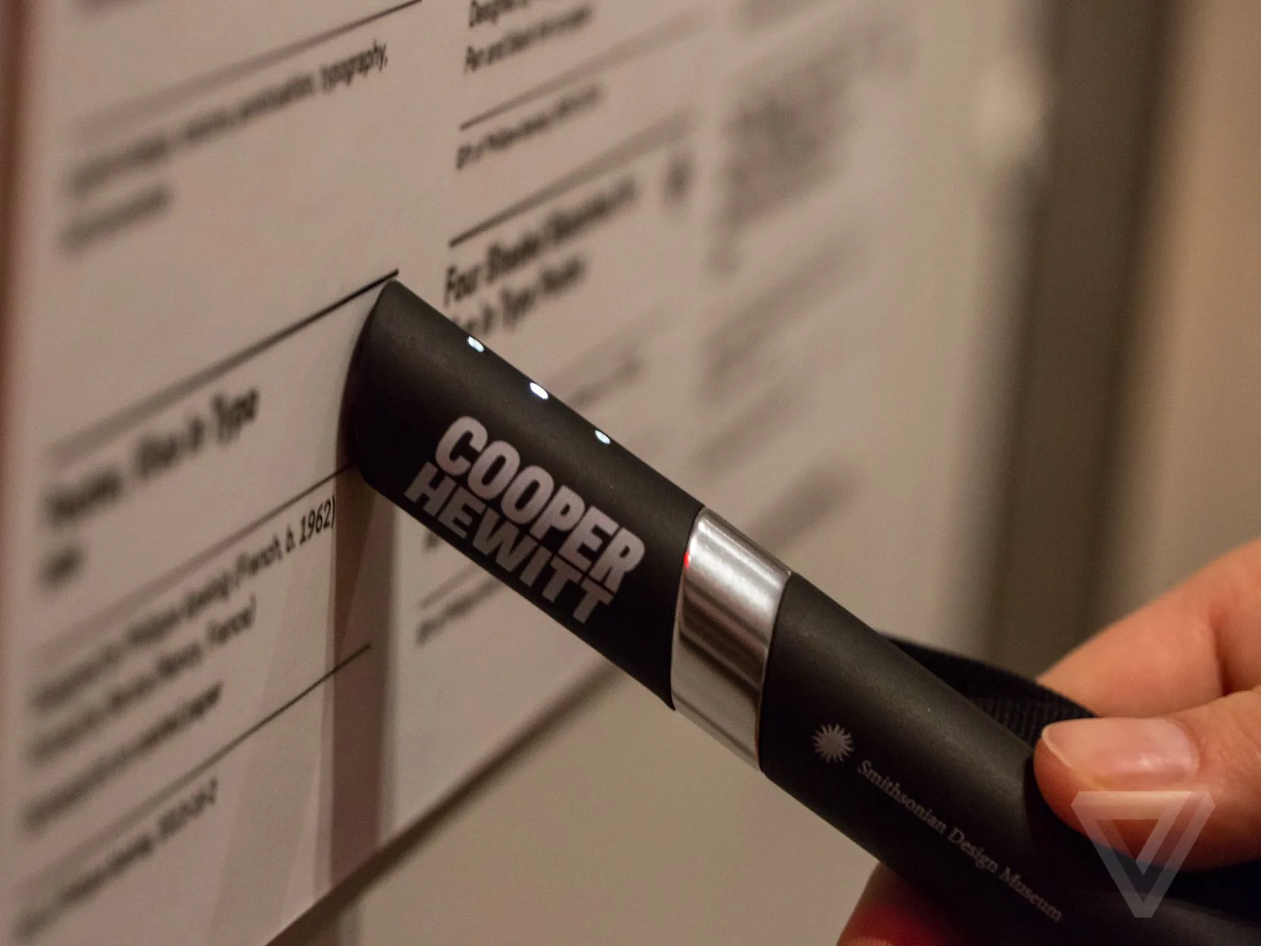
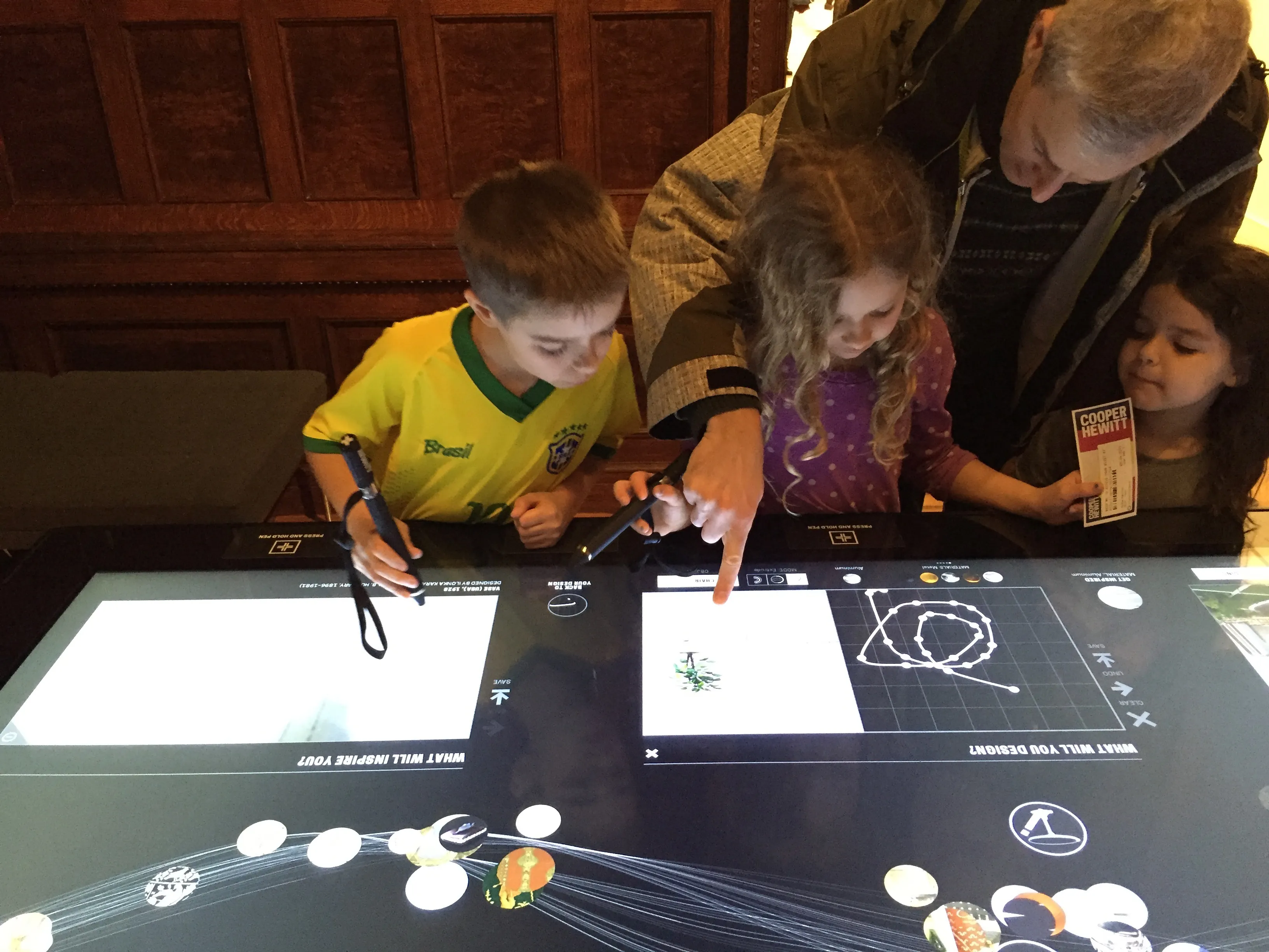
The Pen at work in the reopened museum: touched to an exhibit label with its LEDs lit, and in the hands of a family drawing together at one of the touchscreen tables. These are the two moments the design was for, collecting and making.
Where the Pen was picked up: the museum's own account of designing it and coverage from Smithsonian Magazine to The New York Times around the reopening. I show the marks and link only where the page still answers.






AI usage
2, Ideas. AI helped with research, sources, brainstorming or structure. I wrote every word.The tiers