Auditory appliance experiences grounded in brand and interaction.
The opener for Audio Language, a sound program I led for GE Appliances between 2011 and 2014. It sets up the question the page answers: how a brand that is seen and touched can also be heard, across four appliance lines.
Audio Language
Problem statement
My own framing of the brief, lifted from my 2018 presentation. Sound in a kitchen is a utility that lets cooks keep their attention on the work and calls for it only when needed, and at home it can add delight and a sense of control. I set out the problem as extending an established product experience into a new sense, with a team of consumer insights, industrial, interaction and sound designers.
With consumer product experiences becoming increasingly rich, the GE Appliances concept and brand team asked how we should consider our products' auditory expression. Within numerous kitchen activities, sound is a utility that allows cooks to maintain focus on their craft then request their attention as needed. For families in less professional environments, sound can add an element of delight in alerts and a subtle reinforcement of control interactions. How do we create a language that meaningfully extends a well-established product experience? In this landscape, the team of consumer insights, industrial, interaction, and sound designers approached the problem through the lens of appliance interactions and brand impression.
The problem that made the work hard, in my words. Industrial designers had image boards and material samples to critique against; sound had nothing like that, so the method had to give a team a way to critique what it could not see.
2. How can the team provide critique to a non-visual design process?
Research survey
The brand research reduced to one informal survey question, asked of all four brands at once. Framing a brand as a car, a restaurant, a clothing store or a drink gave people a way to talk about character without musical vocabulary, and asking the four together made the comparison between them useful.
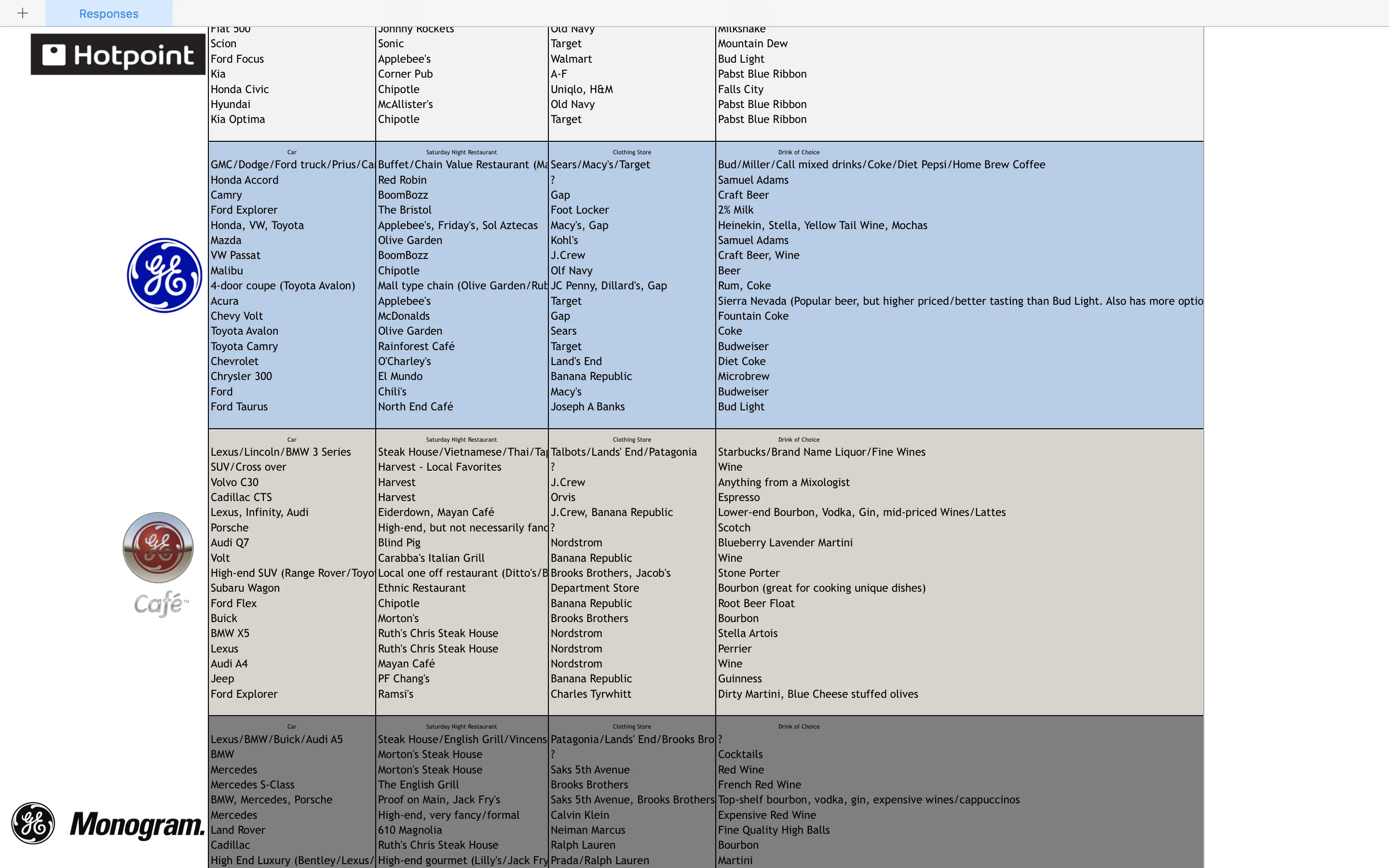
What if <brand> were a…
…car?
…restaurant?
…clothing store?
…drink?
Research workshops
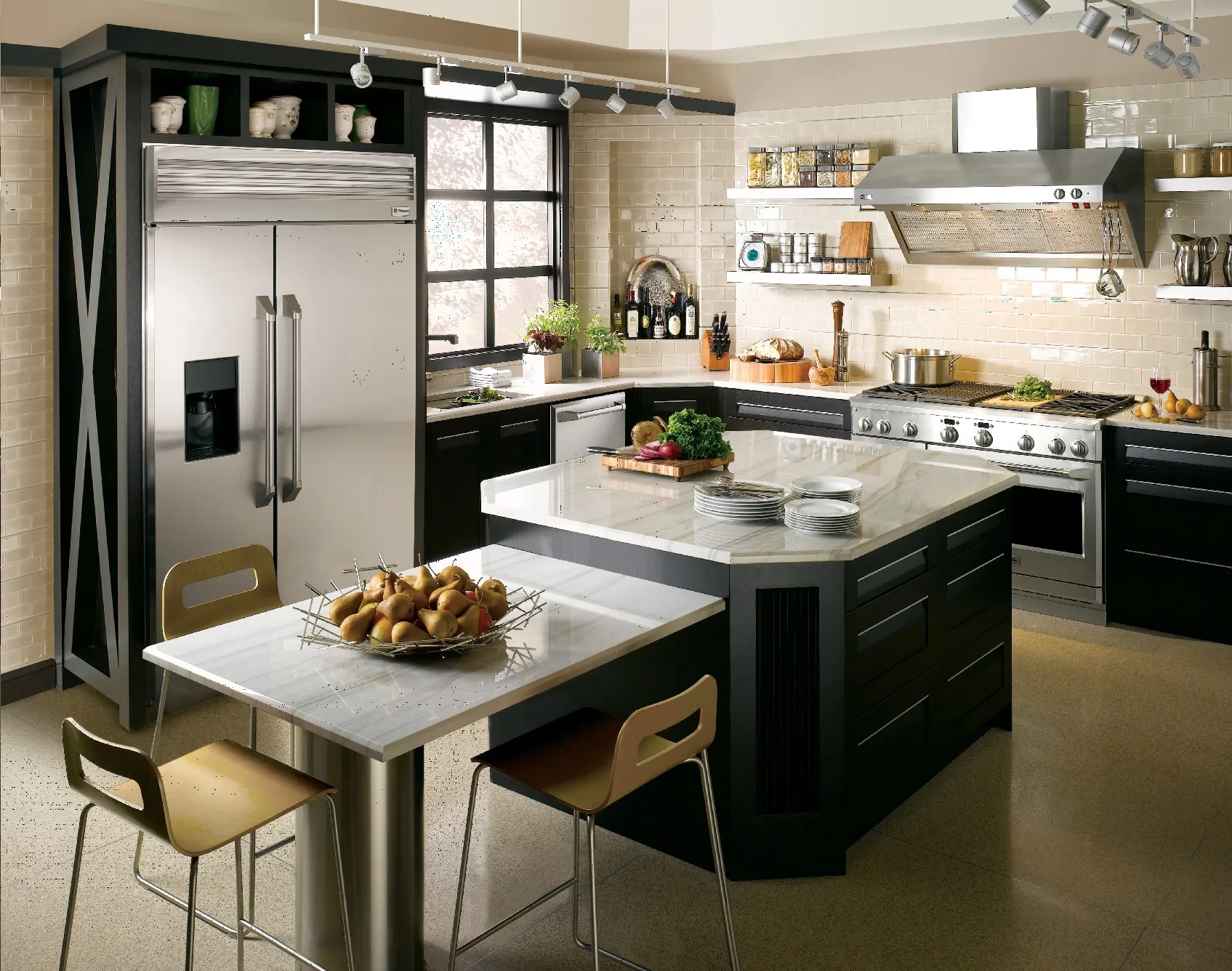
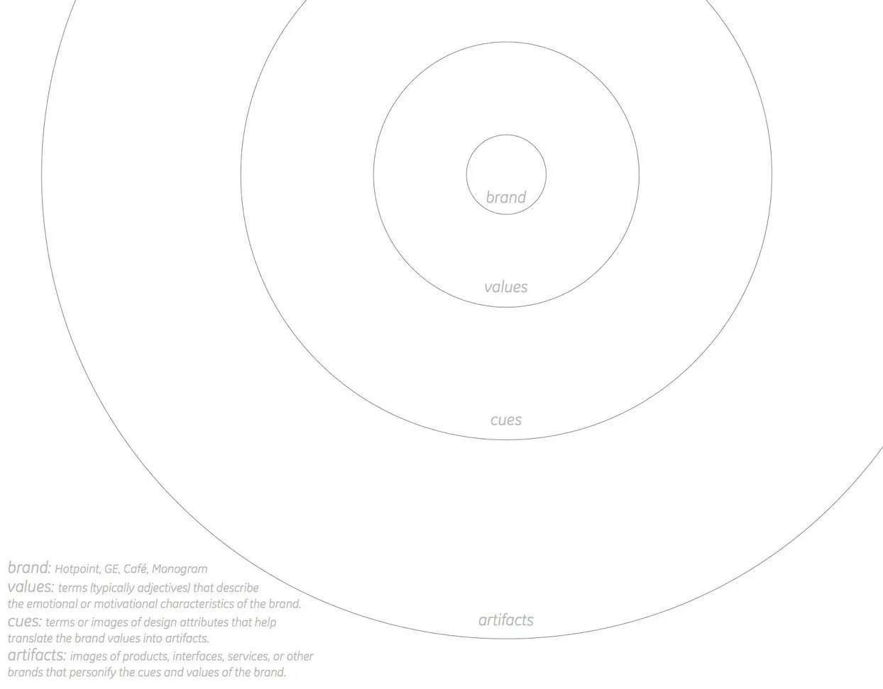
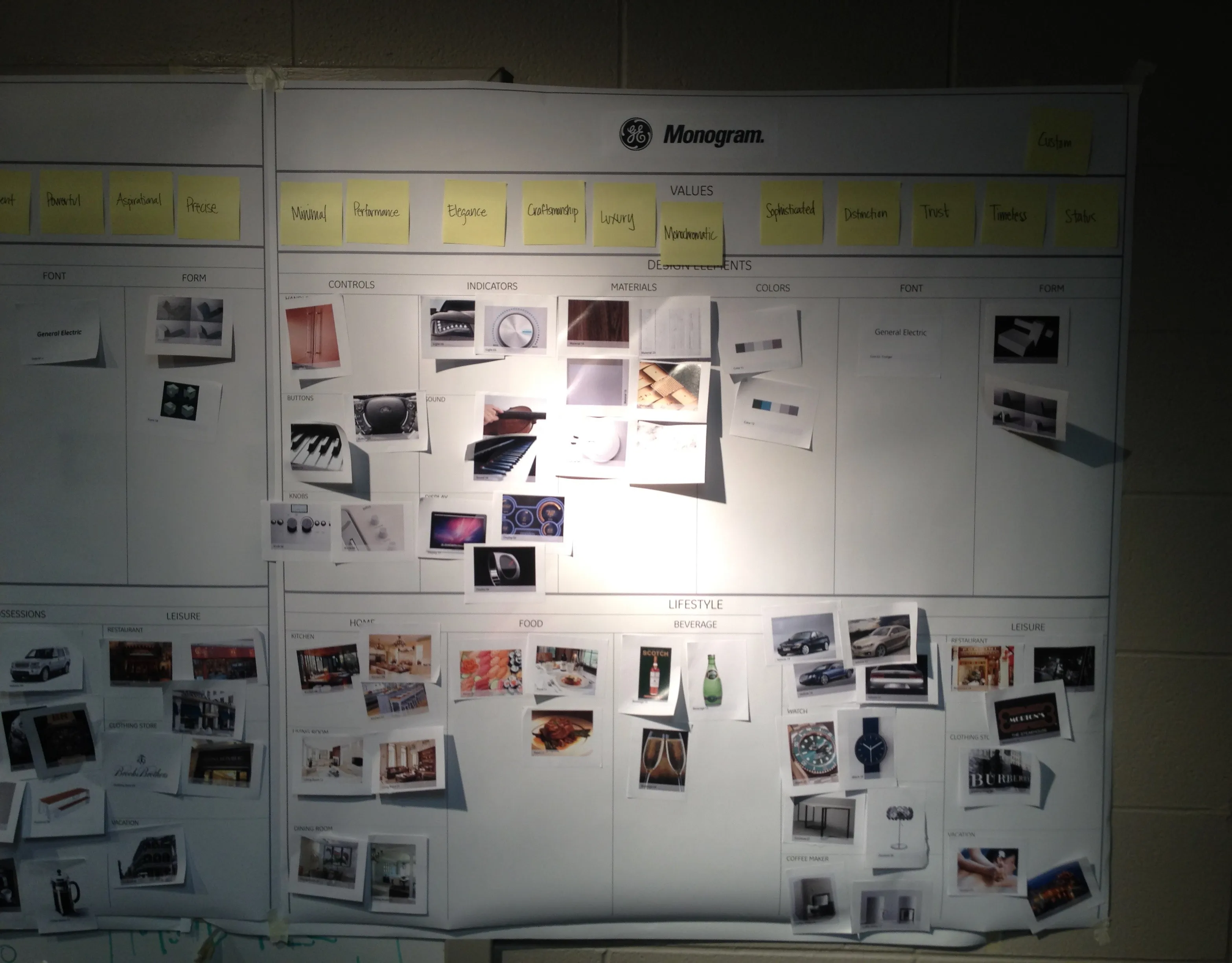
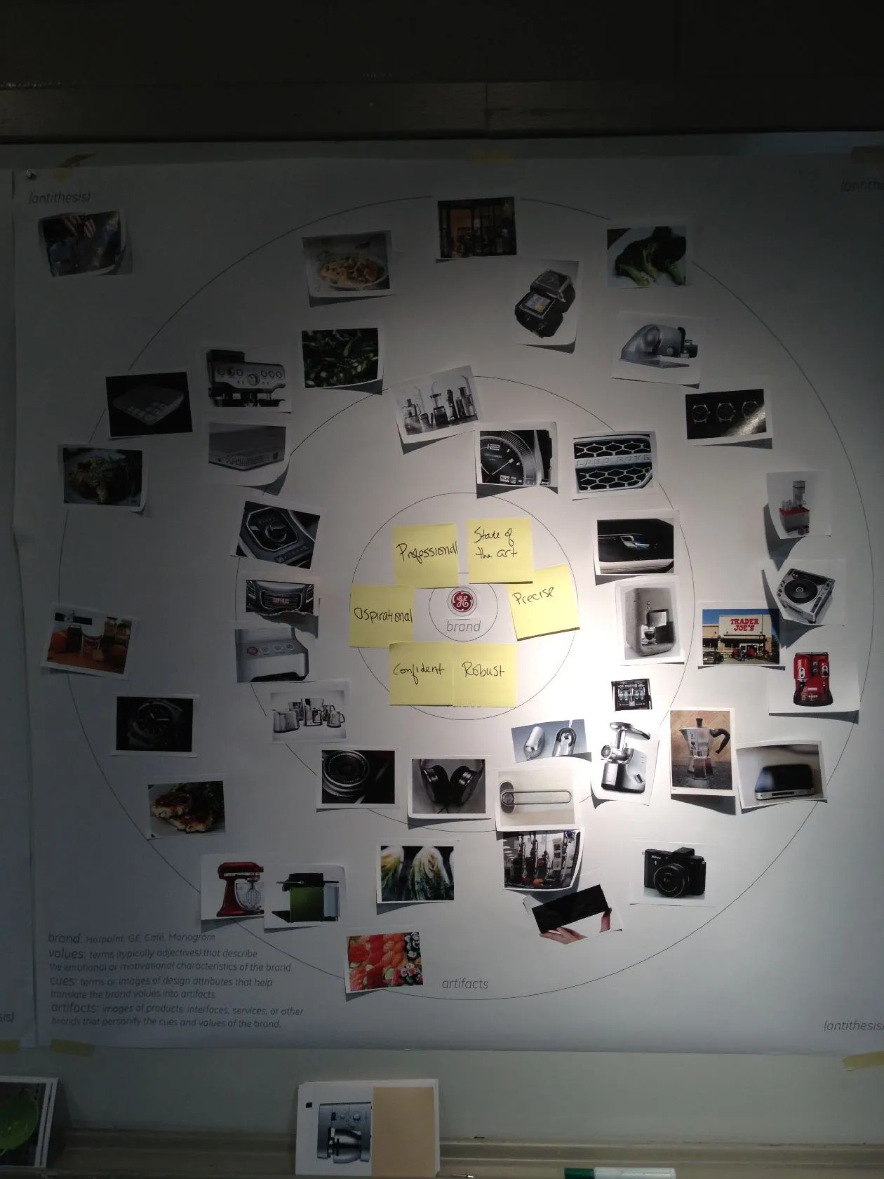
The conceptual framework beside a wall from the second research workshop. Four concentric rings, brand, values, cues, and artifacts, gave the team a structure for describing each brand's character in images, and the Monogram wall shows it in use, with value notes such as Minimal, Craftsmanship, and Timeless above grids of pinned photographs. The second workshop widened the group to participants from marketing, product management, and engineering.
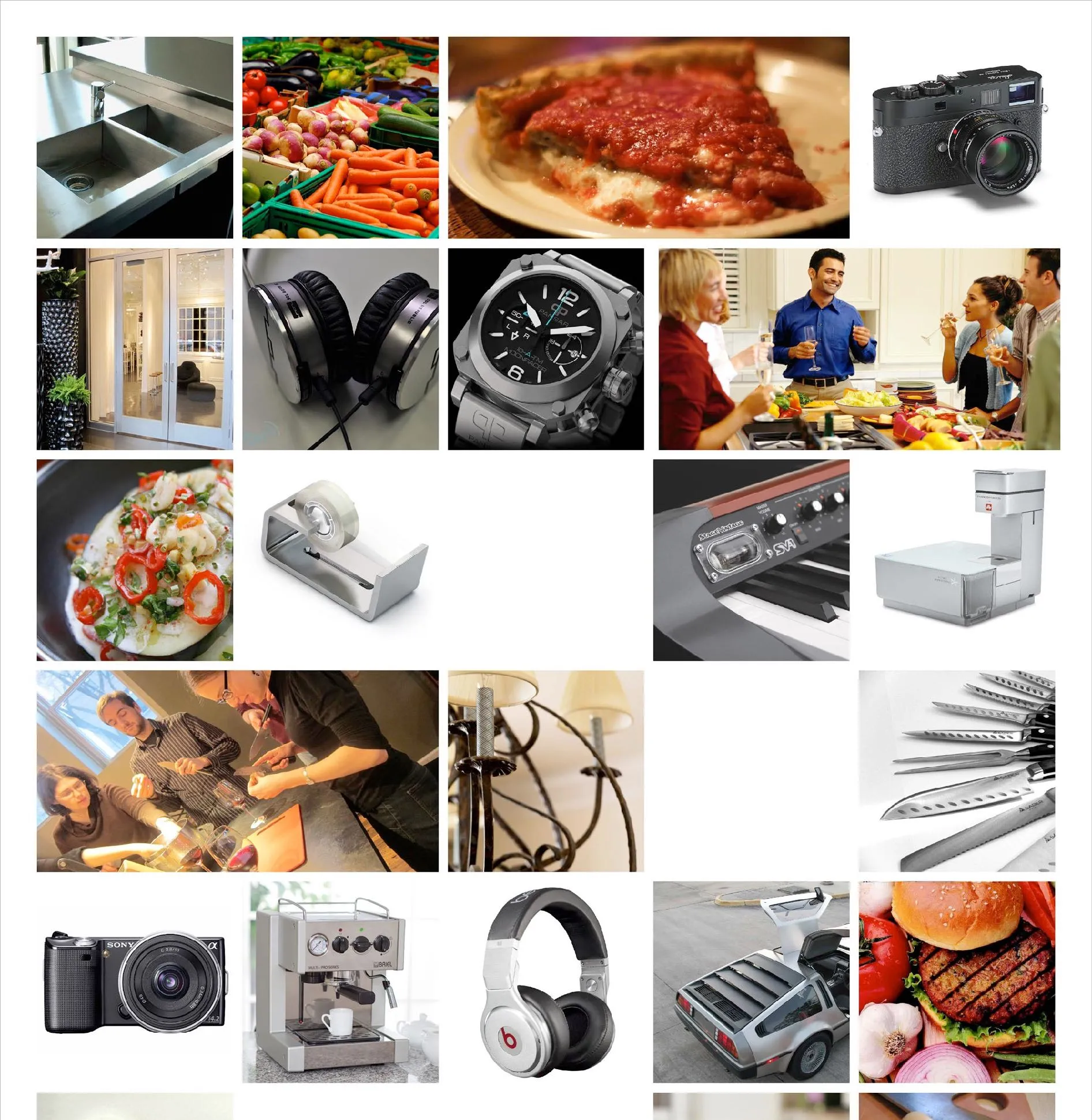
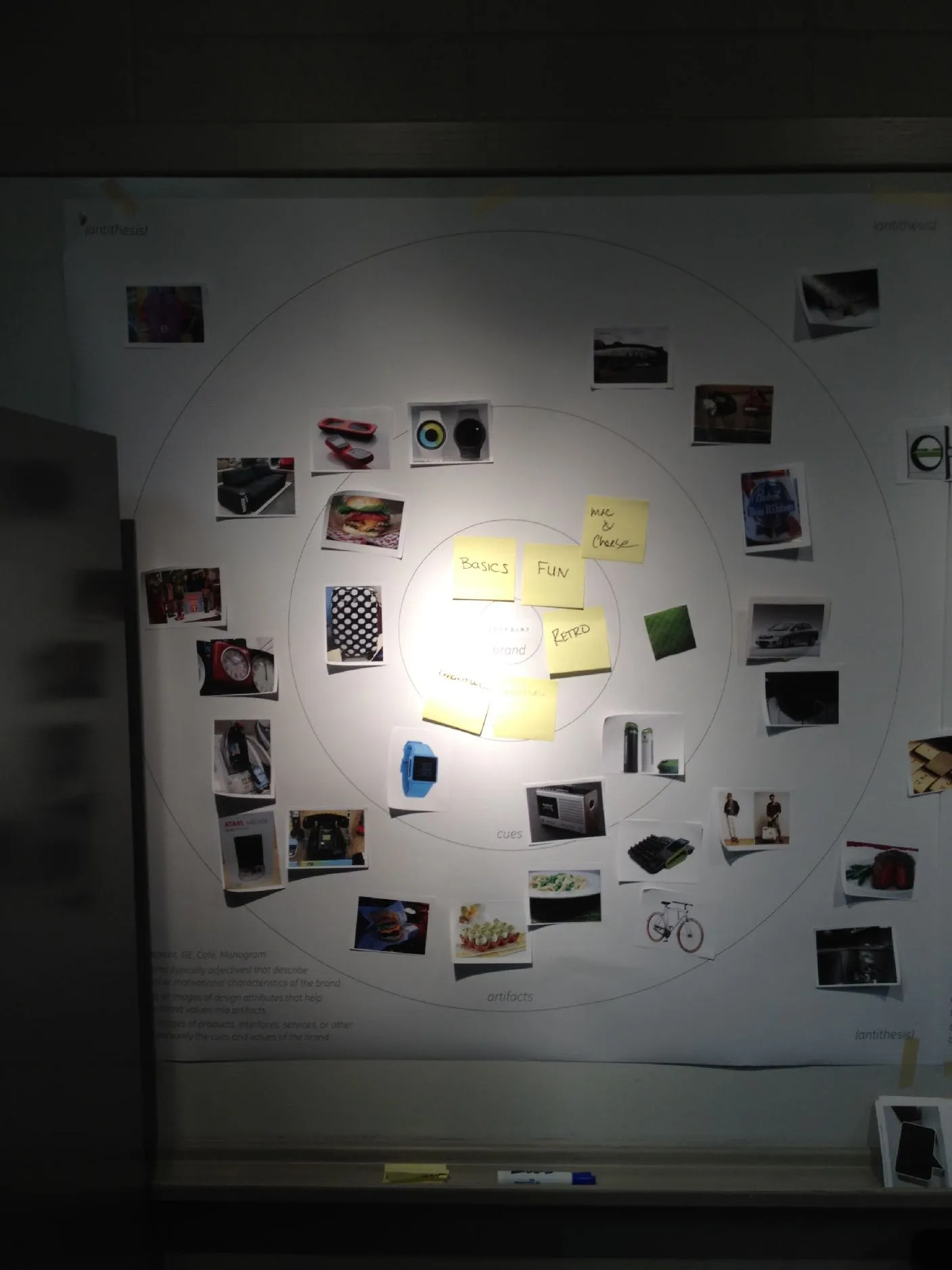
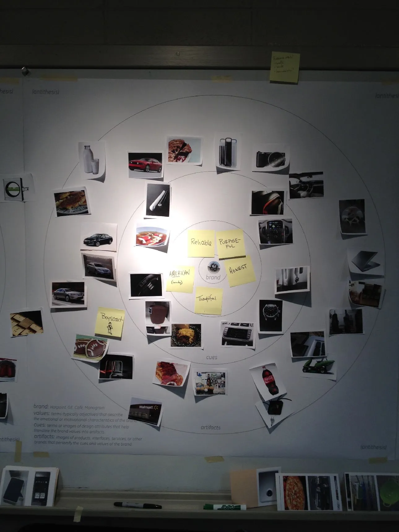
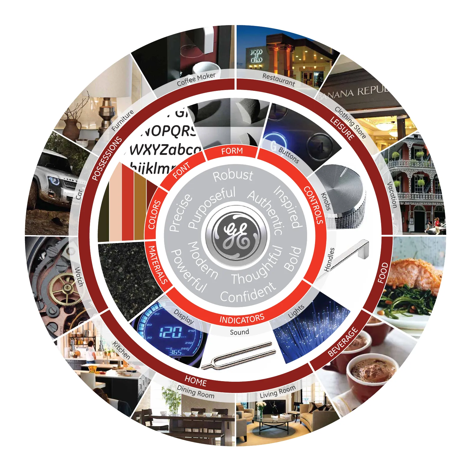
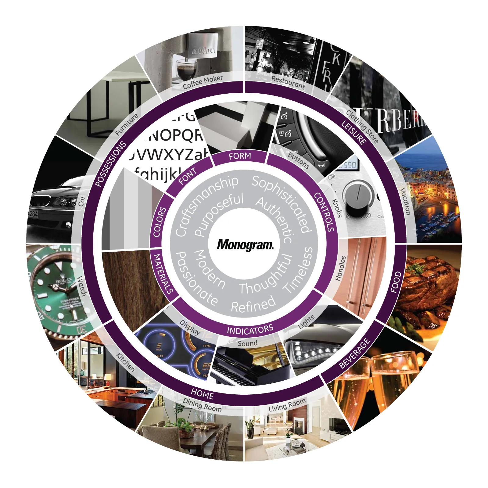
The four bullseye boards from the first research workshop, one per brand, each with value words on yellow notes at the center and printed photographs of products, food, and cars placed around them. The workshop was a dry run with the internal design team to test the framework, and it showed that the verbal debate was as valuable as the resulting map and that each brand needed an antithesis category.
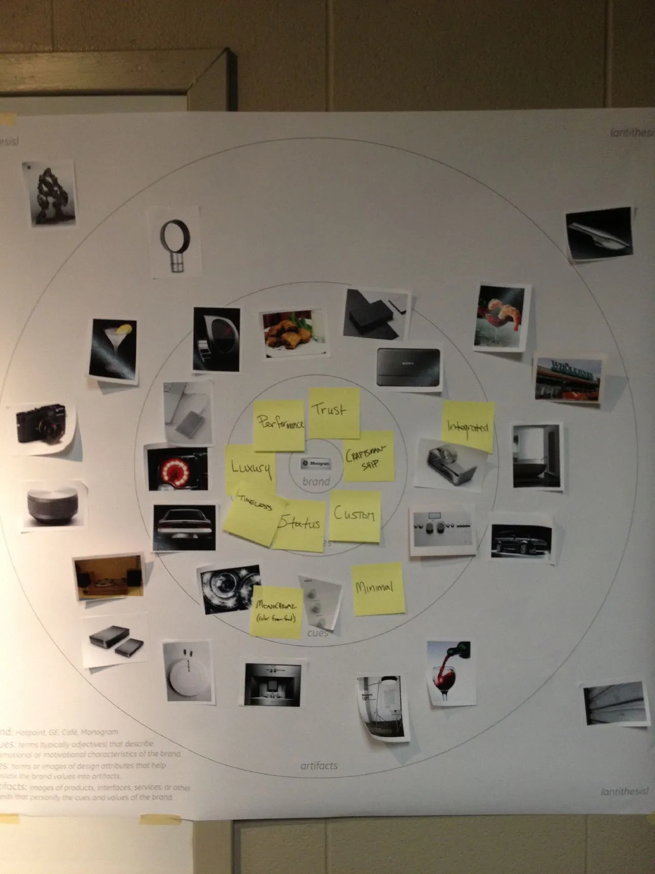
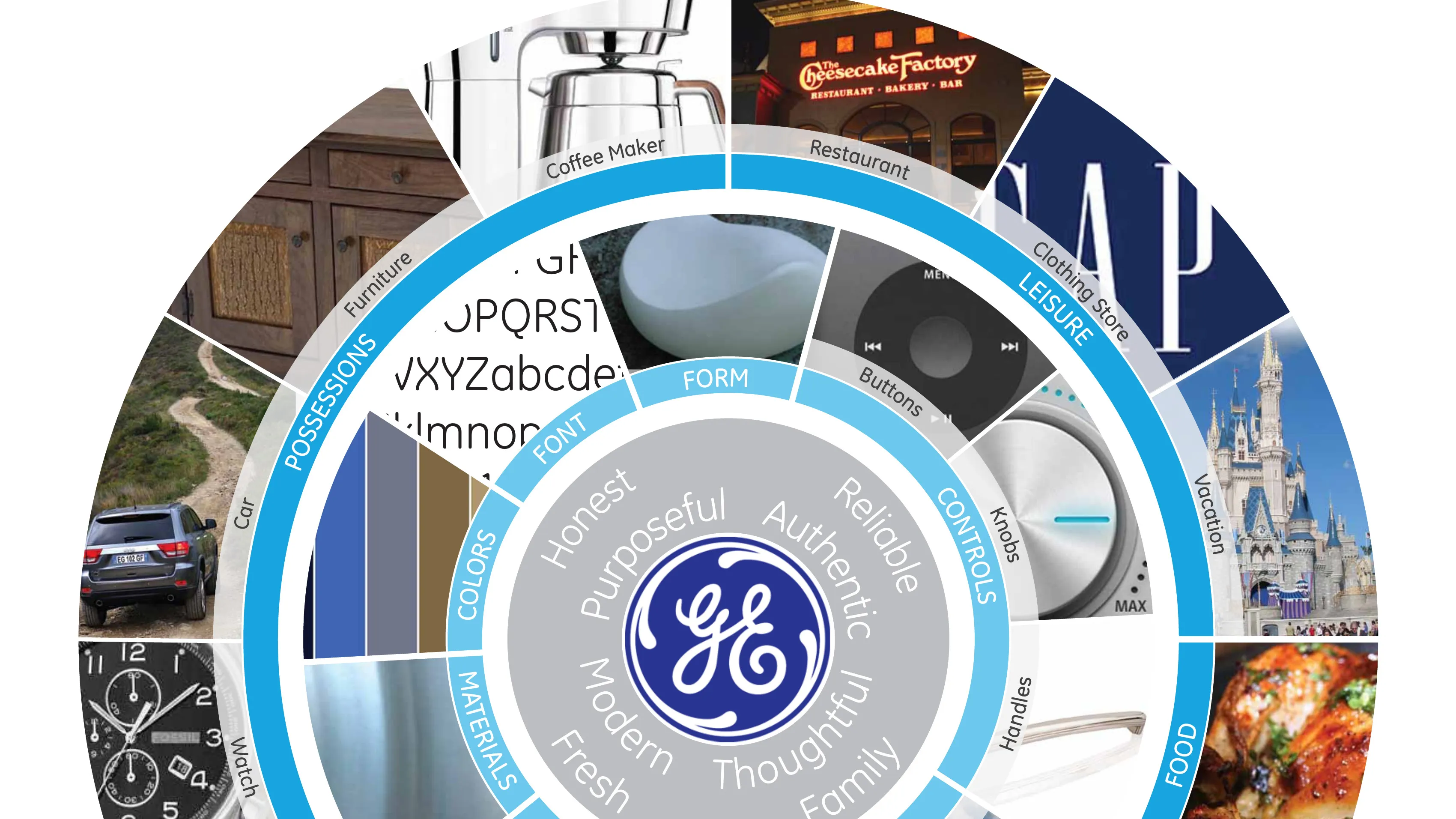
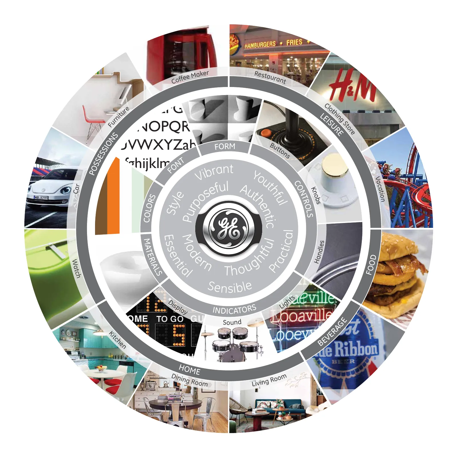
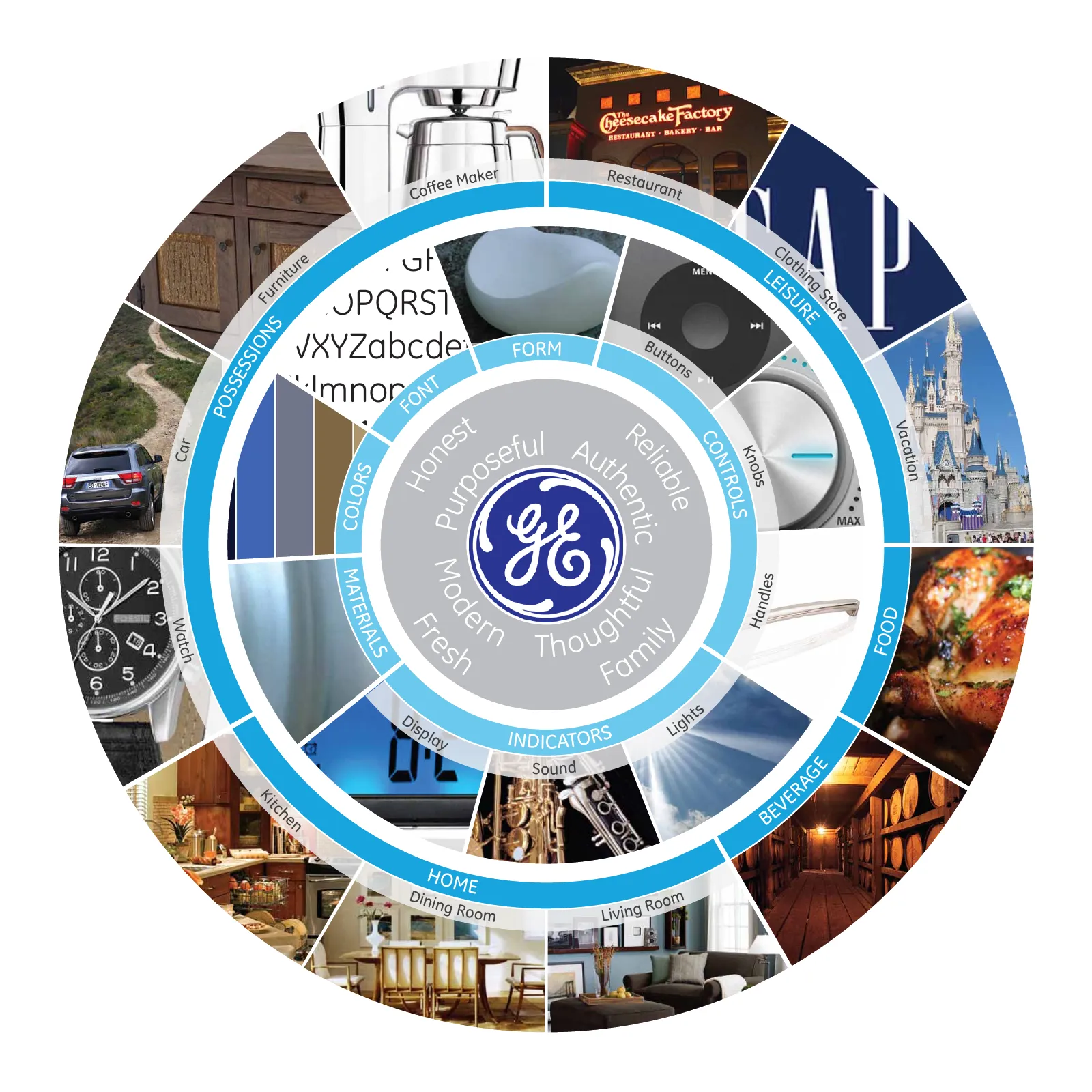
Four brand bullseyes, one each for Artistry, GE, Café and Monogram: radial maps of cues, values and artifacts such as colors, materials, form and rooms of the home. They gave the team an abstraction to argue about a brand without arguing about a sound, and they are the brand set every later block depends on.
Soundtrack
The two goals behind the soundtrack work: inform and inspire the design of an aligned auditory experience, and help the team critique a non-visual design process. The answer was to critique a single score rather than many disparate sounds, then derive the interaction sounds from the soundtrack's instrumentation.
Goals
Soundtracks > Interaction Sounds
1. Inform and inspire the design of an aligned auditory experience. 2. Help the team provide critique to a non-visual design process. Critique a single score rather than numerous disparate sounds. Soundtrack instrumentation then derives interaction sounds for a system of auditory feedback.
The four brand soundtracks, composed by David Chow to my brief, with the rationale I gave in an interview in November 2012. Each brand was given a band or an instrument: garage-band guitar and drums for Artistry, a reserved track for Café so the burners' clicks and the door could carry the brand, airy woodwinds for GE after an acoustic Midwestern direction was dropped, and a luxurious piano for Monogram. The soundtrack came first; the interaction sounds were derived from it.
Artistry
The challenge for developing an audio identity for the Hotpoint brand was understanding where the business wants to take the brand. The brand position is retro, youthful, sensible style. The sound profile we developed has a garage band feel to it, featuring guitar distortion and drums.
Café
The Café brand is all about restaurant-inspired appliances with a professional look and feel. So for the audio we took a more reserved approach, to allow the gas burners' 'clicks' and the solid door closing sound to take more prominence.
GE
The GE brand is really all about living innovation. It's purposeful, modern and authentic. It was one of the most difficult to pin down because of the legacy of the brand. We started with a thought of 'American' and 'familiarity', which lead to an acoustic guitar lead, Midwestern feel. While it was honest and thoughtful, it didn't feel inspired and forward looking. That's when we switched to airy woodwinds backed with an uneven cadence that carries a feeling of innovation. I think what we achieved is a sound language that's Aaron Copeland inspired, forward looking and strong.
Monogram
When you look at GE's Monogram line, you're seeing exceptional craftsmanship and sophistication. When we were looking at a musical instrument that people associate with those qualities, we thought of the piano. The audio for Monogram has an intensity to it — it's not a lazy lounge piano sound, but more luxurious, with an intent.
The complete vocabulary: nineteen functions across four brands, seventy-six sounds, every one playable with its 2013 definition. The rows are grouped into interactions the user makes and passive alerts the product makes, and the shared duration scale lets the four brands be compared like for like. This grid is what the project was for.
Function · design intentArtistryGECaféMonogram
Passive
Control specifications
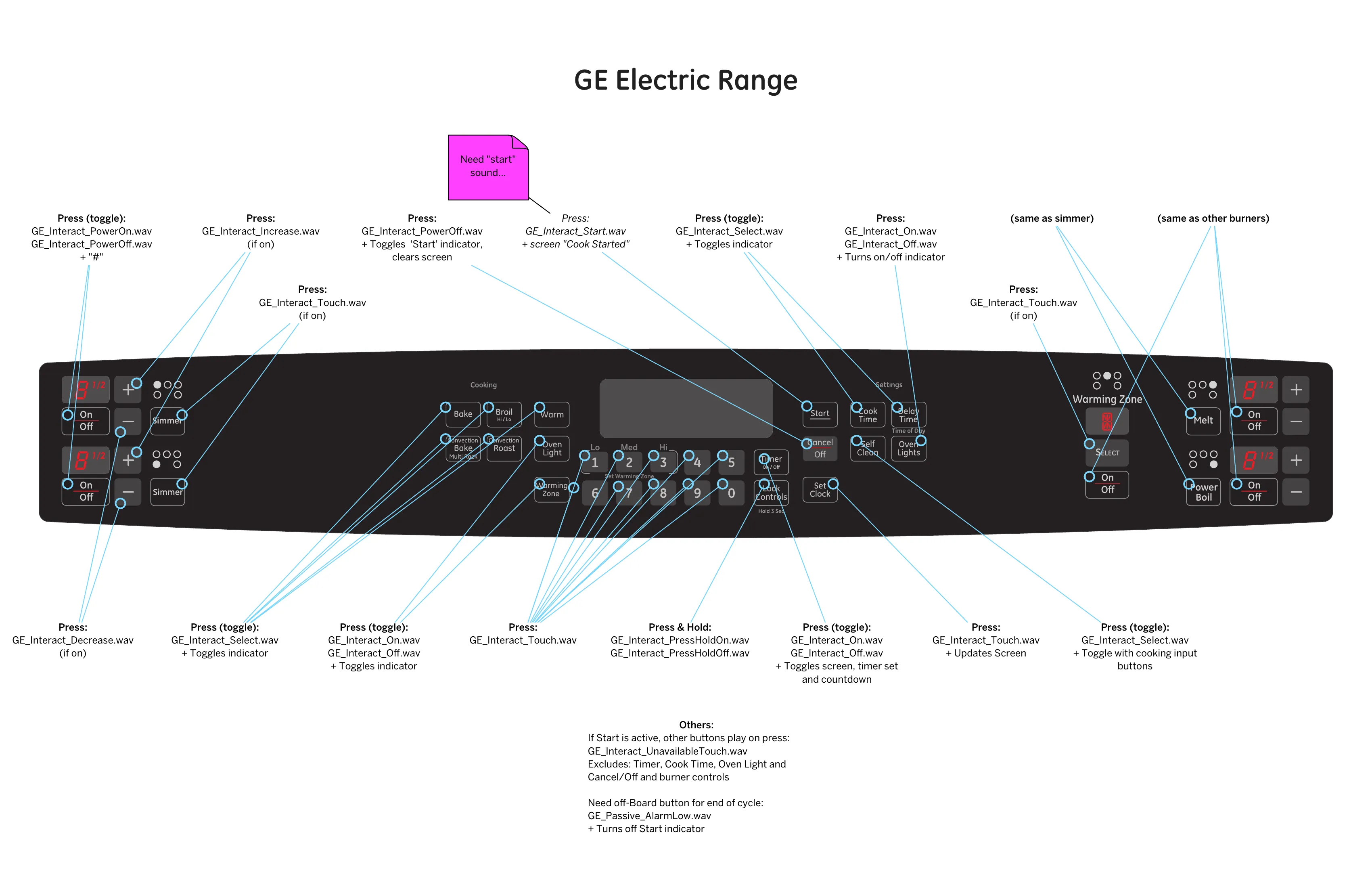
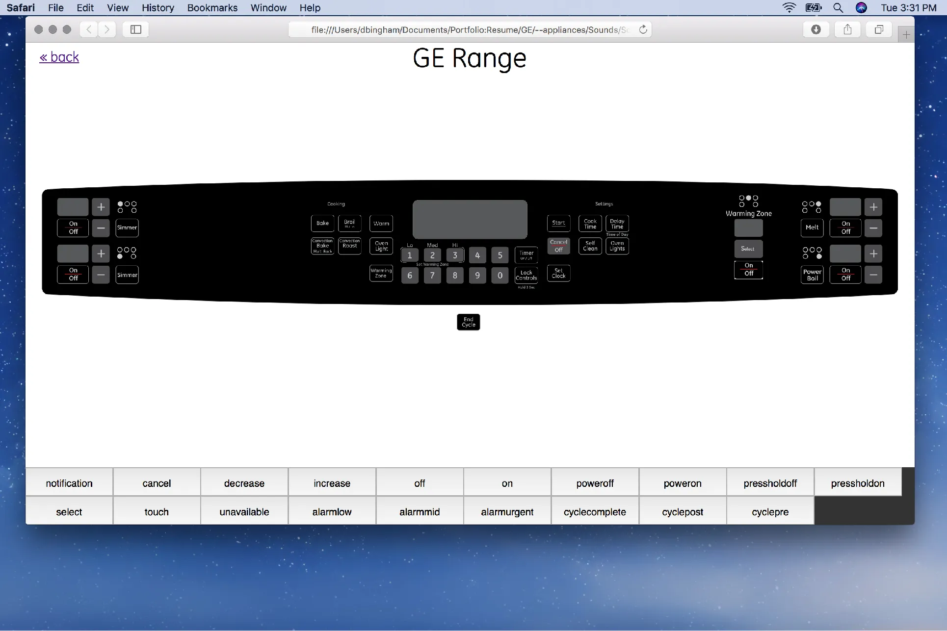
The GE electric range control panel with every button mapped to the sound file it plays, such as GE_Interact_Touch.wav. Specifying sounds against real control artwork validated and refined the interaction sounds, and these documents briefed the team that built the HTML prototypes.
Prototypes
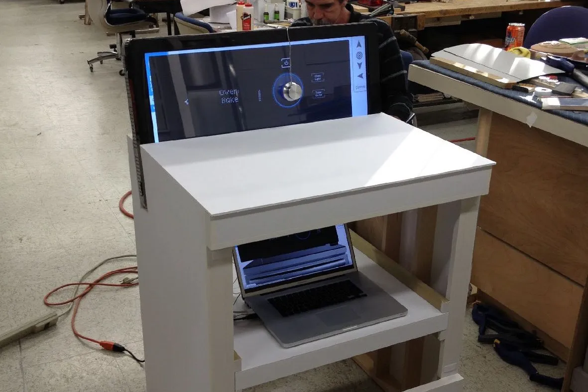
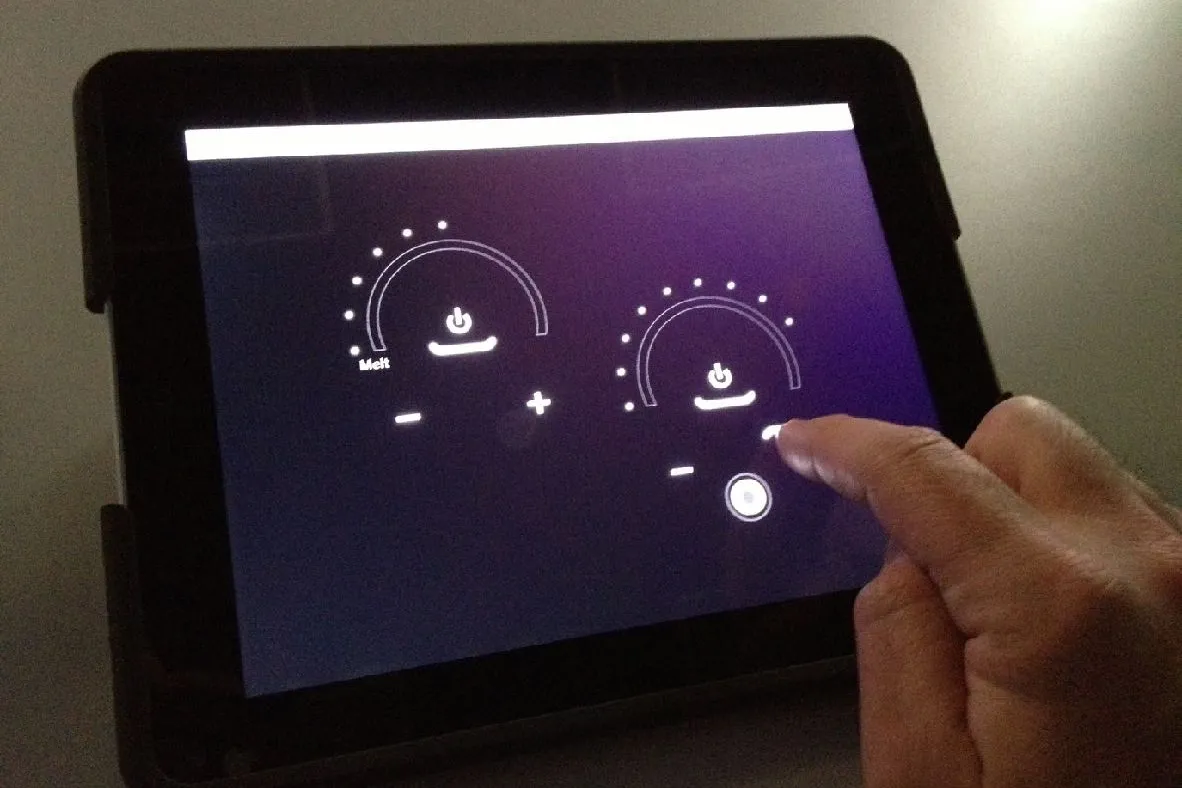
Three ways the team heard the sounds in context: a stove with a touchscreen backsplash, one of fourteen HTML control simulators showing the GE range panel with its sound names, and gestural controls on an iPad. The simulators, one for each product category and brand, were far faster to change than flashing appliance firmware or building hardware controls.
Speaker enclosures
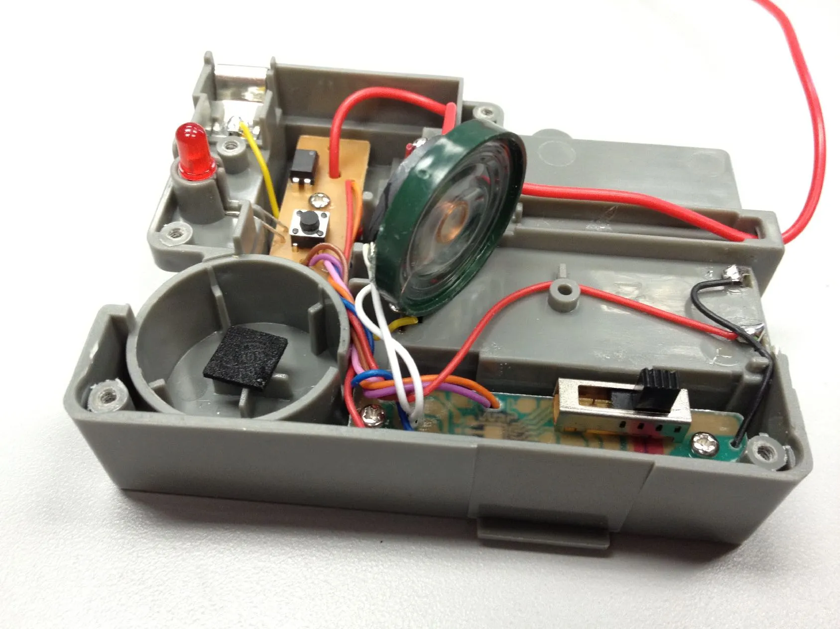
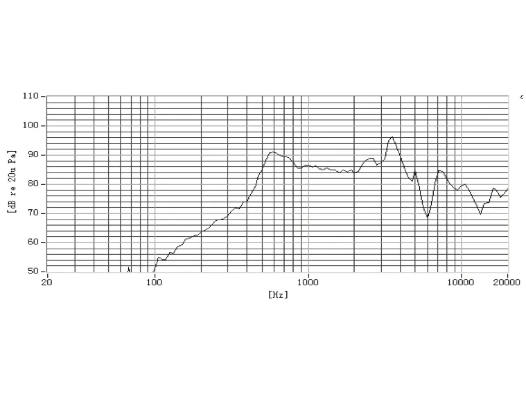
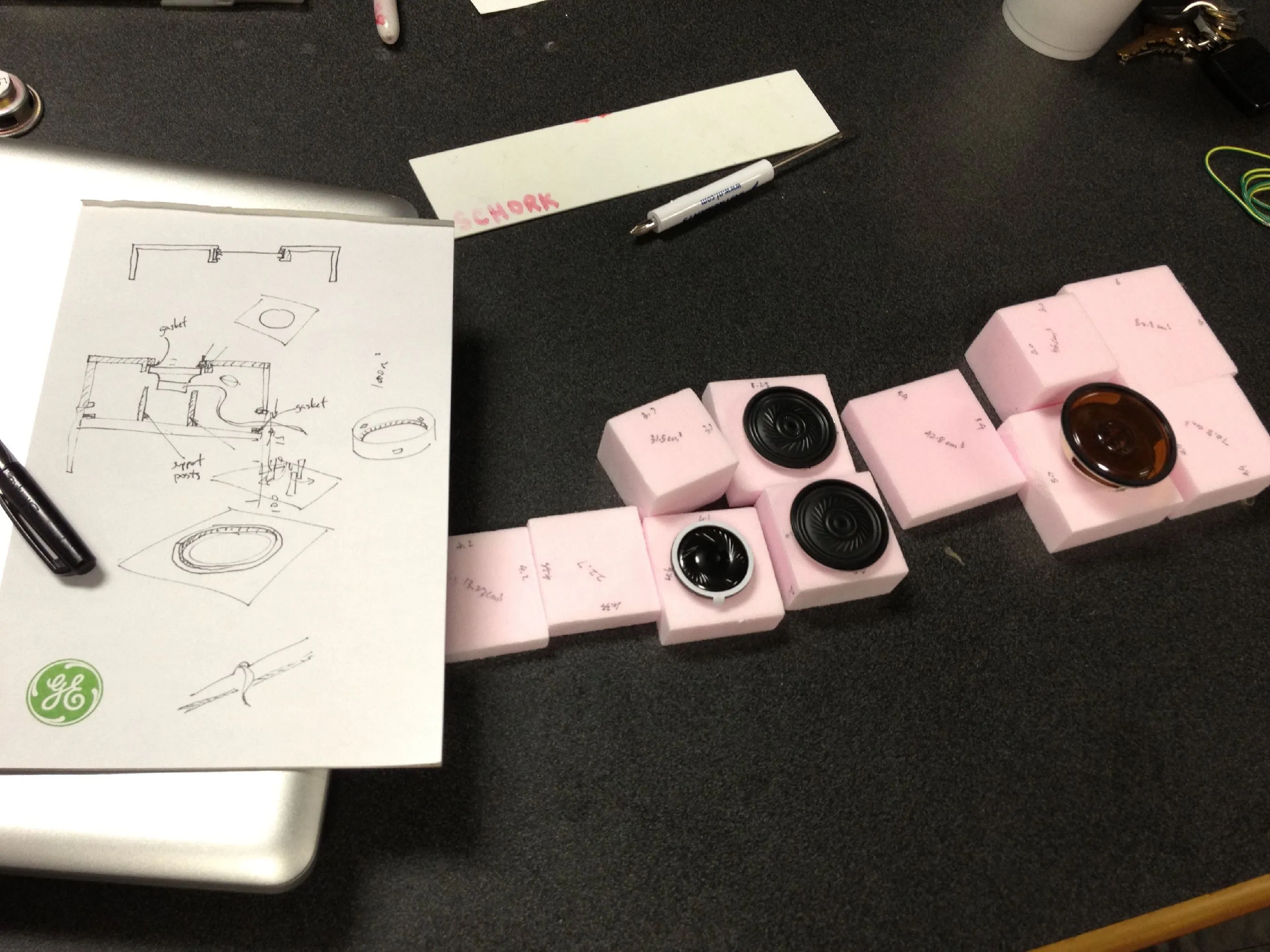
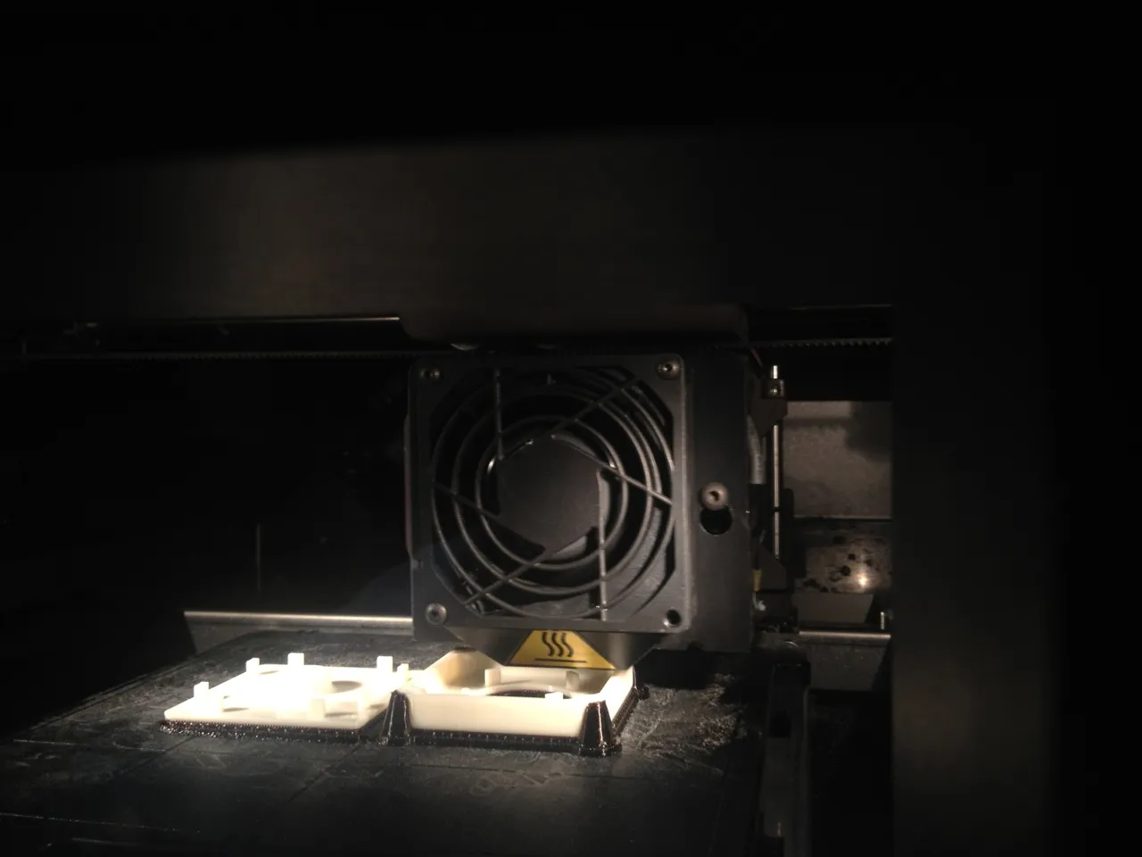
The speaker definition: the part, its frequency response and circuitry, with photographs of the 3D-printed enclosure mock-ups. The decision that mattered was to commonize, one speaker platform across product lines rather than one per program.
My diagram of the audio reproduction chain: instrument, recording, storage, conversion, amplification, transmission, speaker and environment, with quality lost at every stage. It turned a vague complaint that the sound was wrong into a question with eight places to look.

Within appliances
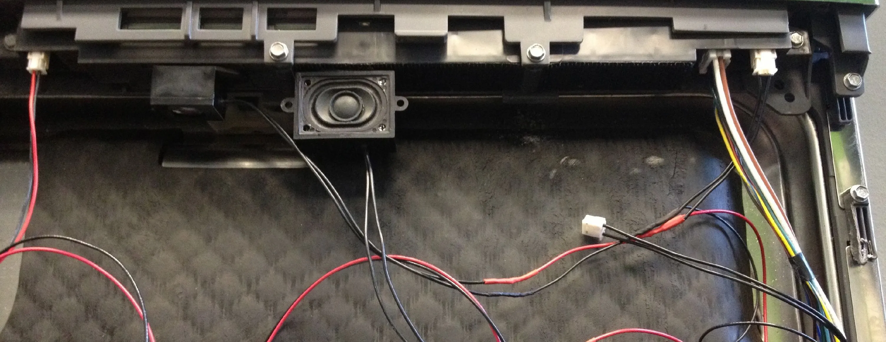
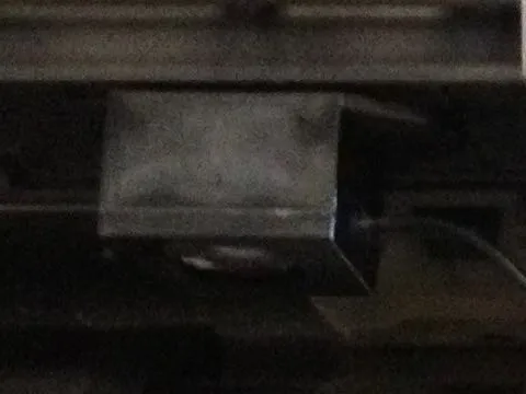
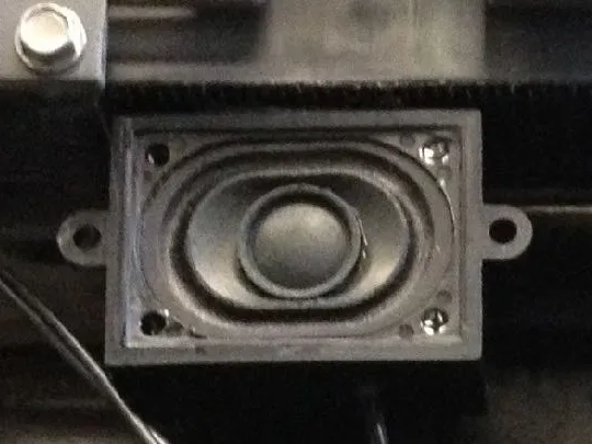
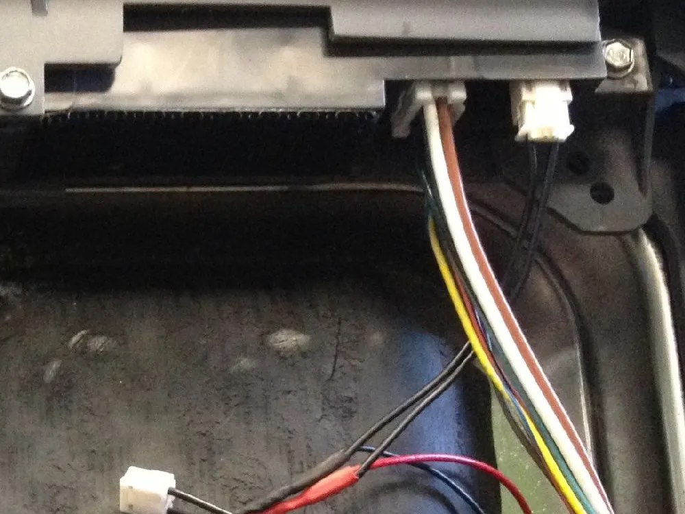
Opens the Speakers section with my account of testing sound inside real appliances. We disassembled a dishwasher, a refrigerator and a range, installed speakers and wired them to an external amplifier for quick iteration and to the internal control with flashed firmware for true playback through the product electronics.
To test how the appliance cavity and electronics would impact sound quality, we disassembled a dishwasher, refrigerator, and range. The speakers were installed and wired to both internal and external sources. The external amplifier wiring could playback sounds from any source for quick iteration. The second source was to the internal control with flashed firmware. While not as quick and flexible as the external wiring, this allowed playback of true control patterns through the actual product electronics.
The speaker test photographed inside a top-control dishwasher door, with the callouts from my 2022 deck: two test speakers, wiring to the internal control and wiring to an external amplifier. It shows how far from the studio the sounds had to work, inside an insulated steel door. The same test appears in Unified Controls, which used these sounds.
 123
 1
 2
 3
Design framework
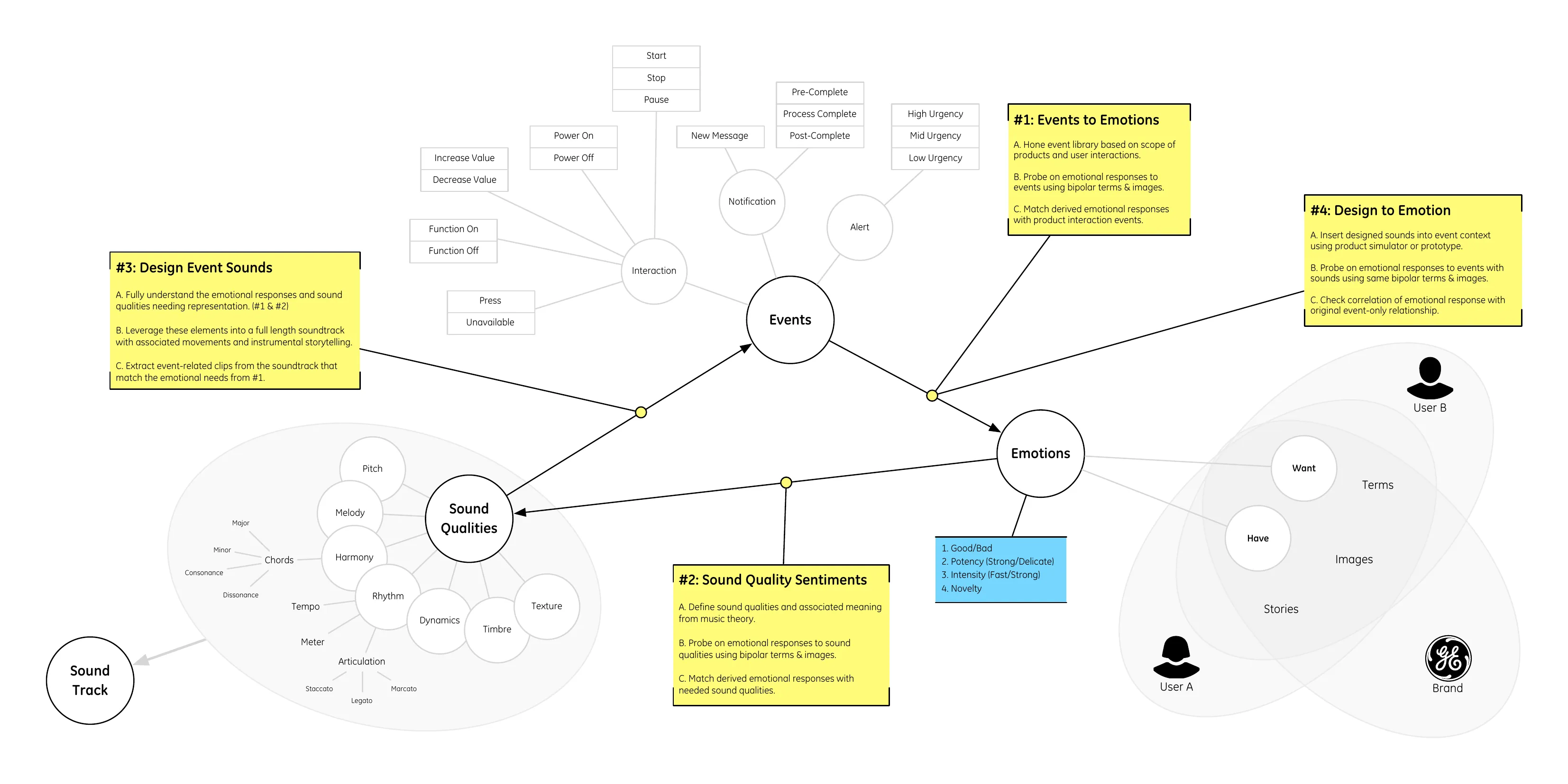
The four steps I set for the program: explore the brands, define and consolidate the technical functions, design the sounds, then gather feedback and iterate. The order matters: the brand work and the function list came before any composer was engaged. The image slot is for the first version of the sound framework.
Implementation guide
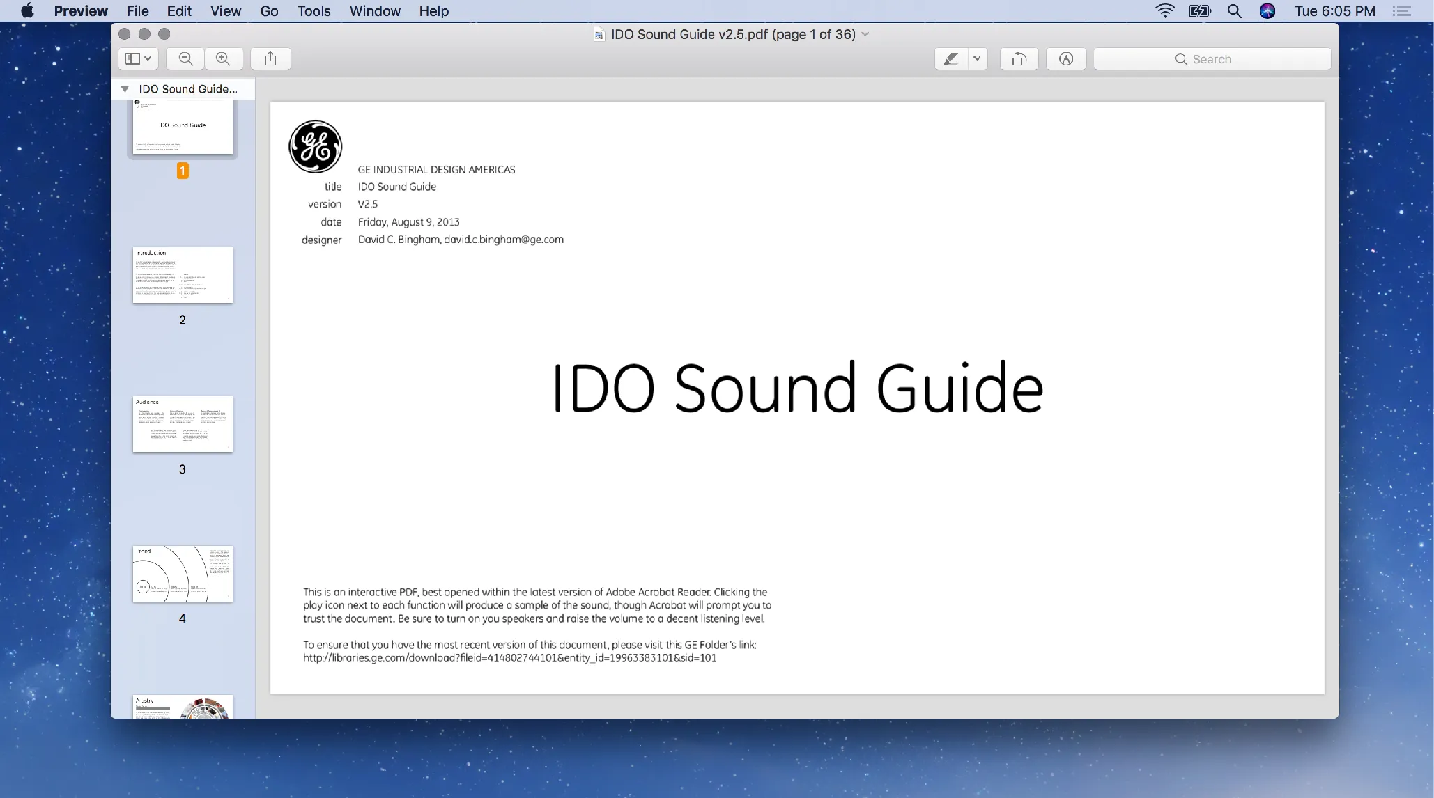
The IDO Sound Guide, version 2.5, dated August 9, 2013, open on its cover, with the full PDF linked for download. It documented the sound library and how to implement and extend it, with the sounds embedded for playback in context, and was published internally for the design, product management, engineering, advertising and public relations, and web and app teams.
Download PDF · 15.6 MB
Press coverage
Two articles from 2012 as they appeared: Co.Design's "GE's New Emphasis In Appliances: Sound Design," dated December 6, 2012, and the Wall Street Journal's "The Search for Sweet Sounds That Sell" by Ellen Byron, dated October 24, 2012. They show the program drew attention in the design and business press more than a year before the Monogram dishwasher shipped in February 2014.
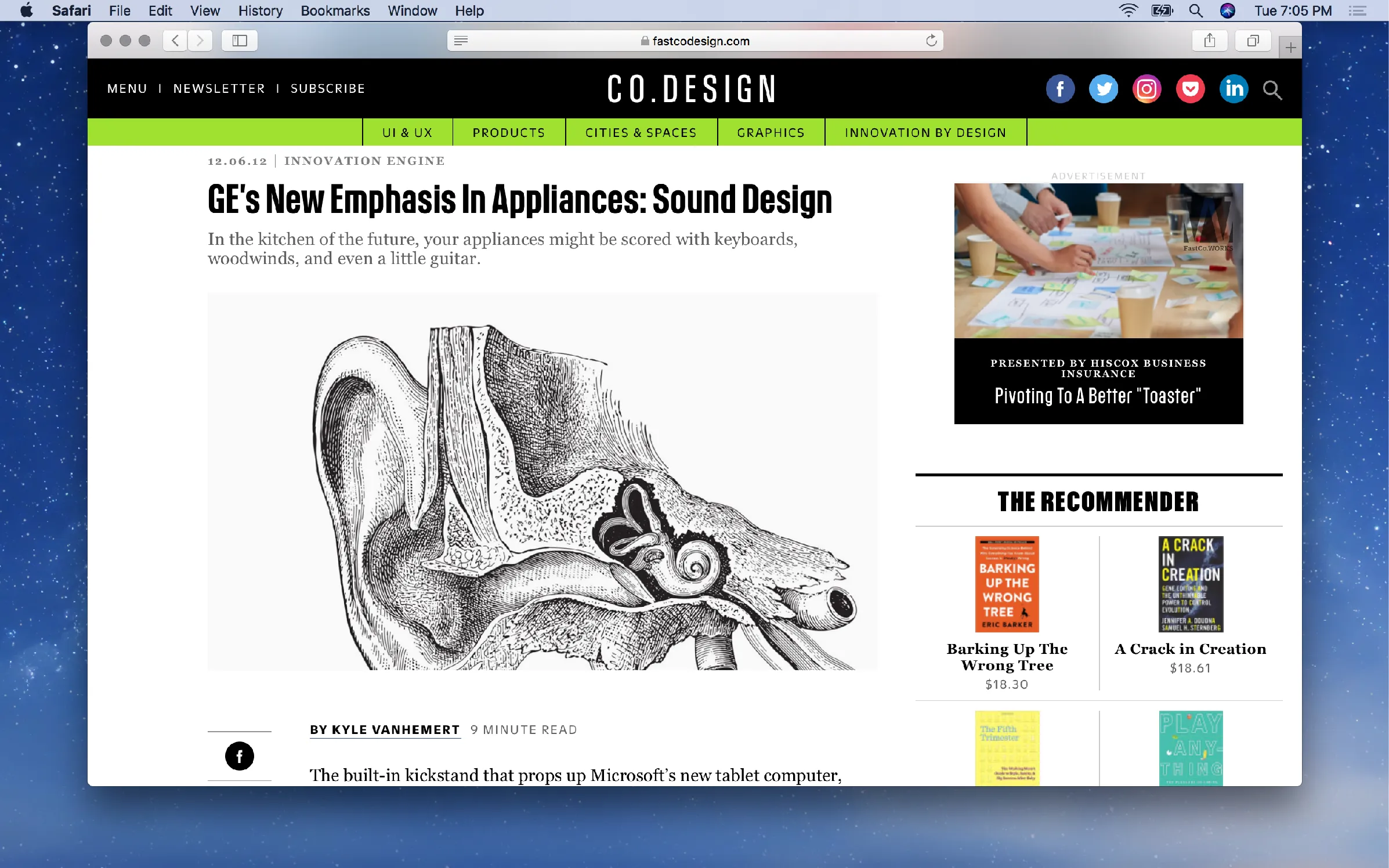
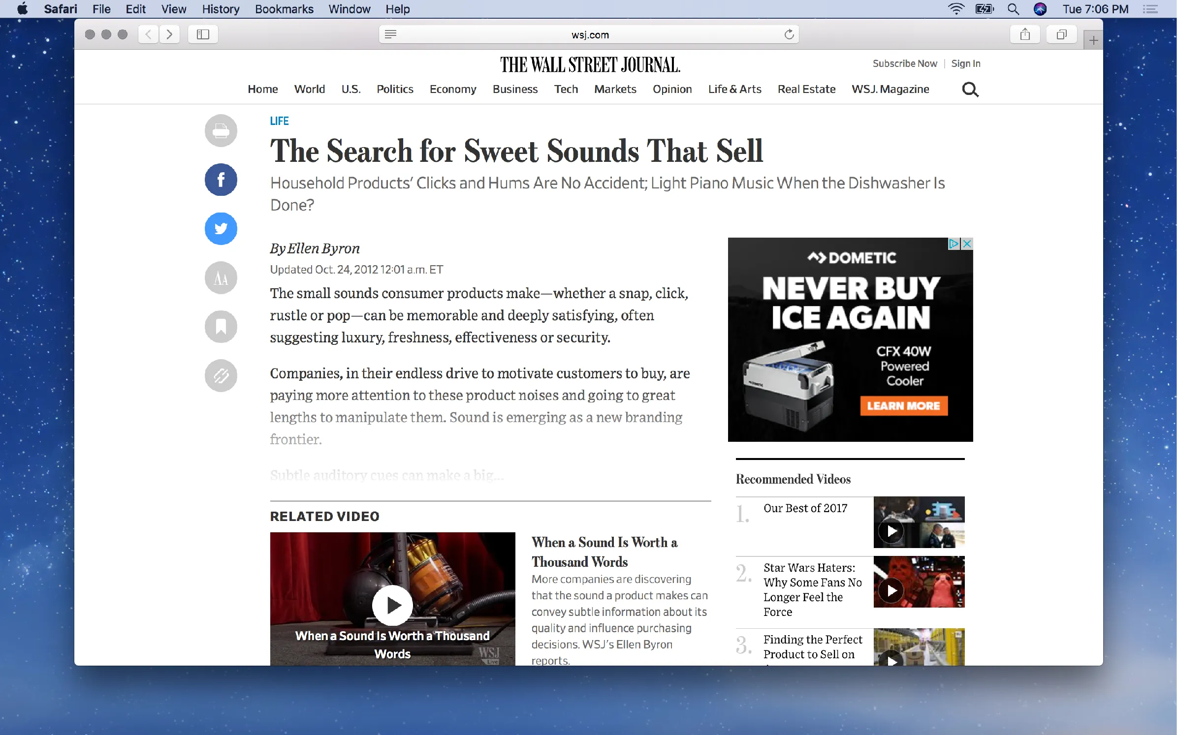
The coverage: GE Appliances' 2013 press release announcing the Monogram dishwasher as the first appliance with its own soundtrack, then the Washington Post, the Wall Street Journal, Co.Design, GE Reports and insideGE. The press is here as corroboration that the work shipped and was noticed.
GE Appliances
Press release · 2013
Indulge Your Senses in Luxury with GE's New Monogram Dishwasher
Live
Co.Design
Article · 2012
GE's New Emphasis In Appliances: Sound Design
Archived · 2012-12
GE Reports
Article · 2012
Beat Is What's For Dinner: Composer Makes GE Washers, Ovens Pitch Perfect
Archived · 2013-09
insideGE
Interview · 2012
Make Some Noise
AI usage
2, Ideas. AI helped with research, sources, brainstorming or structure. I wrote every word.The tiers